From the conversion glossary
Concepts referenced in this article, defined.
Struggling with low sales? Learn how to improve your D2C store's conversion rates with practical, no-fluff tips, no redesign or dev help needed.
Concepts referenced in this article, defined.
Run rigorous A/B tests and personalize every visit on Shopify or any storefront — no engineers required.
Let’s get real for a second.
You’ve built your online store. You’ve got products you believe in, a nice-looking layout, and traffic coming in from Instagram, ads, maybe even email.
But people are visiting... and leaving.
Some add to cart. Fewer start the checkout. And even fewer actually buy.
It’s frustrating—not because you’re not working hard, but because you don’t know what’s going wrong.
The truth is, most stores don’t have a traffic problem. They have a conversion problem.
In this guide, we’ll break down exactly how to identify what’s holding your store back and what you can do step by step to improve your conversion rates without guessing.
When we talk about “conversion,” we’re talking about people doing what you want them to do.
For a D2C store, that usually means:
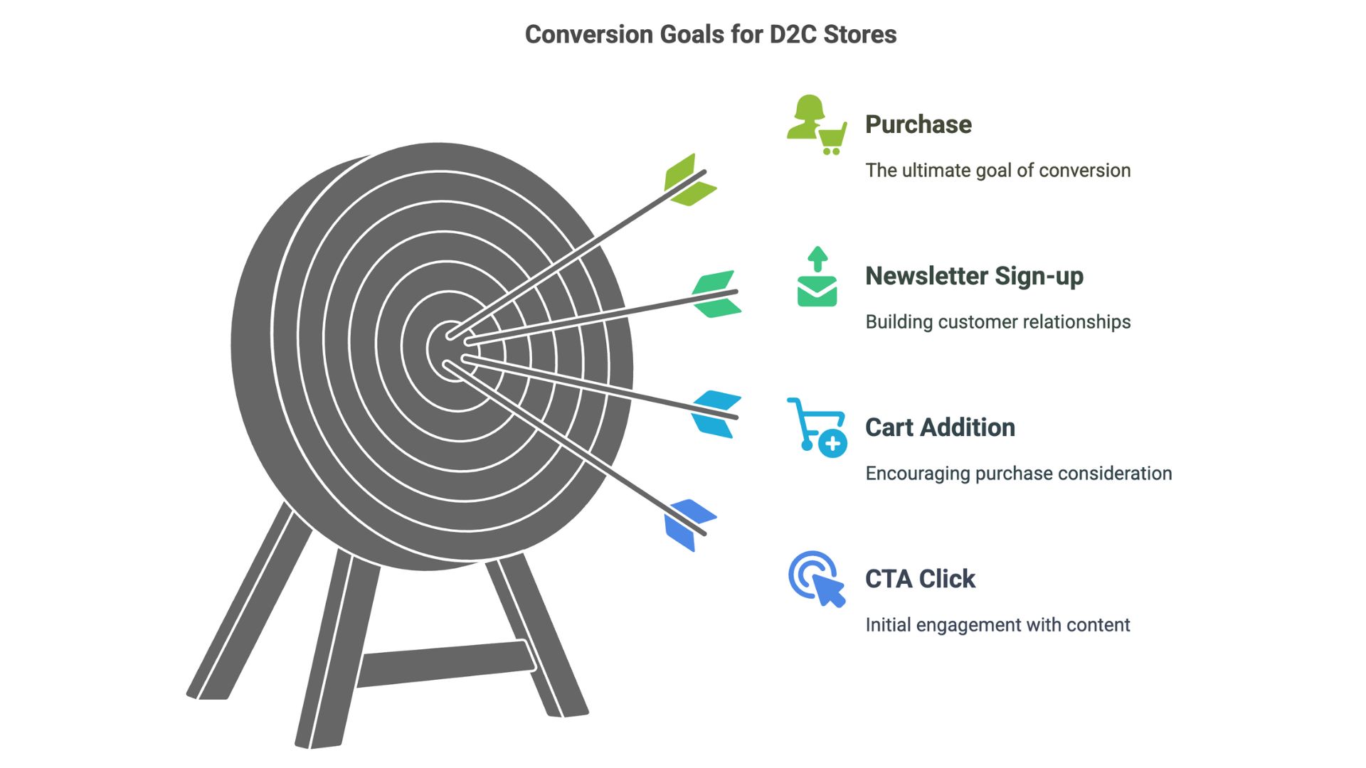
The higher your conversion rate, the more of your traffic is doing something valuable.
Improving conversions means more revenue from the traffic you already have. And often, it doesn’t require a big redesign—just better communication, smoother experiences, and fewer dead ends.
Before you can fix your conversion funnel, you need to find the holes.
Open your analytics (Shopify, GA4, or a tool like CustomFit.ai) and look for:
This will help you understand where people are getting stuck or losing interest. Each drop-off point is an opportunity to fix something small that may be costing you big.
You have 3–5 seconds to earn a visitor’s attention. If they don’t get what your brand is about or what’s in it for them, they’ll bounce.
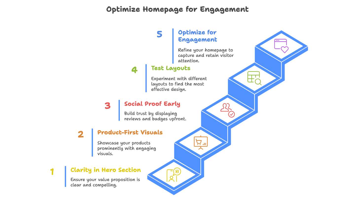
Tools like CustomFit.ai let you test these ideas without rebuilding your entire homepage. You can try different layouts, run quick experiments, and track what’s working.
This is where buying decisions are made—and often lost.
Product pages are where customers look for confirmation. Is this right for me? Is this the best option? Can I trust this brand?
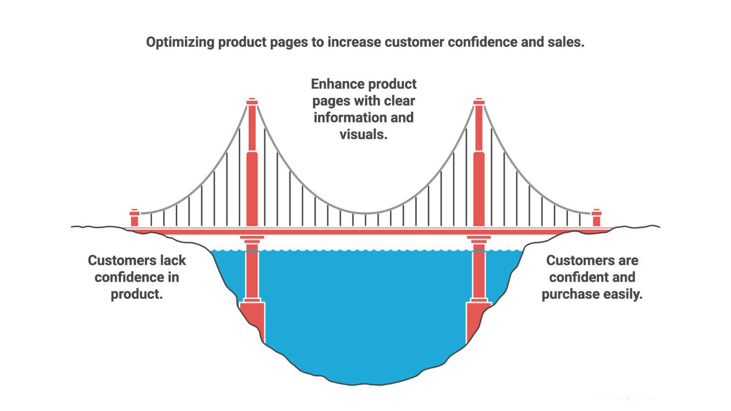
Sometimes, just moving the review stars closer to the title or changing “Add to Cart” to “Buy Now” can improve engagement dramatically.
This is where things get delicate. A user is interested, but hesitation, confusion, or too many steps can scare them off.
Use analytics to track where users drop off. With tools like CustomFit.ai, you can A/B test your cart and checkout flows—even if you’re not a developer.
Your buttons shouldn’t make people think.
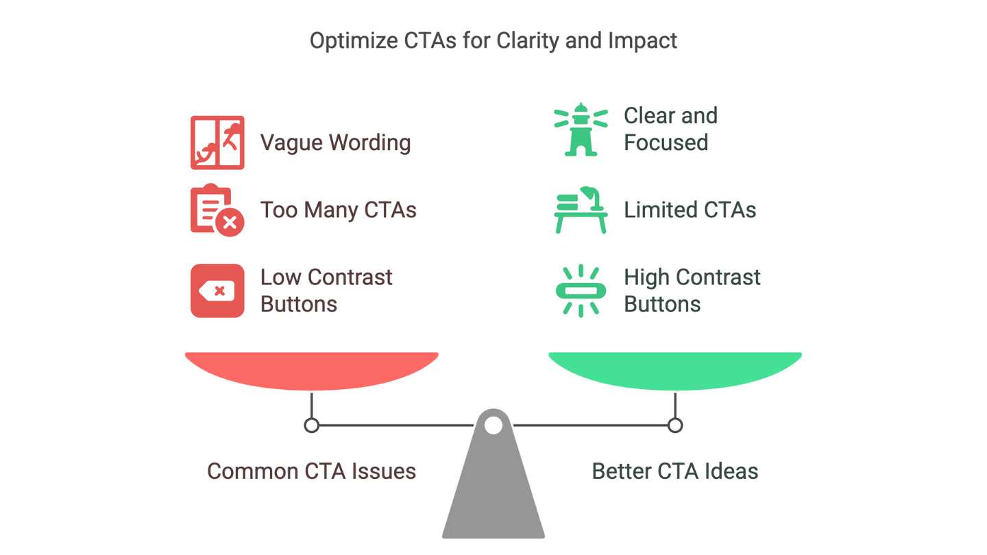
You can A/B test button color, text, and placement. Just change one thing at a time so you know what’s making the difference.
People don’t trust websites. They trust other people who’ve used the product.
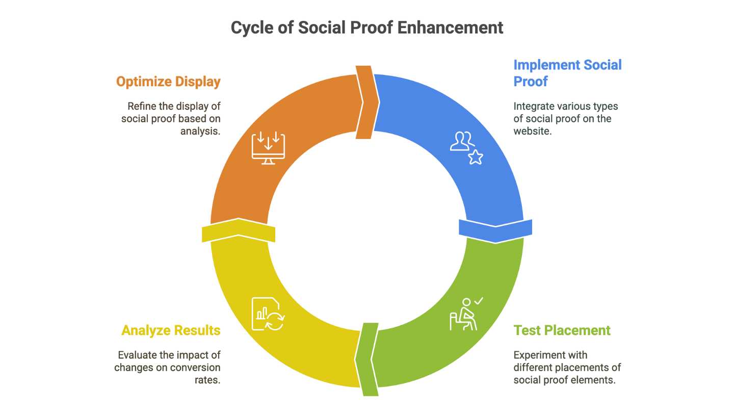
We’ve seen brands get a 10–15% lift in conversions just by rearranging where and how they display reviews.
Not all visitors are the same. First-timers need different messages than returning customers.
With CustomFit.ai, you can personalize:
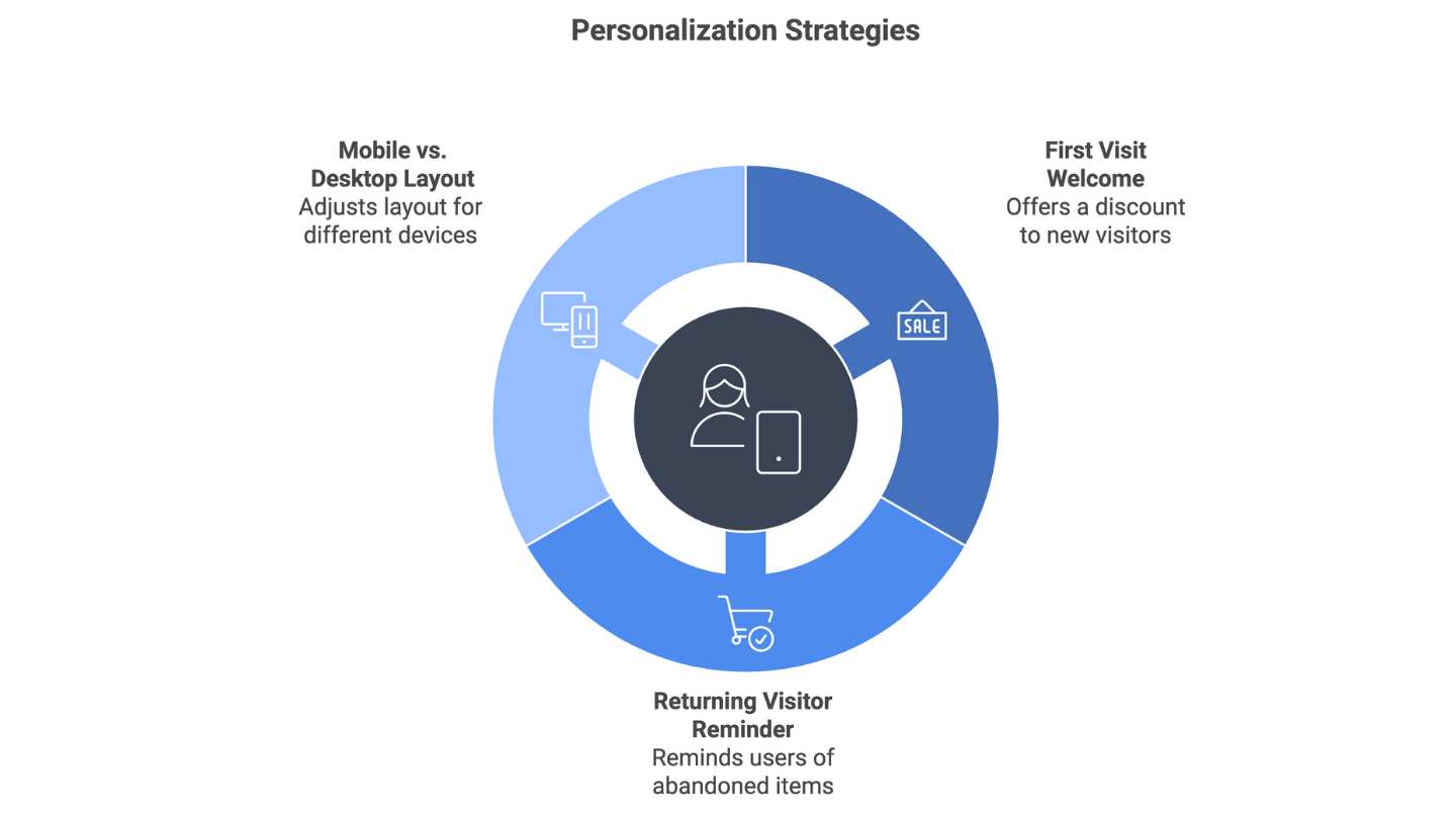
Small changes like these can make users feel understood, which increases their likelihood of buying.
Popups still work—when done right.
Exit intent popups catch users when they’re about to leave. You can offer:
CustomFit lets you show these popups based on behavior, not just time, so you can make it smarter and more relevant.
The best stores didn’t get it right on Day One. They got there by testing, learning, and improving.
If you’re using a tool like CustomFit.ai, you’ll also see how each variant or personalization performs, so you know what’s working and what to cut.
If you want your store to convert better, the answer isn’t always a big redesign or a massive overhaul.
Often, it’s a bunch of small, thoughtful changes:
And most importantly: test each change, don’t just assume it works. Let the data decide.
CustomFit.ai was built to make testing and personalization simpler for D2C brands, without needing a dev team or coding knowledge. It gives you the space to experiment, improve, and grow based on what your visitors are actually doing.
Because when you start treating your website like a conversation, not just a catalogue, people don’t just visit.
They buy.