From the conversion glossary
Concepts referenced in this article, defined.
Concepts referenced in this article, defined.
Run rigorous A/B tests and personalize every visit on Shopify or any storefront — no engineers required.
Checkout completion rate is the final conversion bottleneck for every ecommerce store. Average checkout abandonment hovers around 70% globally — meaning 7 in 10 customers who start checkout never finish. The structure of your checkout — one-page vs. multi-step — is one variable in this equation. But the answer to "which converts better?" is more nuanced than most blog posts admit. Let us look at the actual evidence and when each approach wins.
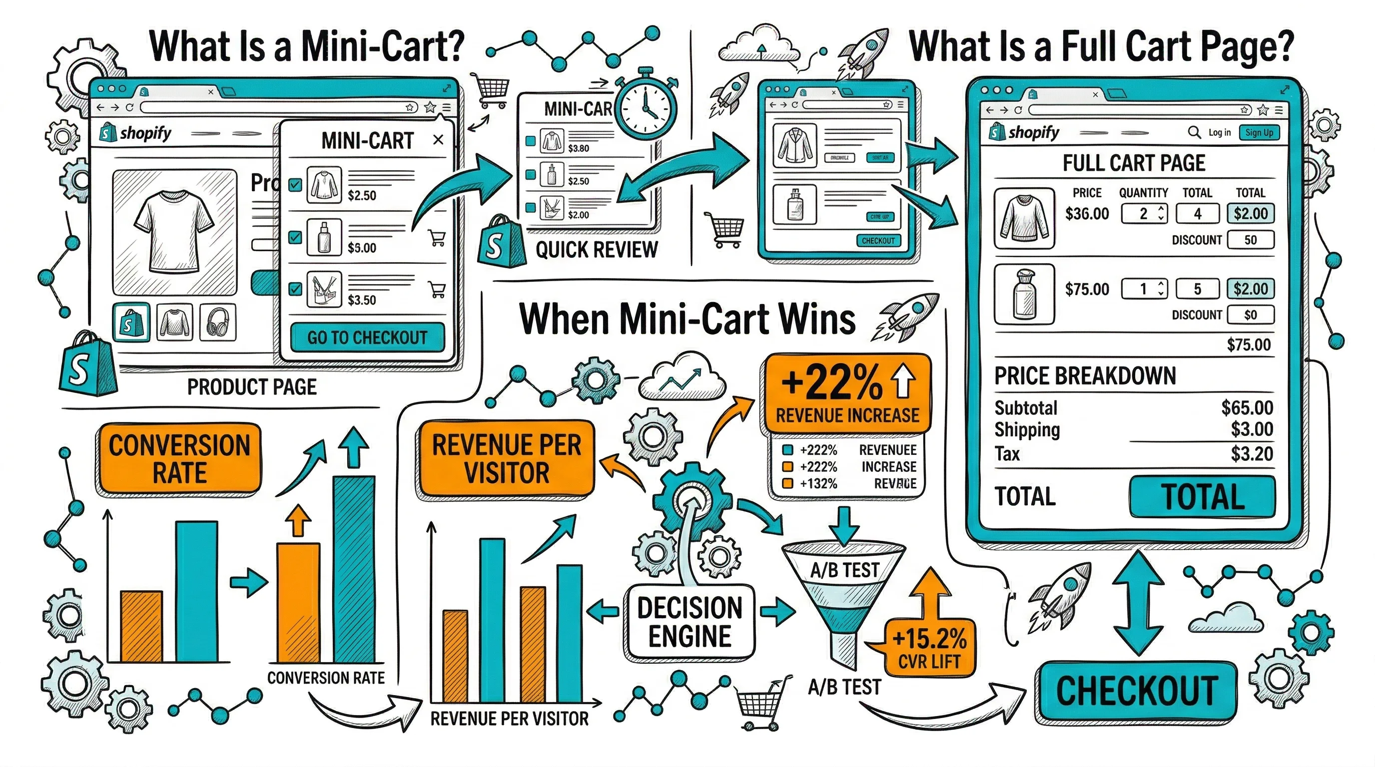
One-page checkout: All checkout fields — contact information, shipping address, delivery method, and payment — appear on a single scrolling page. The customer sees everything at once and can complete the purchase without page transitions.
Multi-step checkout: Checkout is broken into 2–4 sequential steps, typically Contact/Email → Shipping Address → Delivery Method → Payment. Each step is on its own screen with a "Continue" button to advance.
The Shopify default checkout is multi-step. Most traditional ecommerce platforms use multi-step. One-page checkout has been popularized as a CRO technique, but its advantage is conditional.
Fewer page loads: Each page transition in a multi-step checkout is an opportunity for drop-off — network error, impatience, second thoughts. One-page eliminates these transitions.
Complete visibility: Customers can see everything they need to enter upfront, which reduces anxiety about what might come next. "Surprise" payment fields or unexpected delivery charges discovered on the final step cause high abandonment.
Speed perception: Even if the total time to complete both checkout types is similar, one-page feels faster because progress is visible as you scroll rather than as page transitions.
Lower cognitive friction for simple purchases: For a single-item, standard delivery purchase, one-page checkout requires less decision-making — there is nothing complex to manage across steps.
Reduced initial overwhelm: Showing all checkout fields at once on mobile can feel like a wall of form fields. Multi-step breaks this into manageable pieces — each step asks for one category of information.
Progress indicator psychology: A "Step 2 of 3: Shipping" indicator shows customers exactly where they are and how close they are to completion. This reduces abandonment from customers who do not know how much more is required.
Error handling is cleaner: When a customer makes an error in a multi-step flow, the error is contained to that step. One-page checkout errors can be harder to locate and fix on mobile.
Appropriate for complex orders: High-value purchases with multiple items, customization options, or gift messaging benefit from the guided step-by-step approach. The deliberate pacing matches the considered nature of the purchase.
Addresses saved: If you have returning customers with saved addresses in Shopify's customer accounts, multi-step checkout makes address selection cleaner than a one-page form.
Industry data on one-page vs. multi-step checkout is genuinely mixed:
The conclusion the data supports: checkout structure matters less than checkout friction. The biggest drivers of checkout abandonment are:
Fix these friction points and you will gain more conversion than switching between one-page and multi-step.
The single biggest abandonment trigger is shipping cost or tax appearing for the first time on the final payment step. Options:
Forcing account creation increases abandonment by 18–22% on average. Make guest checkout the primary path with account creation as an optional "save your details for next time" offer post-purchase.
Every unnecessary field reduces completion rate. For Indian D2C checkout:
Secure payment badge, money-back guarantee, and return policy visible throughout checkout — not just on the product page. Customers have doubts at the payment step; address them there.
For Indian ecommerce checkout: UPI (PhonePe, GPay, Paytm), all major cards, net banking, COD, and BNPL (Simpl, LazyPay). Missing any of these costs orders.
Given the mixed evidence on one-page vs. multi-step, the right answer is: test it for your specific store, audience, and product mix.
Testing constraints: Full checkout flow testing (changing from multi-step to one-page) requires Shopify Plus or a specialized checkout app. For standard Shopify, you can test elements within the existing flow.
What you can test on standard Shopify with CustomFit.ai:
Full checkout structure tests (for Shopify Plus merchants):
Primary metric: Checkout completion rate — sessions that completed checkout / sessions that started checkout.
Secondary metrics: Cart abandonment rate, time-to-checkout-complete, mobile vs. desktop conversion split.
Indian ecommerce checkout has specific considerations that global best practices do not address:
COD management: COD is used for 40–60% of orders in many Indian D2C categories. Your checkout must:
UPI prominence: UPI should be the first payment option shown, not buried below cards. Most Indian mobile users default to UPI for digital payments.
Address complexity: Indian addresses often include colony names, ward numbers, or regional place references that do not map cleanly to global address forms. Allow enough characters and lines for complete Indian addresses.
Mobile keyboard behavior: Fields that trigger numeric keyboard (pincode, phone) vs. text keyboard (name, address) should be formatted correctly to avoid the keyboard-switching frustration that is disproportionately common in Indian mobile experiences.
Whether you use one-page or multi-step checkout, the highest-impact optimization levers remain the same:
Trust signals: A security badge and "money-back guarantee" mention at the payment step reduces abandonment by 5–8% for most D2C brands.
Progress indicator: In multi-step, a clear "Step 2 of 3" indicator reduces abandonment because customers know they are close to done.
CTA copy at payment: "Place Order" is generic. "Pay Securely — Free Returns Within 7 Days" removes the last objection at the most critical moment.
Mobile autofill: Ensure your checkout fields are marked up to support browser autofill. Customers who can autofill complete checkout faster and at higher rates.
For a complete checkout CRO playbook, see our checkout optimization guide.
Fix friction before changing structure. Upfront cost disclosure, guest checkout, and payment options are higher-impact fixes than switching from multi-step to one-page.
Test on your actual traffic, not industry averages. One-page or multi-step wins depend on your specific product, AOV, and customer profile. Data from other brands is directional, not deterministic.
Measure checkout completion rate by device. Mobile and desktop often show different patterns. Your winner on desktop may not be your winner on mobile.
For COD orders in India, add a confirmation step that sets delivery expectations — this reduces RTO without requiring a separate post-purchase confirmation.
Track funnel analysis by checkout step: where exactly do customers drop off in your current flow? This shows you where to focus optimization effort.
Do not discount the importance of checkout speed. A fast multi-step checkout will outperform a slow one-page checkout every time.
The best checkout is the one that converts your specific customers for your specific products. Test deliberately, measure carefully, and iterate.