From the conversion glossary
Concepts referenced in this article, defined.
Concepts referenced in this article, defined.
Run rigorous A/B tests and personalize every visit on Shopify or any storefront — no engineers required.
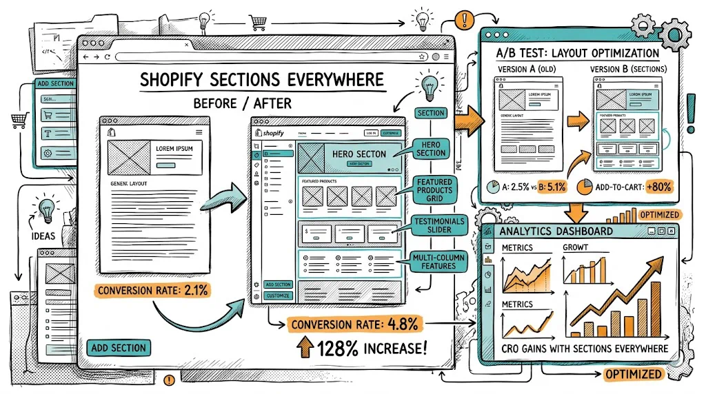
Shopify Sections Everywhere, introduced with Online Store 2.0, is one of the most underused CRO tools available to Shopify merchants. It allows you to add, remove, and reorder content sections on any page template — product pages, collection pages, cart, and more — without touching a line of code. For D2C brands, this means you can turn generic product pages into conversion-optimised landing pages, test new section layouts, and iterate quickly on what's working.
Before OS 2.0, Shopify's section system was limited to the homepage. Product pages, collection pages, and other templates had fixed layouts that required Liquid code changes to modify. Marketers had to queue developer tasks to add a social proof strip or rearrange sections.
OS 2.0 changed this. Now, every page template supports sections. You can:
All of this through the Theme Editor. No code. No developer ticket.
What to add: A compact star rating + review count line near the product title, above the price.
Why: Visitors make split-second trust decisions. A visible "4.8 ★ from 12,400 reviews" before they even read the description anchors credibility. Brands that move this above the fold typically see 5–12% improvement in add-to-cart rate.
How: If your review app (Judge.me, Yotpo, Okendo) provides a badge widget, add it as a section or use a custom liquid block in the theme editor. Most OS 2.0 themes have native support for review badge placement.
What to add: A row of 4–6 icons below the add-to-cart button: "Free returns," "COD available," "100% authentic," "Dermatologist tested," "FSSAI certified."
Why: The area immediately below the add-to-cart button is where purchase hesitation is highest. Trust badges directly counter the most common objections (counterfeit concern, return policy uncertainty, payment safety).
For Indian D2C specifically: "COD Available" as a trust badge, not just a payment option, is a conversion signal — it tells first-time buyers that the brand trusts them to pay on delivery, reducing the "what if it's not good?" risk.
How: Add a custom HTML section or use a trust badges app. Most OS 2.0 themes support a "Custom HTML" block that can render a simple HTML/CSS badge row.
What to add: A dynamic "Only X left in stock" or sale countdown timer section.
Why: Urgency reduces the "I'll buy it later" deferral that costs conversions. Genuine scarcity signals ("Only 3 left") are more credible and sustainable than artificial countdown timers.
Ethical use: Only show actual stock levels. Fake scarcity ("Only 3 left!" when you have 3,000 units) erodes trust when discovered. Real low-stock warnings are useful to buyers and ethical.
For Indian festive sales: Countdown timers during Diwali, Republic Day Sale, and other promotional periods are highly effective. A timer saying "Sale ends in 4 hours 22 minutes" creates justified urgency.
What to add: A 3–5 step numbered section showing how to use the product.
Why: "How to use" information addresses purchase uncertainty for first-time category buyers. For skincare products (new ingredients like retinol or AHA), supplements, or complex gadgets, usage instructions can be the deciding factor.
Best placement: Below the description, above reviews. After a visitor has read what the product is (description), they want to know if they can actually use it correctly (how to use) before reading social validation (reviews).
What to add: A 2–4 product cross-sell section with "Often used together" or "Complete your routine" framing.
Why: Cross-sells increase AOV and help visitors who are interested in the brand's ecosystem discover related products. Positioned below the product description or after the reviews, they don't interrupt the purchase flow.
For beauty brands: This is the "CTM routine" section — cleanser → toner → moisturiser. Showing all three on each product page with one-click add-to-cart increases basket size significantly.
For food/supplement brands: "Often taken together" or "Complete your wellness stack" sections are effective for brands like Kapiva where multi-product routines are part of the proposition.
What to add: A horizontal strip (similar to an announcement bar) directly below the collection header: "Free delivery on orders above ₹499 | COD available | Easy returns."
Why: Collection pages are where shoppers browse, not yet committed. Trust signals in the browse experience reduce abandonment before visitors reach product pages.
What to add: A 2–3 column section below the first product row highlighting why your products are different: "Natural ingredients," "Tested by dermatologists," "Made in India," "No harmful chemicals."
Why: Collection pages for category searches (e.g., "Face Wash") attract visitors who are comparing options. A mid-page brand differentiator breaks up the product grid and reinforces why your brand deserves the sale.
What to add: A full-width featured product section at the top of the collection, before the product grid.
Why: Reduces decision paralysis for new visitors ("where do I start?"). Featuring your bestselling or most-reviewed product with a headline ("Our most-loved face wash — 4.9 ★ from 8,200 reviews") guides low-intent visitors toward a conversion before they're overwhelmed by catalogue choice.
The real CRO power of Sections Everywhere is in testing. Every section addition is a hypothesis: "Adding a social proof strip above the add-to-cart button will increase add-to-cart rate."
How to A/B test sections with CustomFit.ai:
This workflow — section added in theme editor, A/B tested with CustomFit.ai — lets you run continuous product page optimisation without developer involvement.
Adding too many sections: A product page with 12 sections is overwhelming. Each section should serve a clear conversion purpose. Audit existing pages: which sections are visitors scrolling past without engaging? Remove or consolidate them.
Not testing section order: The sequence of sections matters as much as their presence. Reviews above or below "How to Use"? Benefits before or after the description? Test order, not just presence.
Generic cross-sell sections: "You May Also Like" with algorithmically random recommendations converts worse than curated, category-specific cross-sells ("Complete your skincare routine" with specific products). Curate your cross-sell sections manually for high-traffic products.
Desktop-only design thinking: Always preview section additions on mobile before activating. A section that looks clean as a 3-column layout on desktop collapses into a confusing 1-column stack on mobile.
Related reading: Shopify Metafields for CRO: Hidden Power | Shopify Analytics: Understanding Your Dashboard | Website Optimization | Conversion Path | Shopify CRO pillar