
From the conversion glossary
Concepts referenced in this article, defined.
Concepts referenced in this article, defined.
Run rigorous A/B tests and personalize every visit on Shopify or any storefront — no engineers required.
A Shopify cart drawer is the slide-out panel shoppers see when they click "Add to Cart." It is the highest-intent moment in the purchase journey — the shopper has committed to wanting the product. Optimizing this moment with the right upsells, copy, and design can increase average order value by 15–30% without adding friction to checkout.
Most brands spend their optimization effort on product pages and landing pages. But the cart drawer is where the purchase decision hardens. A shopper who has added a Bellavita perfume to their cart is 3–4x more likely to buy than someone just browsing. That is the moment to present a complementary product or a free-shipping threshold nudge — not on the home page.
Yet most default Shopify cart drawers are bare: a product image, quantity selector, and a checkout button. That is a missed opportunity.
What a well-optimized cart drawer should include:
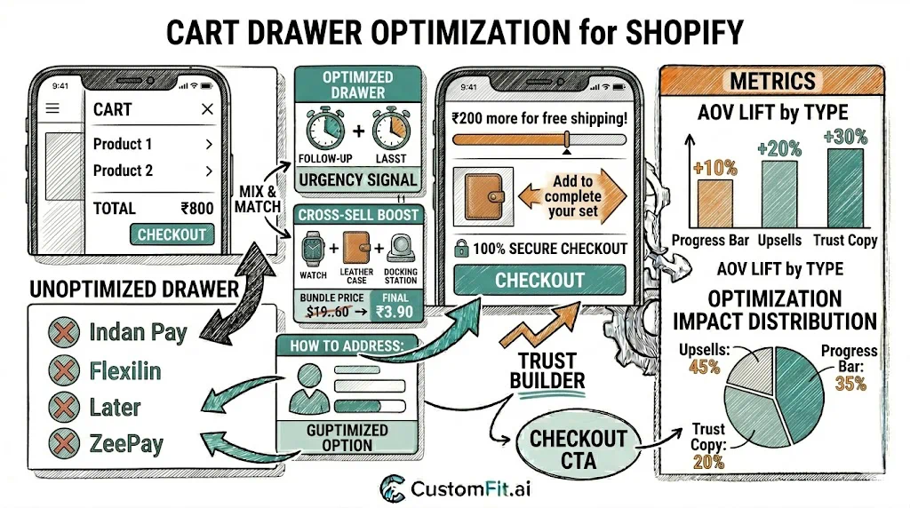
The free-shipping progress bar is consistently the highest-ROI cart drawer element. It shows shoppers how close they are to the free-shipping threshold.
Example messaging progression:
Indian D2C brands using free-shipping thresholds see 8–18% higher AOV when the bar is visible in the cart drawer vs. hidden in the footer. Sugar Cosmetics uses this effectively during festive campaigns to push shoppers from single-item orders to multi-product bundles.
Cart drawers convert upsells better than any other placement because the shopper is already in buying mode.
How to select the right upsell products:
mCaffeine's cart drawer shows exactly one upsell product ("Complete your routine with our Vitamin C Serum") with a simple "Add" button. This approach reportedly contributes to their multi-product order rate.
Upsell copy that works:
Shoppers who open the cart drawer but have not yet clicked "Proceed to Checkout" still have doubts. Address them inline:
Place these as small-font badges or a single line just above the checkout button. They should not visually compete with the CTA — they exist to remove last-second objections.
The checkout button in your cart drawer should be:
Add a secondary "View Full Cart" text link for shoppers who want the detailed cart page view. Do not make this visually equal to the checkout button.
The cart drawer has multiple testable elements:
| Element | Test A | Test B |
|---|---|---|
| Shipping bar | Present | Absent |
| Upsell products | 1 product | 2 products |
| Upsell placement | Above checkout | Below product list |
| CTA copy | "Proceed to Checkout" | "Checkout Securely" |
| Trust copy | Return policy | Secure payment badge |
Run each test for 2+ weeks with clean traffic segmentation. Use CustomFit.ai to test without developer help.
Key metric: Checkout initiation rate (cart drawer open → checkout page). Secondary metric: AOV for orders that passed through the cart drawer.
Several Shopify apps and themes offer cart drawer optimization without custom development:
For testing cart drawer variations without permanent code changes, CustomFit.ai's visual editor works alongside any Shopify theme.
Related reading: