From the conversion glossary
Concepts referenced in this article, defined.
Concepts referenced in this article, defined.
Run rigorous A/B tests and personalize every visit on Shopify or any storefront — no engineers required.
The mini-cart (a slide-out drawer or popup) keeps shoppers on the product page after adding an item. The full cart page redirects them to a dedicated cart view instead. Both formats have their place, but picking the wrong one for your product type and purchase behavior costs you real conversions. There is no single right answer here. You find it by testing against your actual traffic.
A mini-cart appears as a side panel, overlay, or floating widget when a shopper clicks "Add to Cart." It shows:
The shopper never leaves the product page. That is intentional. It keeps the browsing momentum going and lets them continue shopping or accept an upsell before heading to checkout.
A full cart page is a standalone page (typically /cart) that shoppers are redirected to after adding a product. It provides more space for:
The redirect interrupts browsing, but it gives shoppers a clear "pause and review" moment before committing to checkout.
The mini-cart converts better in a few situations.
For single-product, impulse purchases, it usually wins. Brands like mCaffeine (face wash, serum) and Plum (sunscreen, toner) sell products that shoppers decide on quickly. Redirecting them to a full cart page adds an unnecessary pause in the buying momentum, while a mini-cart lets them check out in 2 taps.
It also helps when browse frequency is high. If your average shopper views 4+ products per session (common in beauty, fashion, and supplements), a mini-cart lets them keep adding items without interruption. Every redirect to a full cart page is a potential exit point.
Mobile traffic is another case. On mobile, page loads take time. A mini-cart that opens instantly within the current page loads faster and feels more natural than a full-page redirect.
The same goes for lower-priced products under ₹500. When the purchase risk is low, shoppers do not need the full cart review experience, and a quick confirmation in the mini-cart is enough.
The full cart page converts better in the opposite situations.
For high-consideration, higher-priced products, it tends to win. Products above ₹1,500, such as furniture, electronics accessories, and premium skincare sets, benefit from the full cart page. Shoppers want to review their selection carefully before paying.
Multi-item orders follow the same pattern. When shoppers buy 3 to 5 SKUs, seeing everything laid out on a full page with a clear total feels more trustworthy than a compact drawer.
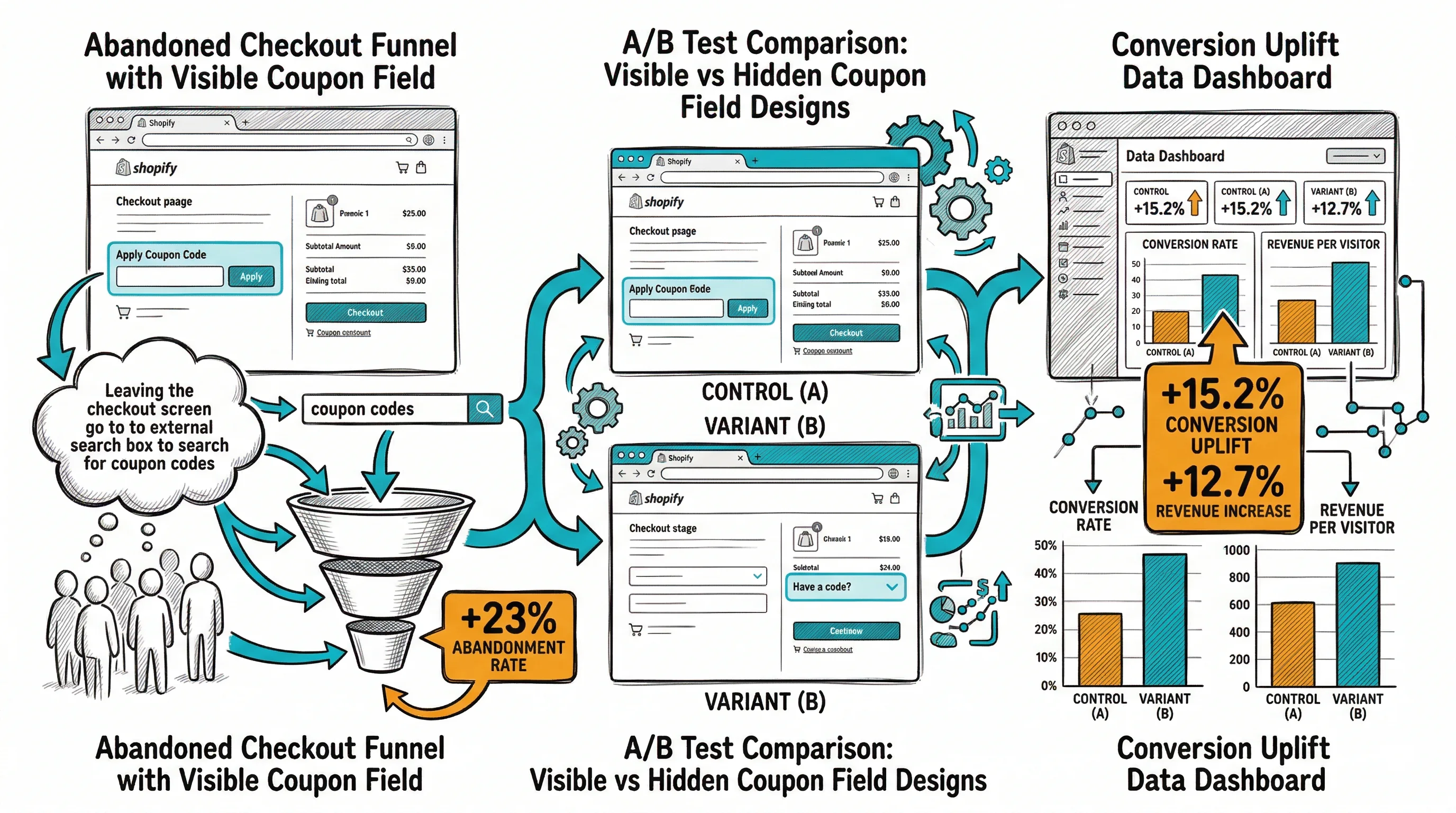
Coupon code use matters here too. The coupon code field converts better when it is prominent on a full cart page. Burying it in a mini-cart drawer leads to lower coupon redemption and more checkout abandonments from shoppers who were searching for a code.
Cross-sell heavy catalogues also fit the full cart page, which provides more space for "Frequently bought together" or "Complete your routine" sections. Kapiva's full cart page showing Ayurvedic supplement pairings reportedly contributed to their 9.48% CVR improvement.
The only definitive answer for your store is a controlled test. Here is how to run one:
With CustomFit.ai, you can test mini-cart vs full cart redirect behavior without touching your Shopify theme code.
Many high-converting Shopify stores use a hybrid:
This hybrid does not force a choice. It routes impulse buyers to checkout fast while giving deliberate shoppers the full review experience they want.
Related reading: