CustomFit.ai — Website personalization, A/B testing and CRO for Shopify and D2C
Product
Features
✱
Website Personalization
Adapt to each visitor's behavior & intent
⧖
A/B & Multivariate Testing
Rigorous experimentation
✨
AI CopilotNEW
Personalize with a prompt
🤖
AI WingmanNEW
Auto-optimize toward winners
🎯
AI Conversion OptimizerNEW
GPT-grade test ideas
✎
No-Code Visual Editor
Drag-and-drop edit any element
▦
Product Recommendations
Personalized recs that lift AOV
⚑
Feature Flags
Ship safely with kill-switches
◧
Chrome Extension
Edit your store in the browser
⧉
Shopify, WooCommerce & more
All platform integrations
View all features →
Use Cases
$
Price A/B Testing
Test price points to maximize revenue
▦
Theme A/B Testing
Compare whole layouts & designs
🗂
Template A/B Testing
Test whole PDP/PLP templates
🏷
Discount A/B Testing
Find the offer that converts
🚚
Shipping A/B Testing
Thresholds, speed & copy
✍
Content A/B Testing
Copy, images & reviews
💳
Checkout Gateway A/B
Payments & one-click
⌖
Geo-Based Personalization
Per-location content & offers
⚡
Buyer-Intent Nudges
Exit-intent & retargeting
↔
Split-URL / Redirection
Full-page redirect tests
View all use cases →
Solutions & Guides
⤢
Conversion Rate Optimization
The complete CRO guide
⧖
A/B Testing Software
Buyer's guide for D2C
🛒
Cart Abandonment Recovery
Win back lost carts
📰
Landing Page Optimization
Convert more paid traffic
S
Shopify A/B Testing
Test your store, no code
S
Shopify Personalization
Tailor the store per shopper
◔
First-Time Visitor Offers
Convert new shoppers with trust & offers
★
Repeat-Customer Experiences
Reward and re-engage loyal buyers
◎
Campaign-Matched Pages
Match the landing page to the ad
⌖
Location-Based Experiences
Currency, language & regional offers
Explore CRO →
Customer stories
GIVA
+32%
conversion via personalized recs
GIVA
Mamaearth
+18%
revenue lift from PDP A/B tests
ME
The Sleep Company
+24%
AOV from product recommendations
TSC
Read customer stories →
Integrations
SWsfGA+15
✦
Not sure where to start?
Let AI Copilot pick your first tests

“We wake up to evidence-backed tests ready to deploy — not a backlog of maybe ideas.”

AN
Anirudh S.
Growth · Chargebee
★★★★★4.8on G2 · 2,400+ brands
Talk to our team →
Widgets
Integrations
Ecommerce & Checkout
Shopify
Shopline
Shoplazza
GoKwik
ShopFlo
Razorpay Magic Checkout
Breeze
Shiprocket
View all integrations →
Analytics & Behavior
Google Analytics 4
Microsoft Clarity
Hotjar
Mixpanel
Amplitude
Heap
Adobe Analytics
Segment (CDP)
View all integrations →
Engagement, CRM & More
Klaviyo
MoEngage
CleverTap
WebEngage
HubSpot
Salesforce
Slack
Meta Ads
View all integrations →
CustomersPricing
Resources
CRO
▤
Playbooks
Proven strategies to boost conversions
🎙
Interviews
D2C leaders & marketing experts
▶
Webinars
Live deep dives & product sessions
Learn
✎
Blog
Tips, experiments & best practices
📕
Free E-Books
Mastering personalization
📖
Conversion Glossary
Every CRO term, defined
✦AI CopilotNEWLog inBook a demo
Start free trial
Select your platform — Install in 2 minsWe'll tailor the setup
⚡ Risk-free 14-day trial · No credit card · Cancel anytime
S
Shopify
Install from Shopify App Store
›
W
WooCommerce
Install the WooCommerce plugin
›
B
BigCommerce
Install from BigCommerce App Marketplace
›
SL
Shopline
Install from Shopline App Store
›
M
Salesforce / Magento
Install from the marketplace
›
SZ
Shoplazza
Install from Shoplazza App Store
›
WP
WordPress / Webflow
Install plugin or paste the script
›
◧
Others
Custom-built on React, Next.js, etc.
›
Tip: pick your platform — we handle the restBook a demo →
Product
Website PersonalizationA/B & Multivariate TestingAI CopilotAI WingmanAI Conversion OptimizerNo-Code Visual EditorProduct RecommendationsFeature FlagsView all features →
Use Cases
Price A/B TestingTheme A/B TestingTemplate A/B TestingDiscount A/B TestingShipping A/B TestingContent A/B TestingCheckout Gateway A/BGeo-Based PersonalizationBuyer-Intent NudgesSplit-URL / Redirection
Solutions & Guides
Conversion Rate OptimizationA/B Testing SoftwareCart Abandonment RecoveryLanding Page OptimizationShopify A/B TestingShopify Personalization
Explore
WidgetsIntegrationsCustomersPricing
Resources
BlogPlaybooksWebinarsInterviewsE-BooksConversion Glossary
Platforms
ShopifyShoplineShoplazzaChrome ExtensionAll integrations
Start free trialBook a demo
Home›Blog›d2c ecommerce›Compare Products Feature for Ecommerce

Compare Products Feature for Ecommerce

SJSapna JoharHead of Growth & CRO, CustomFit.aiJanuary 15, 20257 min read
On this page
  1. When Product Comparison Adds Value
  2. Comparison Table Design
  3. Attribute Selection
  4. Visual Layout
  5. Mobile Comparison UX
  6. How to Surface the Comparison Feature
  7. Comparison Data Quality
  8. A/B Testing Comparison Features
  9. Tips / Best Practices
  10. Key Takeaways
0%
Compare Products Feature for Ecommerce

From the conversion glossary

Concepts referenced in this article, defined.

Definition
What Is Collection Page? Definition & Guide
Definition
What Is Control? Definition, Formula & Guide
Definition
What Is Friction? Definition & Guide
Definition
What Is Variant? Definition, Formula & Guide
← Back to D2c Ecommerce guide
Try CustomFit.ai

Run A/B tests and personalize your store without code. 14-day free trial, no credit card.

Start free trial →
Share
XLinkedInEmail

Related articles

d2c ecommerce

Wishlist Feature: Impact on Conversions & Retargeting

Sapna Johar· 7 min read
d2c ecommerce

User-Generated Content Strategy for D2C

Sapna Johar· 9 min read
d2c ecommerce

Seasonal Demand Planning for Ecommerce

Sapna Johar· 6 min read

Start lifting conversions today.

Run rigorous A/B tests and personalize every visit on Shopify or any storefront — no engineers required.

Start free trialBook a demo

Built for every D2C category

🧴
Skincare
💄
Beauty
🌿
Wellness
☕
F&B
👟
Apparel
💍
Jewelry
🛋️
Home
🍼
Baby
Live · Right now
Mamaearth — free-shipping band +12.4% AOVGIVA — festive collection page +34% revenueBellavita — PDP CTA test +27.4% CVRKapiva — Quiz-driven recs +9.48% CTRThe Sleep Co — landing personalized 2× capturesPlum — Returning shopper swap +18.2% CVRMamaearth — free-shipping band +12.4% AOVGIVA — festive collection page +34% revenueBellavita — PDP CTA test +27.4% CVRKapiva — Quiz-driven recs +9.48% CTRThe Sleep Co — landing personalized 2× capturesPlum — Returning shopper swap +18.2% CVR
Get in touch

Tell us about your store.

We reply within an hour during business hours. No sales pitch, no spam — just answers from someone who's seen 2,400+ D2C stores.

✓ Reply within 1 hour✓ No spam, ever✓ Free demo & setup help
✓ Thanks! We'll be in touch shortly.
CustomFit.ai

The all-in-one website personalization, A/B testing & CRO platform for high-growth D2C brands. Made by marketers, fueled by coffee.

in𝕏◎▶f
Product
  • Features
  • A/B Testing
  • Personalization
  • AI Copilot
  • AI Wingman
  • AI Conversion Optimizer
  • Feature Flags
  • Widgets
  • Integrations
  • ROI Calculator
Platforms
  • Shopify
  • Shopline
  • Shoplazza
  • Salesforce
  • Chrome Extension
  • All Integrations
Resources
  • Blog
  • Playbooks
  • Webinars
  • GrowthFit Interviews
  • Free E-Books
  • Conversion Glossary
  • Case Studies
Compare
  • vs VWO
  • vs Optimizely
  • vs Google Optimize
  • vs Mutiny
  • vs Intelligems
  • vs Shoplift
  • vs AB Tasty
  • vs Convert
  • vs Kameleoon
Company
  • About Us
  • Partners
  • CustomFit Awards
  • Recognition
  • Contact
  • Privacy Policy
  • Terms & Conditions
© 2026 CustomFit.ai · Valley Monks Pvt Ltd · Made by marketers, fueled by coffee, and obsessed with conversions.
SOC 2 Type II · GDPR · CCPA · ISO 27001

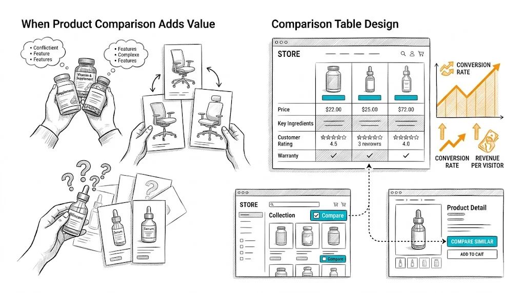
Product comparison is one of the most underutilized conversion tools in ecommerce. When shoppers are deciding between two or three similar products—a common scenario in supplements, skincare, electronics, and furniture—a side-by-side comparison table removes the mental work of holding multiple product pages in memory. For the right categories, adding a comparison feature meaningfully improves conversion rate and reduces post-purchase regret (which drives returns).

When Product Comparison Adds Value

Comparison features earn their place when:

Multiple similar products exist in your catalog: If you sell three different vitamin D supplements—₹399 basic, ₹699 with K2, and ₹999 premium blend—shoppers need to understand the differences before choosing. A comparison table makes this decision straightforward.

Products have meaningful spec differences: Skincare actives (2% salicylic acid vs. 5%), supplement doses (500mg vs. 1000mg), or mattress firmness ratings are meaningful differences that drive the right product match. Comparison tables communicate these differences more clearly than individual product pages.

Purchase stakes are high: Higher-priced products receive more consideration. A ₹4,000 mattress purchase warrants comparison; a ₹199 lip balm does not.

Products are purchased as a system: Skincare brands often have serums, moisturizers, and toners that work together. A comparison feature that shows ingredient compatibility or routine placement adds genuine value.

Comparison features add little value for:

  • Fashion items (fit, style, and aesthetics are personal; specs do not capture what matters)
  • Impulse-buy, low-consideration items
  • Clearly differentiated products where the choice is obvious
  • Brands with very small catalogs (under 10 SKUs)

Comparison Table Design

Attribute Selection

The comparison table's quality is determined by which attributes you include. Principles:

Include decision-driving attributes first. For protein supplements: protein per serving, ingredients, flavor options, serving size, price per serving. For skincare: active ingredients and concentration, skin type suitability, texture, SPF (if applicable), price.

Put price in the table. Price is always a comparison attribute. Show both unit price and value-per-use calculations for consumables (e.g., "₹83 per serving" vs. "₹110 per serving").

Include availability and ratings. In-stock status and star rating with review count should always appear at the top of each product column—they are universal decision factors.

Add differentiation markers. Use check marks, icons, or highlighted cells to show clearly which product wins on each attribute. A bold checkmark under "Contains Vitamin K2" for the relevant product is more scannable than text across all columns.

Limit to 8–12 attributes. A 25-row comparison table is overwhelming. Focus on the attributes that actually differentiate your products and matter to buyers.

Visual Layout

Sticky product headers: As shoppers scroll down a long comparison table, the product names should remain visible in a sticky row at the top. Losing track of which column is which product breaks the comparison experience.

Fixed first column for attribute labels: On desktop, the attribute name column should be sticky as horizontal scroll happens (for wider comparisons). On mobile, horizontal scroll is the primary interaction.

Visual differentiation for best/recommended: Highlight your recommended product (or the "best value" option) with a subtle visual treatment: a colored header, a "Most Popular" badge, or a light background. This merchandising choice drives selection toward the product you want to move.

CTA in each product column: Each product column should have its own "Add to Cart" button below the attribute rows. Do not require shoppers to navigate back to the product page to buy after comparing—friction kills momentum.

Mobile Comparison UX

Mobile comparison tables are inherently challenging—wide tables on narrow screens create horizontal scroll that feels awkward. Options:

Swipe between products: Show one product at a time with left/right swipe gestures. The attributes are fixed on the left; the product values update as you swipe. This is the best mobile pattern but requires more development investment.

Horizontal scroll with sticky attributes: Attributes in the first column remain fixed; products columns scroll horizontally. Standard approach, acceptable on mobile but not as smooth as swipe-based.

Comparison link to dedicated page: From the collection page, a "Compare" button leads to a dedicated comparison page that is mobile-optimized. This separates the comparison UX from the collection page complexity.

How to Surface the Comparison Feature

The comparison feature only creates value if shoppers use it. Placement and discovery matter:

Checkboxes on collection pages: Adding a "Compare" checkbox to each product card on the collection page is the most standard approach. Shoppers check 2–4 products and click a "Compare Selected" button to open the comparison view.

"Compare with similar products" link on product pages: On the product page, a link like "Compare [Product Name] with alternatives" surfaces the comparison for shoppers who have already committed to evaluating this product.

Recommendation widget comparison: If your site shows "Customers also considered" or "Similar products" on the product page, add a "Compare" action to those suggested products.

Search results comparison: For searches that return multiple very similar products, a comparison prompt is natural: "Showing 4 [category] options — compare them."

Comparison Data Quality

A comparison feature is only as good as the data behind it. Requirements:

  • All comparable products must have consistent attributes filled in (no blanks or "N/A" in decision-critical fields)
  • Attribute data must be accurate—wrong dosage or ingredient information drives returns and support tickets
  • Product images in comparison must be consistently sized and cropped
  • Price must reflect current pricing (including active discounts)

Build a data maintenance process: when adding new products or changing prices, update all comparison-relevant attributes simultaneously.

A/B Testing Comparison Features

If you are deciding whether to add a comparison feature, test it:

  • Control: Collection page and product pages without comparison
  • Variant: Collection page with comparison checkboxes; comparison page enabled

Measure: comparison feature usage rate, time-to-add-to-cart for comparison users vs. non-users, conversion rate and return rate.

CustomFit.ai makes setting up this kind of feature toggle test straightforward for Shopify stores without developer involvement.

Tips / Best Practices

  • Start with your top 2–3 high-consideration categories when rolling out comparison. Do not enable it across your entire catalog—focus where it adds most value.
  • Show a "Why we recommend [Product X]" editorial note in the comparison table. A concise 1–2 sentence recommendation within the table increases add-to-cart rate by giving shoppers a confident choice signal.
  • Track comparison funnel analytics: How many shoppers start a comparison? How many complete it? How many add to cart from the comparison page? Each drop-off point reveals optimization opportunities.
  • Keep the comparison table visually clean. Overloading with icons, colors, and callouts turns a clarity tool into visual chaos.
  • Link comparison pages internally. Comparison pages ("Vitamin C Serum vs. Niacinamide Serum") have strong SEO potential—shoppers search for these comparisons. Optimize them for organic search.

Key Takeaways

  • Product comparison features drive conversion for high-consideration, specification-heavy categories; they add little value for fashion, impulse, or simple-choice categories.
  • Effective comparison tables include the 8–12 decision-driving attributes, price, ratings, availability, and a direct add-to-cart button in each column.
  • Mobile comparison requires a dedicated UX approach—either swipe-between-products or horizontal scroll with sticky attributes.
  • Comparison feature discovery depends on clear collection page checkboxes and "compare" prompts on product pages.
  • Comparison page content (e.g., "Vitamin C Serum vs. Niacinamide") has strong organic search potential—optimize these pages for relevant comparison queries.

Related reading: Conversion Rate Optimization | Product Page | Cart Abandonment | A/B Testing | Wishlist Feature

See also: D2C & Ecommerce Growth Pillar