From the conversion glossary
Concepts referenced in this article, defined.
Concepts referenced in this article, defined.
Run rigorous A/B tests and personalize every visit on Shopify or any storefront — no engineers required.
The footer sits at the bottom of every page on your ecommerce site, which means it gets seen—but it's rarely treated with the same optimization attention as the header or product pages. Done right, a footer reinforces trust, captures leads, surfaces critical navigation, and adds SEO value. Done poorly, it's a wall of links that nobody reads. This guide covers how to design a footer that works for your business goals.
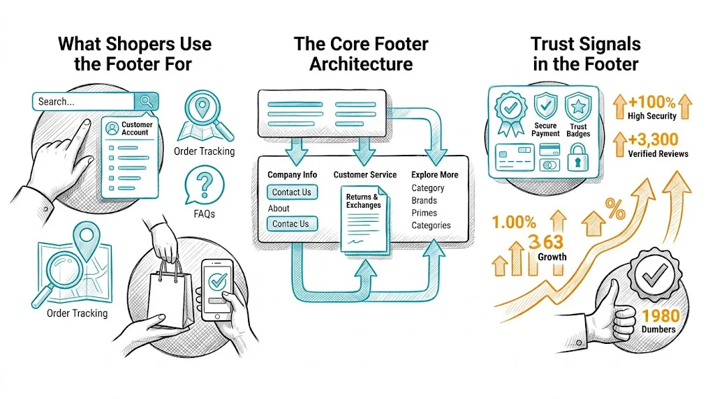
Understanding footer intent helps you design it correctly. Shoppers who scroll to the footer are typically:
Looking for policy information: Return policy, shipping policy, terms and conditions, privacy policy. These are high-trust, high-stakes pages—shoppers checking these are often close to buying or post-purchase.
Seeking contact information: Email, phone, WhatsApp number. A shopper who cannot find contact info in the footer feels less secure about buying.
Looking for brand information: About us, founder story, sustainability commitments. These are trust-building pages that convert browsers into believers.
Finding account links: Order tracking, login, loyalty program. Returning customers specifically look here.
Checking social proof and certifications: Payment method logos, security badges, industry certifications.
Design your footer around these five use cases, not around everything you want to communicate.
Most ecommerce footers use 3–4 columns on desktop:
Column 1: Help & Policies
Column 2: Company
Column 3: Quick Links / Products
Column 4: Connect
Below the columns: Legal strip with copyright, registered address (required for Indian ecommerce companies under Consumer Protection rules), GST number (if B2B relevant), and payment method logos.
The footer is where trust signals live for shoppers who need reassurance:
Payment method logos: Visa, Mastercard, UPI, Paytm, Razorpay. These reassure shoppers that their preferred payment method is accepted. Position these just above the copyright strip.
Security badges: SSL certificate badge, "100% Secure Payments" label. Specific to checkout pages but reinforced in the footer.
Certifications: FSSAI (food brands), ISO, AYUSH, dermatologist-tested badges. Category-relevant certifications shown in the footer build brand credibility for health, food, and beauty brands.
Awards and press mentions: "Featured in Shark Tank India," "Forbes 30 Under 30." These social proof signals work even in the footer.
Customer service availability: "Support available Mon–Sat, 10am–7pm" with WhatsApp/email sets expectations and builds trust.
The footer is a secondary lead capture point for visitors who scroll all the way down—a strong engagement signal:
Email capture: Simple form with one field (email) and a benefit-focused CTA. "Get 10% off your first order" outperforms generic "Subscribe to our newsletter."
WhatsApp signup: Increasingly popular for Indian brands. "Get exclusive offers on WhatsApp — Enter your mobile number." A WhatsApp list is often more valuable than an email list for Indian D2C brands due to higher open rates (70–80% vs. 20–30%).
Placement: A newsletter/WhatsApp signup section above the footer columns—treated as a footer call-to-action block rather than a small form inside a column.
Footer links help search engines discover and understand your site architecture, but they carry less weight than in-content links. Principles:
For Indian D2C brands, linking to your top 5–6 category pages from the footer is both user-friendly (helps returning customers navigate) and SEO-positive (passes link equity to category pages).
Mobile shoppers rarely scroll to the footer—mobile UX research shows footer engagement is 5–10x lower on mobile than desktop. Implications:
Keep it compact. Collapse footer columns into accordion sections that expand on tap. Show only "Help & Policies" expanded by default (the most-used section).
Make contact accessible. Phone number and WhatsApp link should be tappable with one click—no need to copy-paste. Use <a href="tel:+91XXXXXXXXXX"> for phone and <a href="https://wa.me/91XXXXXXXXXX"> for WhatsApp.
Sticky contact button. For mobile, consider a persistent "Chat with us" or "WhatsApp" button floating at the bottom of the screen rather than relying on footer contact—it is more accessible and driven by the same intent.
Payment logos: Even on mobile, payment logos in the footer provide reassurance. Keep them visible without requiring tap to expand.
Too many links: A footer with 60+ links is a navigation disaster. Be ruthless about what earns a footer link.
Missing contact information: An email address or WhatsApp number must be in the footer. Shoppers who cannot find contact info bounce.
Outdated information: A footer that still says "Copyright 2022" or shows a discontinued product category erodes trust.
Broken links: Footer links often go stale after site restructuring. Audit footer links every quarter with a link checker.
Inaccessible footer: Footer text that is 10px and light gray on white fails accessibility standards and is genuinely hard to read. Use 12–13px minimum with sufficient contrast.
Pop-up over footer: Never trigger a pop-up when a user scrolls to the footer. They reached the footer because they were looking for something—interrupting that journey is counterproductive.
Footer changes worth testing with CustomFit.ai:
Footer A/B tests have smaller impact than product page or checkout tests because footer engagement is lower—but they are easy to implement and can drive meaningful list growth.
Related reading: Conversion Rate Optimization | Cart Abandonment | A/B Testing | Ecommerce Header Design | Ecommerce Breadcrumb Navigation
See also: D2C & Ecommerce Growth Pillar | CRO Pillar