From the conversion glossary
Concepts referenced in this article, defined.
Concepts referenced in this article, defined.
Run rigorous A/B tests and personalize every visit on Shopify or any storefront — no engineers required.
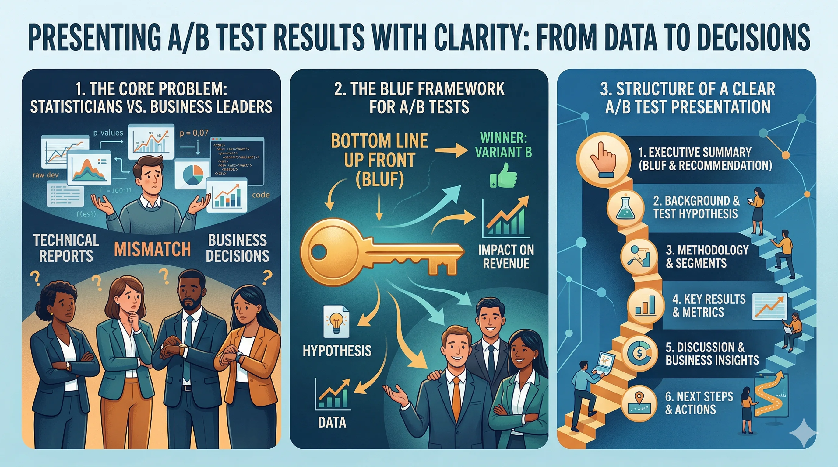
You ran a rigorous A/B test. The results are in. Now you need to turn statistical output into a business decision — and you have 15 minutes in a leadership meeting with people who don't know what a p-value is. This is where many experimentation programs lose momentum: the tests are run well, but the results are presented in a way that doesn't drive action. This guide covers how to present A/B test results clearly, build stakeholder confidence in your experimentation program, and turn data into decisions.
Most A/B test presentations fail because they're structured for statistical credibility rather than business clarity. The presenter leads with methodology, then hypothesis, then data tables, then cautiously arrives at a conclusion buried in caveats. By the time the insight lands, the stakeholder has already disengaged.
Business leaders need to know:
Structure your presentation around these four questions, in this order.
BLUF: Bottom Line Up Front. Start with the conclusion, then the evidence. This is how executives and decision-makers prefer to consume information.
Template:
"We tested [what] on [page/element], targeting [audience/traffic split]. The result: [winning variant] increased [primary metric] by [X%], which translates to [₹ or unit impact per month]. We recommend implementing [variant] immediately. Here's the supporting data."
This opening in 30 seconds covers everything a stakeholder needs. The rest of the presentation is supporting evidence for the decision, not a suspense-building narrative.
Start with why this test existed, connected to a business goal:
"We were seeing 68% cart abandonment on our checkout page. Our hypothesis: adding a 'Free returns within 30 days' trust badge near the payment button would reduce hesitation and lower abandonment."
Frame the test in terms of a problem the stakeholder cares about — abandonment rate, revenue per session, conversion rate — not in terms of a design or UX change.
Show the control and the variant side by side. A screenshot comparison is worth 10 slides of description. Keep it simple: "This was the control. This was the variant. The only change was X."
If you changed multiple elements, acknowledge it: "We changed the button color and the CTA copy together. This was a multivariate test — we can isolate individual effects in the next round."
Lead with the business metric, not the statistical one.
Bad: "The variant showed a conversion rate of 3.84% vs. the control's 3.38%, with a p-value of 0.032 at 95% confidence."
Good: "Checkout conversions improved by 14%. At our current traffic levels, that's approximately 200 additional completed orders per month — or ₹1.8 lakh in additional monthly revenue."
Give stakeholders a number they can anchor on. The percentage improvement is useful, but the ₹ or unit impact is what drives decisions.
You need to include statistical validity, but you don't need to teach statistics:
"We ran the test for 3 weeks with 8,400 visitors per variant. The result is 96% statistically significant — meaning there's only a 4% chance we're seeing random variation rather than a real effect."
If the result isn't statistically significant, say so clearly: "The test ran for 2 weeks but didn't reach significance. We need 2 more weeks of data or a larger traffic allocation before we can conclude anything."
For tests with large traffic volumes, show whether the result held across key segments:
Segment breakdowns that show the effect is consistent increase stakeholder confidence. Segment breakdowns that show heterogeneity (worked for mobile, didn't for desktop) give you the next hypothesis.
Close every A/B test presentation with two things:
What we learned: "This confirms that return policy information is a meaningful hesitation point at checkout. It also suggests that our buyers' price sensitivity is lower than we assumed — the trust badge mattered more than another discount."
What we do next: "We're implementing the winning variant this week. We're also testing a 'Chat with us' option at checkout to address the 12% of sessions where buyers still exit after seeing the badge."
This structure — learning + next hypothesis — signals that your experimentation program is a continuous learning system, not a one-off project.
Null results are not failures. They're information. Every failed hypothesis eliminates a direction and tightens the search for what actually works.
How to frame it:
"Our hypothesis was that a red CTA button would outperform the current blue. After 4 weeks and 22,000 sessions, we found no statistically significant difference. The button color is not the constraint here — our next hypothesis is that the CTA copy is the issue, specifically 'Proceed to Checkout' vs. 'Complete my Order.'"
What not to say: "The test didn't work." What to say: "The button color doesn't matter — now we know where to look instead."
Experimentation teams that present null results confidently, with a clear next hypothesis, build far more stakeholder trust than teams that present only wins. Leaders who only see winning tests eventually realize they're not seeing the full picture.
Good visualizations make results undeniable and memorable:
Conversion rate bar chart: Simple before/after comparison. Control CVR vs. Variant CVR. Include the % uplift as a label.
Revenue impact calculator: A simple table showing: Current daily orders × uplift = additional orders per day × AOV = additional daily revenue × 30 = monthly revenue impact.
Timeline chart: Show how the metrics evolved over the test period. This helps stakeholders see that you didn't stop the test prematurely (a common concern) and that the trend was stable.
Segment heatmap (for complex results): A grid showing the effect size across key dimensions (device × traffic source, or new vs. returning × geo) helps identify whether the winning variant works universally or only for specific segments.
Avoid: raw data tables with 15 columns of numbers. If a stakeholder needs a data table, include it in the appendix.
Single A/B test presentations are less important than building a pattern of credibility across many tests. Here's how to do that:
Maintain a public test log: A shared document (or a tool like CustomFit.ai's test history) where anyone can see what's been tested, what won, what didn't, and what was implemented. Transparency builds trust.
Track implementation rate: What percentage of winning tests actually get implemented? A high win rate with low implementation signals that the CRO team is running tests but not driving change. Track this metric and present it to leadership.
Show compounding impact: After 6 months, sum the cumulative revenue impact of all implemented winners. "Our 8 implemented tests from Q3 are generating an estimated ₹12 lakh per month in additional revenue." This is the number that secures budget and team headcount.
Credit the hypothesis chain: "This winning test was inspired by the null result we got in August — we learned X and tested Y, which won." This narrative of connected learning is what turns a testing program into an experimentation culture.
Related reading: Experimentation Culture Pillar | A/B Testing Pillar | Testing Velocity: How Many Tests Should You Run? | Statistical Significance | A/B Testing