From the conversion glossary
Concepts referenced in this article, defined.
Concepts referenced in this article, defined.
Run rigorous A/B tests and personalize every visit on Shopify or any storefront — no engineers required.
India is a mobile-first ecommerce nation. Over 65% of D2C store visits happen on smartphones — and in Tier 2 and Tier 3 cities, that number approaches 85–90%. Yet most A/B testing programs treat mobile and desktop as the same experience, running identical tests on both devices and averaging results that obscure critical mobile-specific insights. These 20 mobile-only A/B test ideas address the specific constraints, behaviours, and opportunities of India's mobile-first shopper.
Mobile shoppers have different thumbs, different attention spans, different network speeds, and different payment preferences than desktop shoppers. A desktop test winner may actually hurt mobile conversion — and vice versa. Running mobile-only tests and segmenting all results by device is the foundation of mature ecommerce CRO.
The conversion rate gap between mobile and desktop is the largest untapped optimisation opportunity for most D2C brands. Industry data shows mobile CVR averaging 1.5–2%, vs. 3–4% on desktop. Closing even half that gap on a mobile-heavy traffic mix generates enormous revenue.
Variant A: Standard hamburger menu (≡) in the top corner Variant B: Fixed bottom navigation bar with 4–5 tabs: Home | Shop | Search | Cart | Account
Bottom tabs are thumb-friendly and permanently visible. Hamburger menus require an extra tap and hide all navigation until opened. Bottom tabs typically increase category exploration by 15–25% on mobile.
Expected lift: 15–25% mobile navigation interaction rate.
Variant A: Search icon that expands on tap Variant B: Always-visible, full-width search bar directly below the navigation header
Search users convert at 3–5x the rate of browsers. Making search permanently visible and full-width removes the discovery barrier for high-intent visitors who know what they want.
Expected lift: 20–35% mobile search usage rate.
Variant A: Category list in hamburger menu or static grid Variant B: Horizontally swipeable category chips/pills below the navigation on the homepage and category pages
Swipeable category pills allow thumb-accessible, one-handed navigation through your product range without opening a menu or scrolling vertically. Particularly effective for stores with 5–15 product categories.
Expected lift: 10–18% mobile category click-through rate.
Variant A: Filters accessible via "Filter & Sort" button that opens a drawer Variant B: Horizontally scrollable filter chips pinned near the top of the collection page, always visible
Sticky horizontal filter chips reduce the number of taps required to apply a filter and keep filtering options visible as the shopper scrolls through products.
Expected lift: 8–15% filter usage rate on mobile.
Variant A: "Add to Cart" button only at its fixed position on the product page Variant B: A sticky bar at the bottom of the screen showing product name, price, and "Add to Cart" button — always visible as user scrolls
This is the single highest-impact mobile product page test. Mobile users scroll extensively on product pages. A sticky CTA bar ensures the action is always one tap away.
Expected lift: 8–15% mobile add-to-cart rate.
Variant A: Image gallery advances with tap arrows Variant B: Image gallery advances with natural swipe gesture
Native swipe behaviour is intuitive for mobile users and requires less conscious effort. Swipeable galleries see 30–50% higher image engagement rates than tap-to-advance galleries.
Expected lift: 30–50% image gallery engagement; 5–8% add-to-cart rate improvement for categories where image review affects purchase.
Variant A: Full product description visible by default (requires scrolling) Variant B: First 3 lines of description visible; "Read More" expands the rest
"Read More" on mobile reduces the scroll distance between the product images and the "Add to Cart" button — keeping the CTA closer to the top of the page. For low-consideration products, this lifts add-to-cart rates.
Expected lift: 4–10% add-to-cart rate improvement for products where full description is not required for decision-making.
Variant A: Static image as first gallery item Variant B: Short product video that autoplays muted when the product page loads
Autoplay muted video in the hero gallery draws attention and demonstrates product benefits without requiring user interaction. It works particularly well for wearables, food products, and demonstrations of product transformation.
Expected lift: 5–12% product page engagement (scroll depth, time-on-page) and 3–8% add-to-cart rate.
Variant A: Colour/size/flavour variant selected via dropdown Variant B: Horizontal swipeable chip selector with visual swatches
Swipeable chip selectors are more thumb-accessible than dropdown menus on mobile. They also allow visual preview of each variant (colour swatch, size label) without requiring a tap to open and close.
Expected lift: 5–10% variant selection completion rate; lower abandon rate at the variant selection step.
Variant A: Full review cards visible (large, require scrolling past) Variant B: Compact mobile review format — star rating + 2 lines of review text + "See All Reviews" link
Compact review display on mobile shows more reviews in less screen space, giving the visitor a sense of volume and variety without requiring excessive scrolling.
Expected lift: 3–7% product page review engagement rate.
Variant A: UPI payment via UPI ID text field Variant B: UPI payment via scannable QR code (displayed alongside UPI ID field)
A QR code displayed on mobile is scannable from another phone or from a UPI app switch — relevant for customers who prefer using a second device for payment authentication or who find QR more intuitive.
Best for: Desktop checkout. On mobile itself, UPI app switching is typically faster than QR — test the native app switch flow.
Variant A: Standard button width at checkout (80% screen width) Variant B: Full-width "Place Order" button at checkout (100% screen width)
Full-width buttons at checkout are harder to miss and require less aim precision on small screens. They also feel more decisive and final — which can help or hurt depending on whether the visitor has fully committed.
Expected lift: 3–7% checkout completion rate.
Variant A: OTP entry requires manual digit input Variant B: OTP auto-fills from SMS (using SMS OTP API) — customer only needs to confirm
Automatic OTP fill is a significant checkout friction reducer in India where SMS OTP is the standard authentication method. Eliminating the manual copy-paste step reduces checkout abandonment meaningfully.
Expected lift: 8–15% mobile checkout completion rate at the authentication step.
Variant A: Email order confirmation only Variant B: "Get updates on WhatsApp" single checkbox at checkout (pre-checked)
WhatsApp order confirmations have 5–8x higher open rates than email in India. Customers who receive WhatsApp updates are 20–30% more likely to repeat purchase. The opt-in at checkout has minimal friction impact while providing significant post-purchase value.
Expected lift: Minimal checkout friction impact; 20–30% repeat purchase rate improvement for WhatsApp-opted subscribers.
Variant A: Shipping options listed as "Standard: ₹0 | Express: ₹99" Variant B: Shipping options listed as "Free by [Date] | Express by [Sooner Date] — ₹99"
Date-based shipping display is more actionable than cost-based display. A customer choosing between "Free" and "Express" is making a cost decision. A customer choosing between "[Date]" and "[Sooner Date]" is making a timing decision — which is often more relevant to their actual need.
Expected lift: 5–10% express shipping upgrade rate; improved checkout completion for time-sensitive buyers.
Variant A: High-resolution product images (standard compression) Variant B: WebP format with aggressive compression (smaller file, similar visual quality)
Each 1-second improvement in mobile page load time increases CVR by 2–5%. Image size is the primary contributor to slow mobile page loads. Testing WebP compression vs. standard JPEG is a technical test with direct revenue impact.
Expected lift: 2–5% CVR per second of load time saved; test on 3G/4G simulated connections.
Variant A: All product page images load immediately on page load Variant B: Images below the fold load only when the user scrolls to them (lazy loading)
Lazy loading reduces initial page load time significantly, which improves mobile CVR for users on slower connections. The trade-off is a momentary blank image as the user scrolls — test whether this affects engagement negatively for your audience.
Variant A: Standard form layout (labels above fields) Variant B: Floating label form (labels inside fields that move up when focused)
Floating label forms save vertical space on mobile, reducing form length and improving the overall checkout height on small screens. They're increasingly the mobile-standard for form design.
Expected lift: 3–7% form completion rate on mobile.
Variant A: Clicking "Select Size" opens a full-screen overlay Variant B: Clicking "Select Size" opens a bottom sheet (slides up from the bottom, showing the option within context of the page)
Bottom sheets are more native to mobile UX and require less context switching than full-screen overlays. For variant selection that requires minimal comparison, bottom sheets reduce friction.
Expected lift: 4–8% variant selection completion rate.
Variant A: Key CTA buttons at the top of the mobile screen (standard desktop convention) Variant B: Key CTA buttons in the bottom 40% of the mobile screen (natural thumb reach zone)
The "thumb zone" on mobile is the bottom-centre of the screen — easily reachable with one hand. Positioning CTAs and interactive elements within the thumb zone reduces reach effort and tap errors.
Expected lift: 5–10% click accuracy and task completion rate for thumb-zone positioned elements.
| Test | Impact | Effort | Priority |
|---|---|---|---|
| Sticky Add to Cart bar | High | Low | 1 |
| Bottom tab navigation | High | Medium | 1 |
| Full-width search bar | High | Low | 1 |
| OTP auto-fill at checkout | High | Medium | 2 |
| Swipeable image gallery | Medium | Low | 2 |
| WebP image compression | High | Technical | 2 |
| Swipeable category chips | Medium | Low | 3 |
| WhatsApp checkout opt-in | Medium | Low | 2 |
Run all tests with mobile-only traffic segments. Desktop visitors behave differently. A mobile test run on mixed traffic produces diluted results that may not reflect what's actually happening on mobile.
Test across device sizes. A test that works on a 6.5" screen (standard for mid-range Android) may fail on a 5.5" screen (still common in Tier 2/3 cities). Test across the screen size distribution of your actual traffic.
Prioritise network performance tests alongside UX tests. In cities like Jaipur, Patna, and Bhopal, 4G speeds are slower than metros. A 2-second load time improvement from image compression can lift CVR by 4–10% for these audience segments.
Check statistical significance with mobile-only sample size. Running mobile-only tests reduces the traffic pool available. Tests may need 14–21 days to reach significance. Plan your test calendar accordingly.
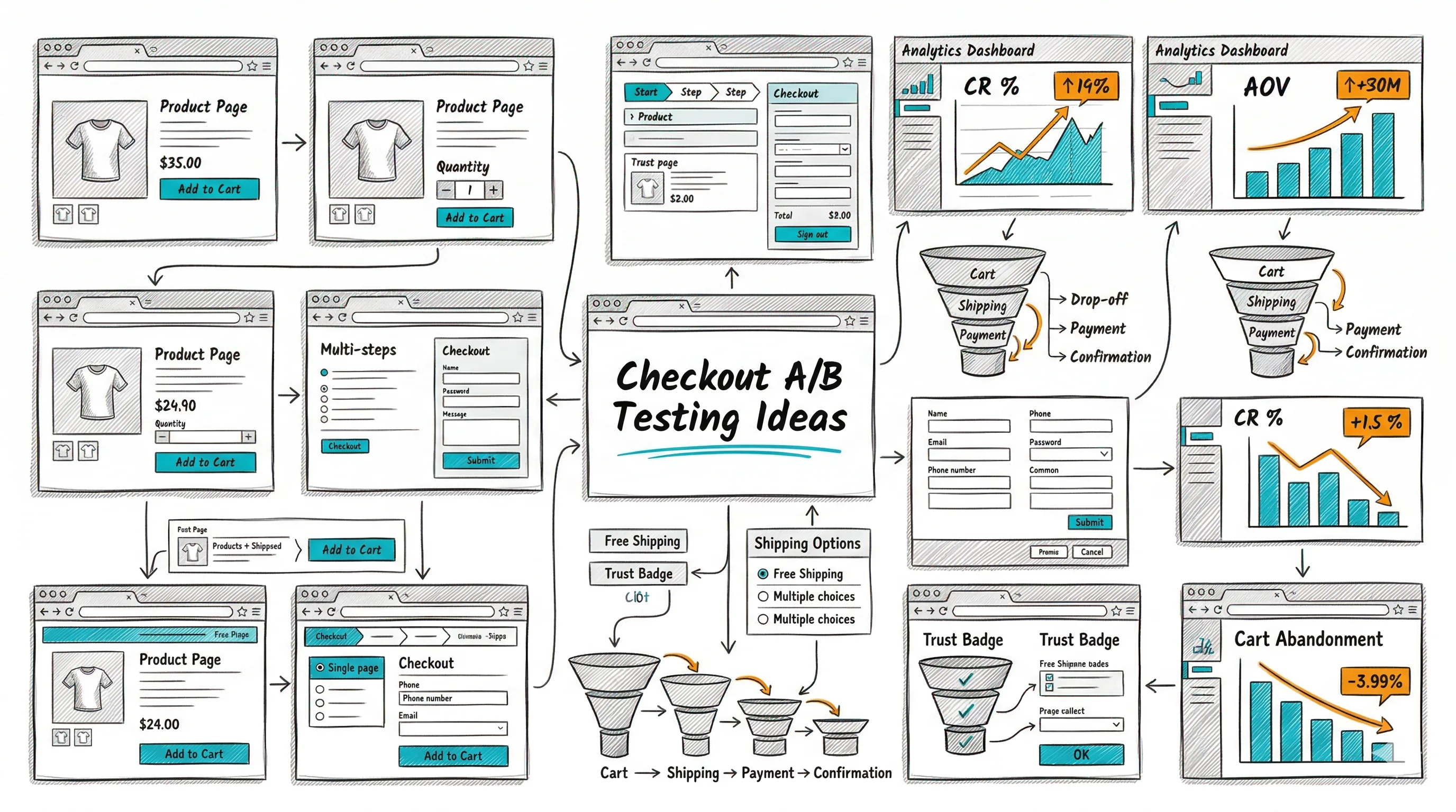
Related: checkout A/B testing ideas and CTA button A/B testing ideas for the full mobile conversion optimisation picture.