From the conversion glossary
Concepts referenced in this article, defined.
Concepts referenced in this article, defined.
Run rigorous A/B tests and personalize every visit on Shopify or any storefront — no engineers required.
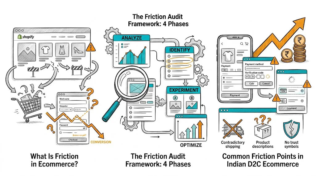
A friction audit is a systematic investigation of your ecommerce store that identifies every point where visitors experience resistance, confusion, or hesitation that prevents them from completing a purchase. Most ecommerce stores have 5–15 significant friction points that collectively suppress conversion by 30–60% below their potential. A friction audit finds these points with evidence, not guesswork, enabling you to prioritize the CRO experiments most likely to move revenue. Brands that complete comprehensive friction audits and act on the findings typically see 15–30% CVR improvements within 60 days.
Friction is anything that makes it harder for a visitor to complete a desired action. It comes in three forms:
Cognitive friction: Too much information, confusing copy, unclear value proposition, decision overload. The buyer has to think too hard.
Emotional friction: Doubt, distrust, risk perception, fear of making the wrong choice. The buyer feels uncertain.
Mechanical friction: Too many clicks, required account creation, long forms, slow page speed, broken features. The buyer encounters technical barriers.
The most damaging friction is invisible — buyers who experience it simply leave without explaining why. A friction audit makes the invisible visible by combining behavioral data with qualitative signals.
Start with numbers. Quantitative data tells you where friction exists; qualitative data tells you why.
Funnel analysis:
In Google Analytics 4 or Shopify Analytics, build a conversion funnel with these steps:
Calculate drop-off rate at each step. The step with the highest absolute drop-off (not just the highest percentage) is your primary friction priority.
Benchmark drop-off rates for Indian D2C ecommerce:
| Step | Typical Drop-off |
|---|---|
| Landing → Product page | 60–70% |
| Product page → Add to cart | 85–92% |
| Add to cart → Checkout | 50–65% |
| Checkout → Information | 15–25% |
| Information → Payment | 10–20% |
| Payment → Confirmation | 5–12% |
Any step with drop-off significantly higher than these benchmarks is a priority friction point.
Device segmentation: Segment funnel data by device (mobile vs. desktop). Mobile drop-off rates are typically 30–50% higher than desktop. High mobile-specific drop-off at a specific step points to a mobile UX friction issue.
Traffic source segmentation: Different traffic sources (paid, organic, email, direct) have different conversion rates. A specific source with unusually low conversion may indicate a messaging mismatch, not a site problem.
Exit page analysis: Which pages have the highest exit rates? High exits on the product page suggest above-fold content issues. High exits on the cart page suggest price/shipping friction. High exits on the payment page suggest payment method or trust issues.
Session recordings show you what visitors actually do — where they click, how far they scroll, where they hesitate, and what they see before they leave.
Tools: Hotjar, Microsoft Clarity (free), FullStory, Mouseflow
Recording review process:
Watch 20–30 recordings of visitors who:
For each group, answer:
Heatmap analysis:
Common session recording findings for Indian D2C stores:
On-site surveys:
Exit intent surveys ("Before you go — what stopped you from buying today?") and post-purchase surveys ("What almost stopped you from completing your purchase?") are the highest-quality qualitative data sources.
Deploy exit surveys on:
Use a 1-question survey with open-ended response:
Collect 50–100 responses before analyzing. Cluster responses into categories to find the most common friction themes.
User testing:
Ask 3–5 people representing your target buyer to complete a purchase on your store while thinking out loud (moderated) or recorded (unmoderated via UserTesting, Maze, or simply Zoom with screen share).
This reveals friction that neither analytics nor surveys can surface — the moment of confusion, the unspoken hesitation, the "I don't understand what this means" on your product page.
Customer support log analysis:
Review the last 50–100 customer service tickets. The most common pre-purchase questions reveal the information gaps in your product pages. Common patterns in Indian D2C:
Each frequently asked question represents a friction point that, once answered on the product page, reduces abandonment.
With all data collected, rank your friction points by:
Impact: How many visitors experience this friction? (Steps with highest traffic volume × highest drop-off rate = highest impact)
Severity: How much does this friction suppress conversion? (A friction point that blocks 100% of affected visitors is more severe than one that delays 20%)
Fixability: How easy is it to fix? (Copy changes and CTA movement are easier than checkout flow redesigns)
Create a friction audit prioritization table:
| Friction Point | Traffic Volume Affected | Drop-off Contribution | Fix Complexity | Priority Score |
|---|---|---|---|---|
| Mobile add-to-cart button not thumb-accessible | High | High | Low | 1 |
| Shipping cost only revealed at checkout | High | High | Low | 1 |
| Return policy not visible above fold | High | Medium | Low | 2 |
| No COD indicator on product page | Medium | High | Low | 2 |
| Product description too technical / no plain language | Medium | Medium | Medium | 3 |
The highest-priority friction points become your first A/B test agenda.
Based on friction audits across Shopify stores selling in India, these are the most common findings:
1. Shipping cost revealed late. 68% of cart abandonment in India is attributable to shipping surprise at checkout. Fix: Surface shipping cost on product page and cart page.
2. COD uncertainty. Buyers in Tier 2/3 cities will not add to cart if they are not sure COD is available. Fix: Show "COD available in [X] cities" on product page.
3. Payment method gap. Absence of preferred UPI method (Google Pay, PhonePe) reduces conversion 8–12% for orders under ₹1,000. Fix: Add UPI as a prominent checkout option.
4. No above-fold return policy. Buyers do not scroll to the footer to find return information. Fix: Add return guarantee badge above the add-to-cart button.
5. Product description in marketing language. "Clinically proven, dermatologically tested" without specifics creates skepticism. Fix: Add specific, verifiable claims with plain-language explanations.
6. Mobile CTA below the fold. On many Shopify themes, the add-to-cart button is not visible on mobile without scrolling. Fix: Implement sticky CTA bar.
7. Required account creation. The single-biggest checkout friction for first-time buyers. Fix: Offer guest checkout prominently.
Each friction finding becomes a test hypothesis:
Finding: 80% of mobile users who add to cart abandon at the payment page. Hypothesis: Payment method uncertainty (COD not visible until too late) is causing abandonment. Test: Variant A (control: payment methods revealed at checkout) vs. Variant B (COD + UPI prominently displayed on product page and cart page) Metric: Mobile checkout completion rate
Finding: Exit survey responses most commonly mention "didn't see if returns were easy." Hypothesis: Moving the return guarantee above the fold will reduce decision hesitation. Test: Variant A (return policy in footer) vs. Variant B (return guarantee badge above add-to-cart) Metric: Add-to-cart rate, CVR
Related reading: