From the conversion glossary
Concepts referenced in this article, defined.
Concepts referenced in this article, defined.
Run rigorous A/B tests and personalize every visit on Shopify or any storefront — no engineers required.
Tree testing shows you whether your store's navigation structure makes sense to your customers — without the distraction of visual design. Participants are given your menu hierarchy as plain text and asked to find specific products. Where they go wrong reveals exactly which category labels are confusing and which levels of navigation are too deep. Fix these, and you remove one of the most invisible conversion killers in ecommerce.
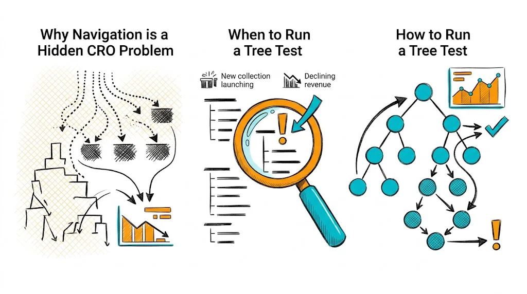
Most CRO work focuses on product pages and checkout. But a visitor who can't find the right product never reaches those stages. Navigation friction is invisible in conversion data because it shows up as high bounce rates and low pages-per-session — metrics that get attributed to traffic quality rather than site structure.
For D2C brands with growing product catalogs, navigation complexity grows silently. What started as five categories becomes fifteen, with subcategories that made sense to the founding team but confuse a first-time visitor. Tree testing puts a number on that confusion.
Key metrics from tree testing:
A task success rate below 70% on a critical product category means your navigation is likely costing you sales every day.
See also: User Experience glossary | Conversion Path glossary | Bounce Rate glossary
Run tree testing when:
Don't run tree testing in isolation. Pair it with card sorting (to build structure) and first-click testing (to validate visual navigation, not just the information architecture).
Translate your site navigation into a hierarchical text list. Include every level — main categories, subcategories, and any tertiary levels. Don't include visual elements, images, or filters. The whole point is to test the labels and hierarchy without design cues.
Example tree for a wellness D2C brand:
Shop
  Supplements
    Immunity
    Gut Health
    Sleep & Stress
    Women's Health
    Men's Health
  Hair Care
    Shampoos
    Oils
    Masks & Treatments
  Skin Care
    Moisturizers
    Serums
    Sunscreens
    Cleansers
Bundles
  Health Bundles
  Gifting
New Arrivals
Sale
Tasks should be realistic user goals, written as scenarios — not instructions. Each task has one correct answer.
Good tasks:
Bad tasks:
Aim for 5-10 tasks. Include tasks for your most important product categories and any categories where you suspect navigation issues.
Free and low-cost tools:
Upload your tree structure, add your tasks, and set the correct answers. The tool will calculate success rates and first-click data automatically.
15-30 participants gives statistically useful data. For ecommerce navigation:
For Indian D2C brands: test separately with metro and Tier-2 city users if you have significant traffic from both. Navigation mental models can differ.
After running the test, focus on:
Low success rate tasks (<70%): These reveal navigation failures. Look at where participants went instead of the correct path — this is your clue to what they expected.
High directness + high success: Users went straight to the right answer. This category structure works.
Low directness + high success: Users eventually found the right answer but backtracked. The path is confusing even if they get there. Fix the label or move the subcategory.
First click analysis: Where did users click first for each task? If most users click the wrong top-level category, the category label is the problem. If they click the right top-level but fail within it, the subcategory structure is the problem.
See also: Click Map glossary | Heatmap glossary | Conversion Rate Optimization glossary
Label ambiguity: "Wellness" vs. "Supplements" — users don't know which category their product lives in. Fix: Use product-first labels ("Vitamins & Supplements") over brand-speak ("Wellness Solutions").
Too many top-level categories: Users have to process 10+ options before deciding where to click. Fix: Flatten to 5-7 primary categories. Use mega-menus or filters for depth.
Wrong taxonomy: Placing "Protein Bars" under "Fitness" when users look for them under "Nutrition" or "Food." Fix: Use card sorting to identify user mental models, then adjust tree accordingly.
Missing cross-links: A product that belongs in two categories (e.g., a collagen supplement that serves both "Skin Care" and "Supplements") is only findable from one path. Fix: Create category cross-listings or filtered views.
Indian context-specific issues: Seasonal products (festive gifting, monsoon skincare) and regional categories (Ayurveda, Unani) need dedicated navigation paths, not buried subcategories.
Tree testing sits at the discovery stage of CRO — it's a qualitative research method, not a split test. The workflow:
Tools like CustomFit.ai allow you to A/B test navigation structures on Shopify without developer involvement — so you can validate tree test fixes before fully committing.