From the conversion glossary
Concepts referenced in this article, defined.
Concepts referenced in this article, defined.
Run rigorous A/B tests and personalize every visit on Shopify or any storefront — no engineers required.
Accessibility is not just a compliance checkbox—it is a user experience and conversion issue. Over 15% of the global population has some form of disability, and a significantly larger portion of shoppers experience situational impairments: browsing in bright sunlight, using one hand, struggling with small text on a budget phone. Making your ecommerce store accessible improves the experience for all these users and directly improves conversion rate alongside meeting ethical and legal standards.
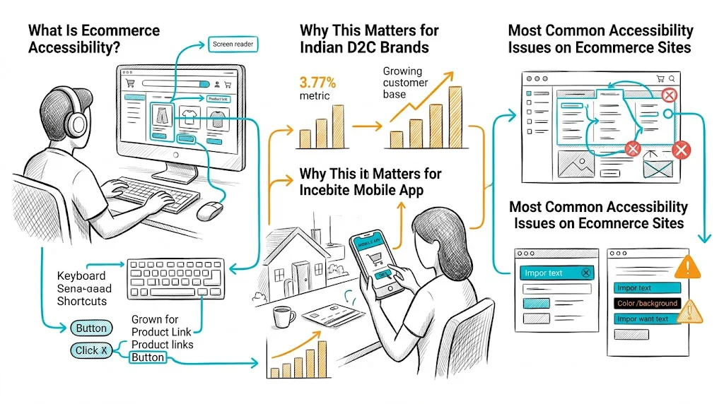
Web accessibility means that people with disabilities can perceive, understand, navigate, and interact with your website. The international standard is WCAG (Web Content Accessibility Guidelines), currently at version 2.1, with Level AA compliance being the broadly accepted target for commercial websites.
The four core WCAG principles (POUR):
Broader audience reach: India has 26.8 million visually impaired people and tens of millions more with other disabilities. Many use assistive technologies to shop online. An inaccessible site excludes them entirely.
Mobile accessibility overlaps with general mobile usability: Indian ecommerce is 70–80% mobile. Touch targets that are too small, text that is too small to read without zooming, and poor contrast all affect mobile users regardless of disability status.
Conversion rate impact: Multiple studies show that accessible design improves general usability metrics—task completion rate, time to checkout, error rate—for all users, not just those with disabilities.
Emerging legal landscape: While India lacks direct private-sector web accessibility enforcement today, brands targeting UK, US, EU, or Australian markets face real legal exposure. ADA (Americans with Disabilities Act) web accessibility litigation in the US has resulted in thousands of lawsuits against ecommerce companies.
Text must have a contrast ratio of at least 4.5:1 against its background (WCAG Level AA for normal text). Many popular Shopify themes use light gray text on white backgrounds or white text on pastel backgrounds that fail this standard.
How to check: Use the WebAIM Contrast Checker (free, browser-based). Enter your foreground and background hex colors.
What to fix: Darken your body text color, increase contrast on sale badges and price labels, ensure CTA button text has sufficient contrast against button background.
Every product image, banner, and icon must have descriptive alt text that communicates the image's purpose to screen reader users.
Poor alt text: alt="image1.jpg" or alt="" on a product image
Good alt text: alt="Bellavita Rose Gold Perfume 50ml bottle in pink and gold packaging"
For decorative images that convey no information, alt="" is correct (tells screen readers to skip it). For product images, descriptive alt text also improves SEO.
Every input field in your checkout must have a visible, programmatically associated label—not just placeholder text. Placeholder text disappears when you start typing and is not accessible to all screen readers.
Audit your checkout form:
Some users cannot use a mouse and rely entirely on keyboard navigation (Tab, Enter, arrow keys). Test your site by unplugging your mouse and trying to:
If you get stuck at any step, that is a keyboard trap—a critical accessibility failure. Ensure every interactive element can be focused and activated with keyboard.
Exit-intent pop-ups, newsletter signup modals, and promotional overlays are common on D2C sites. Poorly implemented pop-ups:
Theme selection: Choose a theme that explicitly states WCAG 2.1 AA compliance in its documentation. Shopify's Dawn theme has better accessibility than many third-party themes.
App audit: Third-party Shopify apps (pop-ups, reviews, chat) often introduce accessibility issues. Audit each app's output and replace those that consistently fail.
Product images: Use Shopify's alt text field for every product image—it is in the media section of each product. Many stores leave this blank.
Collection page filters: Ensure filter checkboxes and dropdowns have proper labels and can be operated by keyboard. Custom filter UIs often fail here.
Many accessibility fixes are identical to CRO best practices:
| Accessibility Fix | CRO Benefit |
|---|---|
| Higher color contrast | Easier to read on mobile in sunlight |
| Larger touch targets | Fewer mis-taps on mobile checkout |
| Clear form labels | Lower form abandonment |
| Descriptive error messages | Faster error recovery in checkout |
| Alt text on images | Better SEO rankings, more organic traffic |
| Faster page load (streamlined code) | Higher CVR across all users |
Related reading: Conversion Rate Optimization | Product Page | Cart Abandonment | Ecommerce Site Search Optimization | Ecommerce Header Design
See also: D2C & Ecommerce Growth Pillar