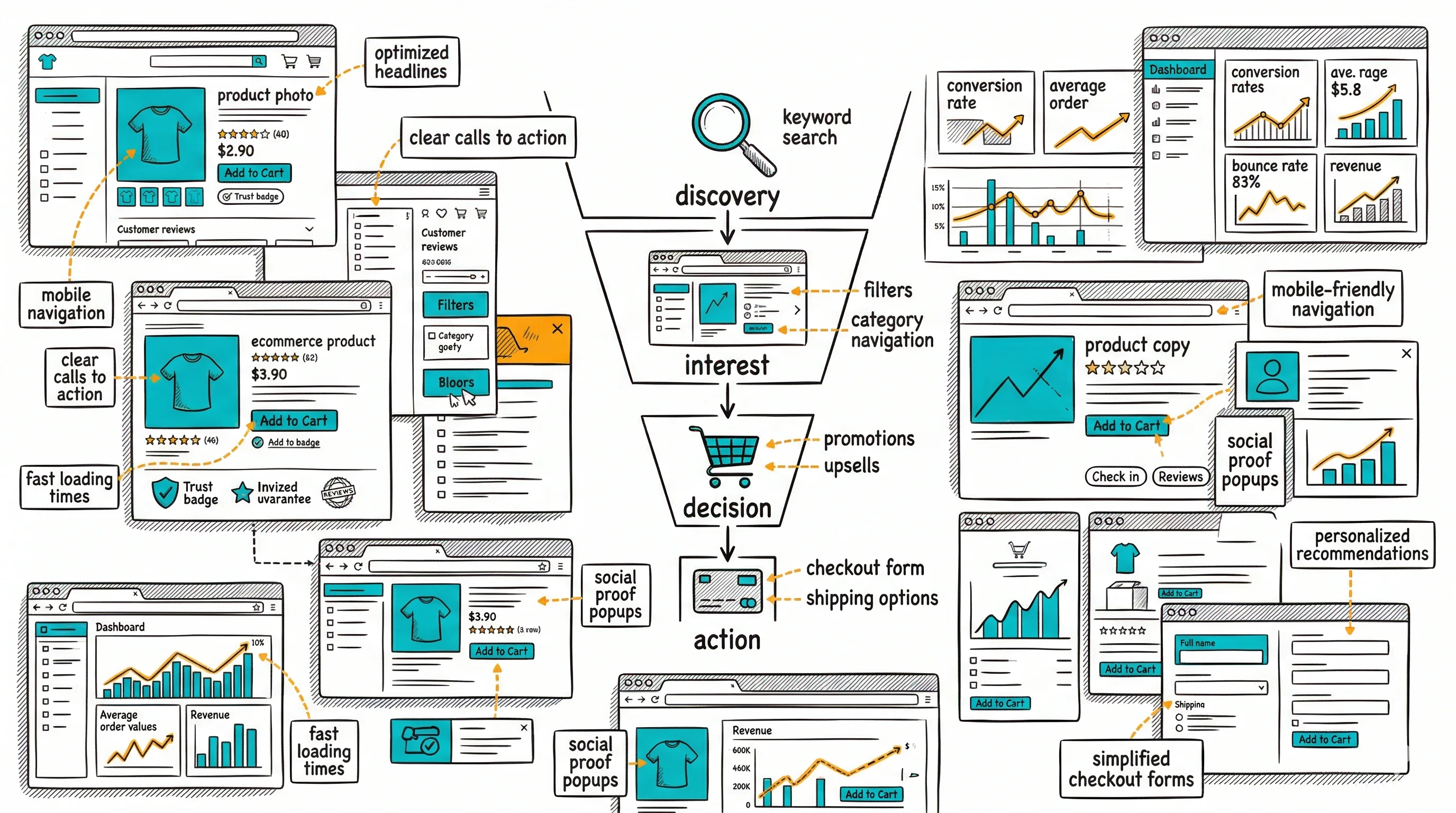
From the conversion glossary
Concepts referenced in this article, defined.
Concepts referenced in this article, defined.
Run rigorous A/B tests and personalize every visit on Shopify or any storefront — no engineers required.
Product photography is the closest substitute online shoppers have for touching, trying, and examining a product in person. When it falls short, conversions fall with it—no amount of compelling copy or aggressive pricing fully compensates for images that don't inspire confidence. The brands that understand photography as a conversion tool, not just a visual element, systematically outperform those that treat it as a checkbox.
Online shoppers can't pick up your product, feel its weight, check the stitching, or see how the color looks in natural light. Photography has to do all of that work.
Research consistently shows that image quality ranks as the top purchase factor in ecommerce—ahead of price, shipping speed, and even product reviews. This isn't surprising when you think about the psychology: a blurry, poorly lit image signals "we don't care about quality," even if the product itself is excellent. A crisp, multi-angle, well-styled image signals "we're proud of this product and we want you to see everything."
For Indian D2C brands, this matters particularly for categories where customers have trust barriers—skincare (will this cause reactions?), supplements (what does the actual product look like?), apparel (how does this fit on a real body?), and electronics (what ports and connections does this actually have?).
The conversion math: If your product page converts at 2% and better photography lifts this to 2.7%, that's a 35% increase in revenue from the same traffic—without touching ads, pricing, or any other element.
Not all product images serve the same purpose. A complete image set typically needs 5–8 images across different types:
1. Hero/Primary Image
The image shown in search results, category pages, and as the default on the product page. Usually a clean, neutral background (white or light grey) with the product centered. This image needs to be immediately recognizable at thumbnail size.
Do: High contrast between product and background, full product visible, professional lighting Avoid: Drop shadows that obscure edges, excessive negative space, multiple props competing with the product
2. Multiple Angles
Front, back, side, and top views give customers the spatial understanding they'd get from holding the product. For a bag: front (shows the design), back (shows the harness/strap attachment), inside (shows interior pockets), and base (shows durability details). For a skincare bottle: full front, label close-up, pump/cap detail.
3. Close-Up / Detail Shots
Material texture, stitching quality, hardware finish, ingredient labels, print quality—whatever communicates craftsmanship specific to your product. These images address "but how does it actually look up close?" anxiety.
For brands like Sugar Cosmetics or mCaffeine, close-up shots of formulation texture and packaging quality significantly influence purchase confidence.
4. Model / In-Use Images
Humans buy what they can imagine themselves using. A model wearing your kurta tells buyers more about fit, drape, and scale than any flat lay. A lifestyle image of someone applying your face serum creates product aspiration. For non-apparel products, in-use images demonstrate application or use context.
5. Scale Reference Image
Size is frequently misjudged from product images alone. Including a scale reference—a hand, a coin, a common object—prevents the disappointment that drives returns ("I didn't realize how small this was").
6. Lifestyle/Context Image
The product in a real or aspirational setting. A coffee mug on a morning desk. A backpack in a travel context. These images sell the lifestyle, not just the product, and tend to generate the strongest emotional response.
7. Packaging Shot
Especially important for gift-worthy products. Good packaging builds perceived value. Showing the box, wrapping, or presentation communicates the unboxing experience.
Lighting is the single most important technical element in product photography. Good lighting cannot be fully rescued in editing; bad lighting shows regardless of post-processing.
Natural light: Works well for lifestyle and context images. Soft, directional natural light from a window creates warm, authentic images that perform well for beauty, food, and wellness categories. Avoid direct sunlight which creates harsh shadows.
Studio/continuous lighting: Provides consistent, controlled results. A basic two- or three-light setup (key light, fill light, background light) eliminates shadows and creates the clean look that product pages require.
Lightbox: For small products (jewelry, electronics accessories, skincare), a lightbox setup is cost-effective and produces consistent results. Many Indian D2C brands use lightbox photography effectively for marketplace listings.
Color temperature consistency: All images in a set should have matching color temperature. Mixed warm and cool images on the same product page look unprofessional and create doubt about which image represents real color.
Over 70% of D2C ecommerce traffic in India comes from mobile. Product photography must be optimized for the mobile experience—not just the desktop view.
Square formatting (1:1): Performs well on mobile product pages. Images fill the screen width without letterboxing or zooming issues.
Portrait formatting (4:5): Slightly taller than square, this format shows more product area on mobile screens and tends to perform well for apparel and full-height products.
Landscape (16:9): Usually a poor choice for product pages on mobile. The product appears small relative to screen size.
Image file size: Large image files slow page loads, which directly hurts conversion. Use WebP format, compress images to under 200KB without perceptible quality loss, and use lazy loading for gallery images below the fold.
Test on actual devices, not just desktop browser "mobile views." The experience on a budget Android phone (the most common device among Indian shoppers) is different from an iPhone or desktop simulation.
User-generated content (customer photos and videos) has a different conversion function than professional photography.
Professional images build aspiration and establish quality. UGC builds trust and handles skepticism. They're not competing—they're complementary.
Brands like Mamaearth, Nykaa, and Boat actively collect and display customer photos on product pages because:
How to collect quality UGC:
Display UGC in a dedicated section on the product page, clearly labeled as customer photos. It sits alongside professional images, not as a replacement.
Photography decisions shouldn't be made by gut feel. Test them.
High-value photography tests:
Hero image style: Model wearing vs. flat lay vs. lifestyle. Winner varies by category. Test with 2-week minimum run time and at least 200 conversions per variant.
Background color: Pure white vs. brand color vs. neutral grey. Category-dependent; often neutral outperforms white for fashion categories.
Number of images shown: Does showing 8 images in the gallery hurt conversion vs. 5 curated images? Some categories benefit from comprehensive coverage; others from editorial curation.
Video vs. static as first image: A product video as the gallery hero performs very well for categories where motion matters (apparel fit, texture, mechanism).
CustomFit.ai enables these tests on Shopify without developer involvement. Set up image swap tests, split traffic, and measure impact on add-to-cart rate in the dashboard.
Apparel (fashion, ethnic wear): Model images are essential. Flat lays alone underperform significantly. Show front, back, and detail. Include size reference on the model (model height and size worn).
Skincare and beauty: Texture shots, ingredient visuals, and before/after (where honest and FTC/ASI-compliant) all perform well. Close-up of packaging quality matters.
Food and supplements: Appetite appeal (professional food styling), ingredient visuals, and packaging shots. For supplements: the actual product (capsule/powder) alongside the packaging.
Electronics and gadgets: Multiple angles, port/connection close-ups, scale reference, and in-use context. Exploded views showing what's included in the box reduce post-purchase disappointment.
Jewelry: See our dedicated guide Jewelry D2C India. Macro shots and video are especially important.
Links: Conversion Rate Optimization | Add-to-Cart Rate | Social Proof | Product Page Optimization Pillar | Product Page Layout Best Practices | Product Video Conversion Rates