From the conversion glossary
Concepts referenced in this article, defined.
Concepts referenced in this article, defined.
Run rigorous A/B tests and personalize every visit on Shopify or any storefront — no engineers required.
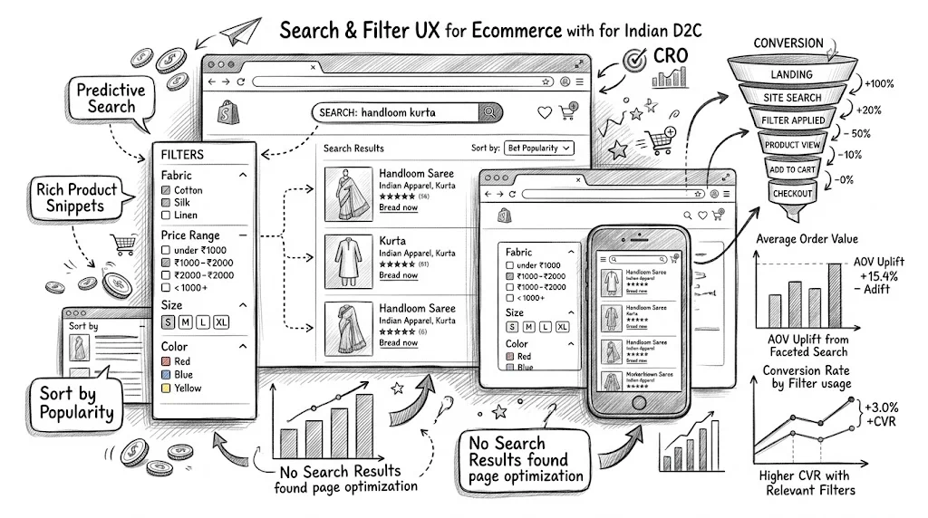
Site search and product filtering are among the most valuable but most neglected UX elements in ecommerce. Shoppers who use site search convert at 2–5x the rate of those who browse without searching—not because search creates intent, but because it captures intent that already exists. And filter UX determines whether a visitor with clear product criteria (size M, under ₹1,000, red, 4+ stars) can find what they want without frustration. Getting both right is one of the highest-ROI UX investments available to D2C brands.
Site search users are not casual browsers. They're customers who know what they want and are actively looking for it. This makes them the highest-intent segment on your site.
The data consistently shows search users converting at 2–5x the base rate. A store with 2% overall CVR might see 6–10% CVR from search-initiated sessions. This gap isn't about preference for search—it's about intent. These are your most purchase-ready visitors.
The problem most Shopify stores have:
Each of these failures loses a high-intent customer who was ready to buy.
Before worrying about search quality, ensure customers can find the search functionality.
Desktop placement: A prominent search bar in the header—ideally a large, open search field rather than a magnifying glass icon that requires an extra click. Research shows open search bars get 30–40% more usage than icon-only triggers.
Mobile placement: Mobile navigation often hides search behind icons. Since mobile shoppers have smaller screens and find browsing harder, mobile search is even more important. A visible search bar (or prominent magnifying glass icon) in the mobile header is essential.
Search bar placeholder text: "Search products..." is generic. "Search by skin concern, ingredient, or product name" provides guidance. "Search kurtas, ethnic wear, or fabric type" adds category context. Better placeholder text reduces "what can I search for?" confusion.
Autocomplete (also called predictive search) is one of the highest-impact search improvements available.
What good autocomplete does:
What poor autocomplete does:
Autocomplete improvements typically deliver 10–20% improvement in search-initiated CVR—because more customers find the product they're looking for, and find it faster.
A zero-results page—"No products found for [search query]"—is the most damaging search outcome. A customer with purchase intent gets zero results and typically leaves.
Zero results causes:
Zero results solutions:
Synonym mapping: Tell the search engine that "sunblock" = "sunscreen," "face wash" = "cleanser," "kajal" = "kohl." This requires manual synonym mapping but eliminates a significant category of zero results.
Fuzzy matching: Search that handles misspellings automatically. Most modern search apps (Searchanise, Boost Commerce) include this.
Alternative suggestions on zero results page: If nothing matches, don't show a blank page. Show "Did you mean [suggested query]?" and a set of relevant products from related categories.
Redirect common queries: If customers frequently search "discount" or "sale," redirect to your sale collection page rather than returning a zero-results page.
Good filter UX allows customers to narrow a collection to products that match their specific criteria without frustration. Bad filter UX sends customers back to the homepage or search.
The essential filter attributes for D2C categories:
Fashion/Apparel: Size, color, price range, material/fabric, occasion, style, brand (for multi-brand stores)
Beauty/Skincare: Skin type, skin concern (acne, anti-aging, brightening), product form (serum, cream, gel), ingredient (with/without fragrance, vegan), price range
Health/Supplements: Health goal (immunity, weight loss, energy), format (capsule, powder, liquid), key ingredient, brand, price range
Food/Beverages: Dietary (vegan, gluten-free, organic), flavor, brand, price range, occasion
The filter attributes you choose should match what your customers actually decide by. Survey your support tickets and reviews to find the criteria customers mention most frequently.
Show product counts per filter option:
"Red (12)" vs. "Red" helps customers understand the inventory before filtering. A filter option that shows "(0)" products is useful—it tells the customer that combination doesn't exist and prevents wasted filtering. "Red (0)" means they can pick a different color.
Sticky filter panel:
On desktop, the filter sidebar should remain visible as customers scroll through products. Disappearing filters make it hard to adjust criteria mid-browse.
Multi-select within a category:
Customers should be able to select multiple values in one filter dimension simultaneously. Selecting "M" and "L" in size, or "Red" and "Blue" in color, is a natural shopping behavior. Single-select filters that force one choice at a time are frustrating.
Active filter display:
Show which filters are currently applied (e.g., "Size: M, L | Color: Red | Price: ₹500–₹1,500") with easy removal for each individual filter or a "Clear All" option. Customers need to see and manage their active filter stack easily.
Instant vs. Apply button:
On desktop: instant application (results update as filters are clicked) is generally preferred. On mobile: a filter drawer with an "Apply" button is better for most stores, because instant filtering can feel laggy on slower connections.
Mobile filtering is where many D2C stores fail. On desktop, a sidebar filter panel is standard. On mobile, the same sidebar doesn't work—it takes up too much screen space.
Mobile filter patterns that work:
Horizontal scrollable filter bar: A row of filter chips (size, color, price, etc.) that scroll horizontally above the product grid. Quick access to the most common filters without opening a full panel.
Bottom drawer filter panel: Tapping "Filter" opens a drawer from the bottom of the screen with all filter options. This feels native to mobile UX (similar to iOS and Android bottom sheets) and provides full filter access without leaving the product grid.
Sticky filter bar: Keep the filter access point visible as the customer scrolls through products.
What to avoid on mobile:
Your search data is a goldmine of customer intent signals. Analyze regularly.
Key search analytics to track:
Top search queries: What are customers searching for most? If high-traffic searches lead to poor results, fix those specifically.
Zero-results queries: What searches return no products? These reveal either gaps in your catalog or terminology mismatches you need to fix with synonyms.
Searches with high exit rate: Customers searched, got results, but left. This suggests results weren't relevant—even if they weren't zero.
Search-to-purchase conversion by query: Which searches convert well? Which don't? Poor-converting search terms may indicate product page issues for those specific products, not search issues.
Search query > category navigation: When customers search for a category and then filter, they're doing both—combine search and filter analytics to understand this combined path.
Advanced search implementations can personalize results based on customer history:
Purchase history prioritization: A customer who previously bought protein supplements sees protein-category results ranked higher when they search "supplement."
Browsing history weighting: A customer who spent 5 minutes on hair care product pages sees hair care results weighted up in ambiguous searches.
Segment-based search merchandising: New visitors see bestsellers ranked higher; loyalty members see new arrivals first.
CustomFit.ai can work in conjunction with search apps to surface different product orders or recommendations based on visitor segments.
High-value tests:
Search bar visibility: Open search field vs. icon-only trigger. Does a visible search bar increase search usage and CVR?
Filter display style: Sidebar vs. top filter bar vs. bottom drawer on mobile.
Product count display: Showing product counts per filter option vs. not—does it improve filter usage and CVR?
Autocomplete visual style: Text-only suggestions vs. thumbnail images in the dropdown.
Filter application: Instant vs. Apply button on mobile.
Links: Conversion Rate Optimization | Bounce Rate | User Experience | UX Design Conversions Pillar | Product Page Layout Best Practices | Color Psychology Conversions