From the conversion glossary
Concepts referenced in this article, defined.
Concepts referenced in this article, defined.
 cro
croPre-order waitlist CRO strategies that convert hype into real revenue - how to design waitlist and pre-order pages that don't lose momentum before launch.
 cro
croFirst purchase experience optimization - practical strategies to turn first-time visitors into buyers, from welcome offers to a smarter new customer funnel.
 cro
croRetail media CRO explained - how to monetize on-site ads and sponsored placements without tanking your conversion rate. A practical balance guide.
Run rigorous A/B tests and personalize every visit on Shopify or any storefront — no engineers required.
Mobile drives most ecommerce traffic, yet it converts at a fraction of desktop rates. In India, where mobile accounts for 70-80% of D2C traffic, that gap is the single largest CRO opportunity for most brands. Once you understand why the gap exists and how to close it, you have more to gain here than from any other optimization you'll run this year.
Global benchmarks for ecommerce conversion rates:
The desktop-to-mobile CVR gap globally is roughly 2-3x. Mobile traffic has grown fast while mobile conversion rates have improved much more slowly, which leaves a large gap to work on.
The mobile-desktop CVR gap in India has a few characteristics of its own.
Traffic is more mobile-skewed. Indian D2C brands typically see 70-80% of traffic from mobile, versus 50-60% in Western markets. That makes the aggregate impact of low mobile CVR more severe for Indian brands.
Payment is more complex. The Indian payment ecosystem covers UPI, COD, EMI, wallets, and debit and credit cards. That range can create friction on mobile if it isn't implemented well. A checkout flow that accommodates every payment method while staying simple on a 5-inch screen takes deliberate design.
The device range is wider. Indian mobile users shop across a broader spread of devices and screen sizes, from flagship iPhones to budget Android phones with 2GB of RAM. A page that loads well on a flagship may be unusable on a mid-range Android.
COD still matters. Cash on delivery remains significant in Indian D2C, especially in Tier-2 and Tier-3 markets. Brands that make COD easy to select on mobile typically see higher mobile CVR from these segments.
4G connectivity varies. Even as 5G expands, large portions of Indian shoppers still experience 4G speeds, or slower in some areas. Page load time has more CVR impact in India than in markets with consistent high-speed connectivity.
See also: Conversion Rate Optimization glossary | Bounce Rate glossary | User Experience glossary
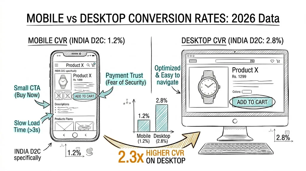
Mobile users are often in discovery mode, browsing Instagram, watching YouTube, or checking WhatsApp. Desktop users are more often in deliberate buying mode. That difference is behavioral rather than a UX defect, but it means your mobile product page has to work harder to move users from browsing to buying intent.
Filling out checkout forms on mobile is genuinely harder. Keyboard autocomplete errors, zip code fields that switch keyboard types, and address fields without proper mobile input types all add up. Each field is a potential abandonment point.
Mobile connections are slower and more variable than desktop. A product page that loads in 2 seconds on desktop may take 4-5 seconds on a budget Android on 4G. Every additional second of load time reduces conversion rate by 7-12%.
Small buttons, hard-to-tap links, and CTA buttons that shift below the fold when the keyboard opens are all worse on mobile. An "Add to Cart" button that's easy to reach on desktop can require zooming or scrolling on mobile.
Trust badges, review counts, and social proof that are immediately visible on a desktop product page may sit below the fold on mobile, so users have to scroll before they encounter them. Many don't.
Multi-step checkout flows are harder to navigate on mobile. Progress indicators are often missing. Payment method icons may be tiny. UPI app deep-links may not work if the app isn't installed.
Run Google PageSpeed Insights on your mobile homepage and top product pages. Focus on:
A 1-second improvement in mobile load time typically lifts mobile CVR by 7-12%. For most D2C stores, this is the highest-ROI technical change you can make.
Audit your product page on an actual mobile device, not a browser resize. What appears without scrolling? On most D2C product pages, the answer is the hero image and the title. Trust signals are buried.
Test moving key trust elements above the fold on mobile:
See also: Click Map glossary | Session Recording glossary | Heatmap glossary
Checkout is where mobile abandonment is highest. To reduce friction:
Run your A/B tests segmented by device. A variant that wins on desktop may not win on mobile, because the user behavior, screen real estate, and friction points differ.
CustomFit.ai supports device-segmented testing, so you can run a mobile-specific test without affecting the desktop experience, or the reverse. This matters most for Indian D2C brands, where mobile traffic dominance means a mobile-specific improvement moves aggregate CVR more than any desktop improvement.
| Category | Typical Mobile CVR |
|---|---|
| Wellness/Supplements | 0.8 to 1.8% |
| Skincare/Beauty | 1.0 to 2.2% |
| Fashion/Apparel | 0.6 to 1.5% |
| Home/Kitchen | 0.5 to 1.2% |
| Food/Beverages | 1.2 to 2.5% |
These are directional benchmarks. Your own baseline and improvement trajectory matter more than how you compare to category averages.
To track mobile vs desktop CVR in GA4:
You can also create a custom exploration with Device Category as a segment, which lets you compare mobile and desktop across all key funnel metrics at once.