From the conversion glossary
Concepts referenced in this article, defined.
Concepts referenced in this article, defined.
Run rigorous A/B tests and personalize every visit on Shopify or any storefront — no engineers required.
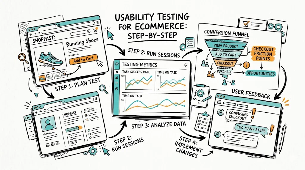
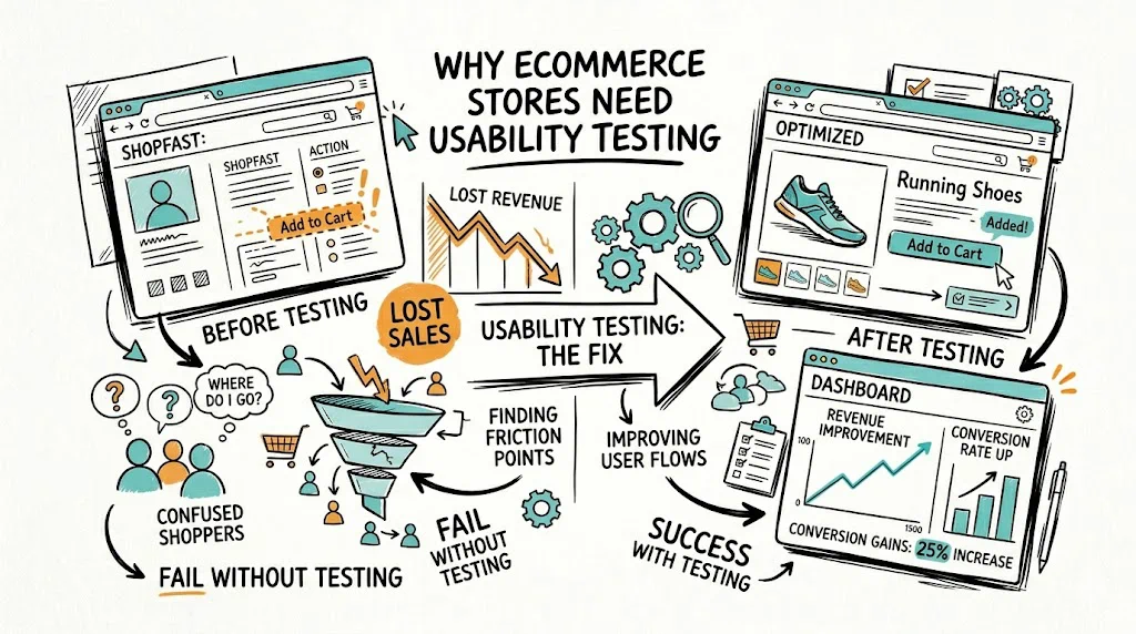
Usability testing for ecommerce means watching real people try to use your store — finding products, reading descriptions, completing checkout — and identifying where they get confused, frustrated, or give up. Five hours of usability testing will reveal more conversion blockers than months of staring at analytics reports.
Analytics tell you where visitors leave. Usability testing tells you why. When 65% of your visitors abandon the product page, your funnel data shows a number. A usability session shows you that users can't find the size guide, don't understand which variant to pick, or assume the product is out of stock because the "Notify Me" button looks like the primary CTA.
For Indian D2C brands, usability testing often reveals friction specific to the local context: users expecting a COD option that's hard to find, confusion about whether a product ships to their pincode before they commit to checkout, or mobile keyboards covering the CTA button during form fill.
Brands in categories like Ayurveda, supplements, and ethnic fashion — where products need explanation — consistently find that users skip product descriptions entirely and look for video content or customer photos instead.
Moderated Remote Testing You observe via video call while a participant shares their screen. You can ask follow-up questions in real time. Best for understanding complex checkout flows or category navigation.
Unmoderated Remote Testing Participants record themselves completing tasks using tools like Maze or Lookback. Scales easily — you can run 20 sessions simultaneously. Best for validating specific flows.
In-Person/Guerrilla Testing You sit next to someone with a laptop and watch them use your store. Zero cost, fast setup. Ideal for early-stage brands that need quick insights.
First-Click Testing You show users a screenshot of a page and ask them to click where they'd go to complete a task. Reveals navigation and visual hierarchy issues quickly.
Comparative Testing Users interact with your current site and a competitor's site side-by-side. Highlights gaps in expected patterns.
See also: Conversion Rate Optimization glossary | User Experience glossary | Bounce Rate glossary

Be specific about what you want to learn. "Improve the user experience" is not a usability testing goal. "Find out why users abandon checkout on mobile" is.
Good ecommerce usability testing goals:
Tasks should be realistic scenarios, not instructions. Bad task: "Click on the skincare category." Good task: "You want to buy a gift for your mother's birthday — she has dry skin. Find something suitable under ₹1,500."
Write 3-5 tasks per session. More than 5 creates fatigue.
Recruit people who match your actual customers. For a D2C wellness brand targeting urban women 25-40, don't test with a 22-year-old male engineering student. Source participants through:
Aim for 5 participants for a moderated test. Five is enough to identify 85% of critical issues.
For remote sessions: Use Google Meet, Zoom, or any screen-sharing tool. Record with permission. Ask participants to think out loud — narrate what they're doing and what they're looking for.
Moderator's role: Don't lead participants. When they're stuck, ask "What would you do next?" not "Would you look at the navigation?" Your goal is to observe authentic confusion, not guide them to success.
What to watch for:
After testing, categorize issues by:
A critical issue encountered by 4 of 5 users is your top priority. A minor confusion experienced by 1 user goes to the backlog.
Create a simple table: Issue | Severity | Frequency | Recommended Fix | Test Required?
Not every usability finding needs an A/B test. If 5 of 5 users missed your return policy link because it's in grey text at the bottom of the page — just fix it. But when the fix has business risk (e.g., changing your entire checkout flow), run an A/B test first.
Use a no-code tool like CustomFit.ai to run tests on Shopify without developer involvement.
See also: Session Recording glossary | Click Map glossary | Heatmap glossary
Navigation too deep: Users can't find products in more than 2 clicks. Fix: Flatten category structure. Add predictive search with visual results.
Variant selection confusion: Users select the wrong size or color because swatches aren't labeled clearly. Fix: Show selected variant name alongside the swatch. Add size guide link prominently.
No trust signals at purchase decision point: Users see trust signals in the header but not near the Add to Cart button. Fix: Add trust badges (return policy, COD availability, secure payment) directly below the CTA.
Mobile keyboard covering CTA: On checkout, the keyboard pushes the "Place Order" button off-screen. Fix: Test on actual Android and iOS devices. Add scroll behavior so CTA stays visible.
COD not visible early enough: Indian users check payment options before committing to a product. Fix: Show available payment methods (COD, UPI, EMI) on the product page, not just at checkout.
Pincode check friction: Users want to know delivery timelines before adding to cart. Fix: Add a pincode checker to the product page. Show estimated delivery date, not just "ships in 3-5 days."