From the conversion glossary
Concepts referenced in this article, defined.
Concepts referenced in this article, defined.
Run rigorous A/B tests and personalize every visit on Shopify or any storefront — no engineers required.
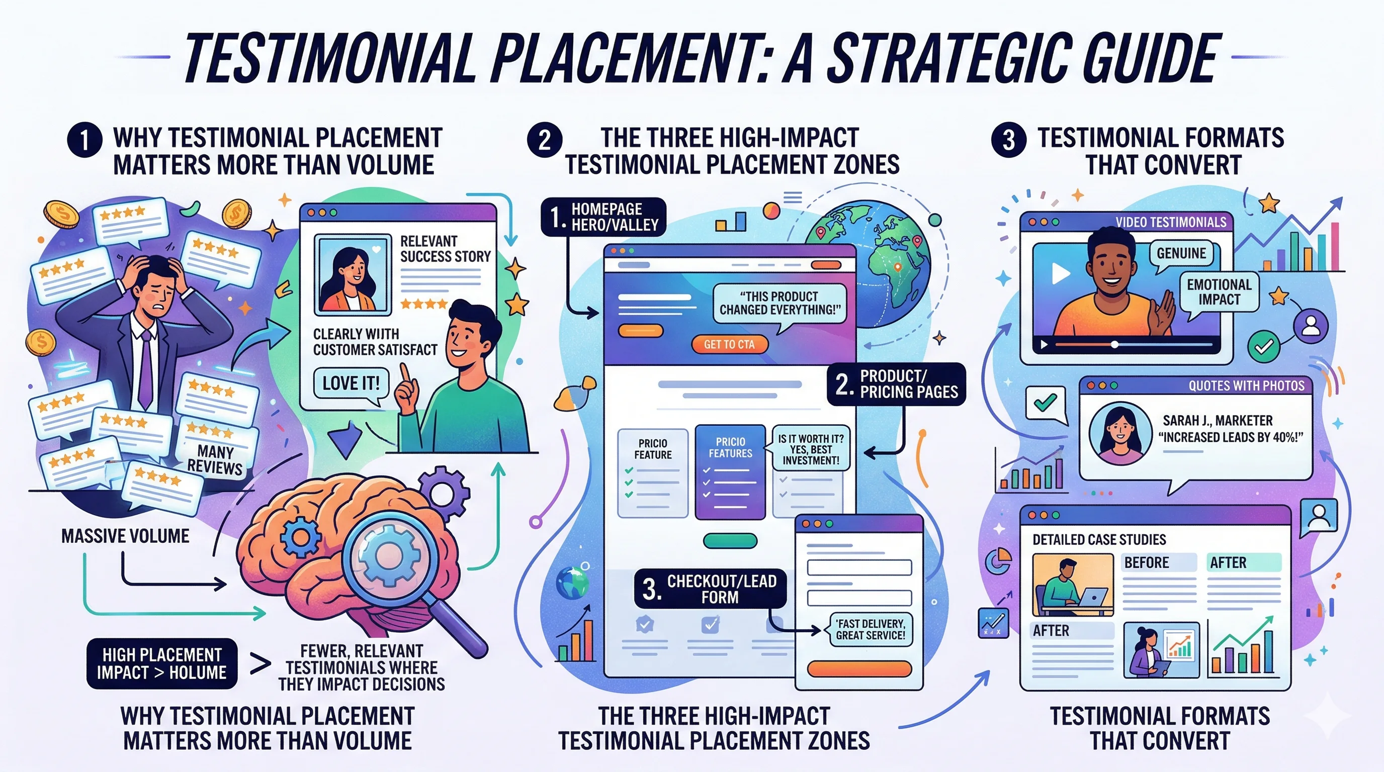
The right testimonial in the right place can do more for your conversion rate than any discount — because it answers the visitor's unstated question: "Has this worked for someone like me?" Testimonials that are specific, relevant, and placed near decision points consistently outperform generic praise buried at the bottom of the page. Getting placement and format right is a repeatable skill, not guesswork.
Most D2C brands treat testimonials as decoration. They collect a wall of five-star reviews, paste them near the footer, and move on. This misses how visitors actually read landing pages.
Visitors do not read linearly. They scan, they jump to the CTA, they look for reasons to trust or distrust, and they make a decision. Testimonials that appear next to moments of doubt — near the price, near the CTA, near a risk-reversal section — answer objections exactly when they arise.
The evidence: brands that move testimonials from the footer to directly below the hero section see measurable lifts in conversion rate. Kapiva, an Ayurvedic D2C brand, saw a 9.48% lift in overall conversion after restructuring their product page social proof alongside pricing information.
This is the most overlooked placement. Most visitors will see your hero CTA and hesitate — "But does it actually work?" A single, strong testimonial within 200 pixels of the CTA button addresses that hesitation before it becomes a bounce.
What to put here:
Example format:
"I ordered expecting average quality but got completely surprised — the texture is incredible and it arrived in Bangalore within 2 days." — Priya M., Bangalore ★★★★★
Keep it short. This is not the place for a long story. The goal is to reduce friction at the moment of decision.
Price is where the most doubt happens. When a visitor sees ₹1,799 for a skincare set, their brain immediately runs a calculation: "Is this worth it?" A testimonial here that says "I spent ₹3,000 on a competitor and this blew it out of the water" does the conversion work for you.
This placement is especially effective for:
The bottom of your landing page is where visitors who have read everything arrive. They are close to deciding. A strong social proof block here — three to five testimonials, a customer count, or a media mention — gives them the final push.
This is the place for richer proof: video testimonials, longer written reviews, or an aggregate rating widget.
The most effective testimonial format for D2C. It names a measurable outcome, a specific pain point solved, or a concrete detail that makes it believable.
Works: "Lost 4 kg in 6 weeks using the morning ritual pack — and my digestion has never been better." Does not work: "Amazing product! Highly recommend to everyone!"
The second example is so generic it creates zero trust because it sounds fabricated.
A real customer photo (even a slightly imperfect one) next to a testimonial increases perceived authenticity. Studio-shot testimonial photos backfire because they look too polished — visitors know they are staged.
For Indian D2C, WhatsApp screenshot testimonials work particularly well because they look genuinely unfiltered. Pair a screenshot with a brief context line ("After using our Triphala capsules for 60 days...") for maximum impact.
For products in the ₹1,500–₹5,000 range, a 45–90 second video testimonial from a real customer builds more trust than text alone. The customer does not need to be polished — natural, slightly imperfect speech reads as more credible than a scripted delivery.
Host the video on your own server or a fast CDN rather than embedding YouTube, which adds a logo, recommended videos, and loading time. Keep auto-play off; let the visitor choose to watch.
For landing pages built from Shopify reviews, adding a "Verified Purchase" label to testimonials lifts credibility. Visitors have grown sceptical of unverified reviews. Even a simple "Verified Buyer" text tag next to the customer name helps.
Display aggregate star ratings (e.g., "4.8 / 5 from 2,340 reviews") near the top of the page only if your rating is 4.3 or above. A prominent 3.9 rating is worse than no rating.
For brands with fewer than 50 reviews, skip the aggregate and use hand-picked specific testimonials instead. Volume cues help only when the volume is high enough to be credible.
Different audiences need different social proof. A visitor from a Google ad searching "best whey protein India" needs different testimonials than a visitor from a festive Diwali Instagram ad.
With landing page personalization, you can show:
CustomFit.ai's no-code personalisation lets you swap the testimonial block based on UTM source or audience segment — no developer required.
Generic praise with no specifics. Audit your current testimonials. Any that say "great product, fast delivery" without naming a specific result should be replaced or moved to secondary positions.
No photo or identity signal. Anonymous testimonials ("— J.K., Mumbai") are less trustworthy than ones with a photo and a full first name. Even a first name + city significantly improves credibility.
All testimonials from the same demographic. If your brand sells to both men and women, both age groups should see relevant testimonials. A 22-year-old visiting a page full of testimonials from 45-year-olds will self-select out.
Testimonials that address a different use case. If someone arrives on your "Hair Growth Oil" landing page, testimonials about your face wash do not help. Segment testimonials by product or use case.
Missing testimonials altogether on mobile. Some brands hide testimonials on mobile to reduce page length. This is the wrong trade-off. Shorten other elements but keep at least one strong testimonial above the fold on mobile.
The best testimonials come from asking the right question at the right time:
That second question generates objection-handling testimonials — gold for landing pages.
For Shopify brands, an automated post-purchase email sequence with these questions captures testimonials at scale. Tools like Loox or Judge.me work well for structured review collection.
Use names and faces. First name + city + photo = 3x more credibility than just a name.
Rotate testimonials by audience. If you run ads to multiple segments, personalise the testimonial block. A customer from Chennai should ideally see a testimonial from another Chennai customer.
Test placement before format. Move your best testimonial next to the CTA before you invest in video production. Placement changes are faster to test and often move the needle as much as format changes.
Include negative-turned-positive stories. "I almost didn't buy because of the price — but after 3 months, I spend less on doctor visits than I used to" is more convincing than pure praise.
Update seasonally. During festive season, surface testimonials about gifting, packaging quality, and delivery speed — the factors that matter most to gift buyers.
For more on landing page strategy, see the Landing Pages pillar guide and the article on landing page hero section optimization.