From the conversion glossary
Concepts referenced in this article, defined.
Concepts referenced in this article, defined.
Run rigorous A/B tests and personalize every visit on Shopify or any storefront — no engineers required.
Category pages (product listing pages) are among the most visited and least optimized pages in most ecommerce stores. Visitors arrive from navigation, search, and paid ads — and the category page determines whether they click through to a product or bounce. A/B testing PLPs can lift product click-through rates by 15–30% and directly increase add-to-cart and purchase rates downstream. For Indian D2C brands with large product catalogs, category page optimization is one of the highest-leverage growth activities available.
Most teams spend their CRO budget on product pages and ignore the funnel step that determines which products visitors even consider. This guide covers what to test on category pages and how to run valid experiments on PLPs.
The funnel math: If your category page has a 25% click-through rate to product pages and your product page converts at 4%, changing your category page CTR to 35% effectively adds 10 percentage points of qualified visitors to your product pages — without changing the product page at all.
The challenge: Category pages serve many different visitors with different intent levels. Someone who arrived from a "best moisturizer" organic search is different from someone who navigated from your homepage to "Skincare > Moisturizers." Segmenting these behaviors is essential for interpreting test results.
The opportunity: Most D2C brands A/B test their product pages, checkout, and homepage — but not their category pages. This means category pages are often running on default Shopify theme settings rather than optimized layouts.
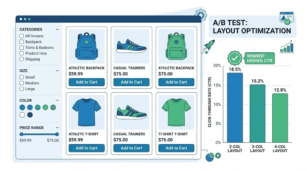
The number of products visible per row is one of the most impactful category page variables.
What to test:
Expected findings: For beauty and premium categories, 2 columns often outperforms 3 because larger images show product detail and texture. For functional products (supplements, cleaning products) where variety matters more than aesthetics, 3–4 columns can increase click-through by letting visitors see more options quickly.
Mobile consideration: On mobile (dominant for Indian ecommerce), a "2-column" layout is standard. Testing 1-column vs. 2-column on mobile is a meaningful variant.
Each product card in the grid is its own optimization opportunity.
What to test:
High-impact Indian D2C test: Adding an "Add to Cart" button directly on the category page card (without requiring a click to the PDP) can increase overall category page CVR — but test this carefully as it removes the product education that product pages provide.
The products shown first on a category page convert at dramatically higher rates than products shown later.
What to test:
Expected findings: For most categories, showing bestsellers first maximizes click-through rate for new visitors. For returning visitors who've already seen the bestsellers, "New Arrivals" first can be more engaging. Test these separately by visitor type.
Indian festive context: During Diwali or Valentine's Day, test surfacing gift sets and bundles to the top of relevant category pages. A "Gifts under ₹999" or "Diwali combos" sort can significantly lift festive season revenue.
Filters help visitors narrow down a large catalog but add page complexity.
What to test:
Indian context: Filters relevant to Indian consumer decisions — "Free Shipping", "COD Available", "FSSAI Certified", "Cruelty-Free" — are under-represented in most filter sets. Test adding these as filterable attributes.
Most category pages have a banner at the top (image + headline). This is prime real estate.
What to test:
Common finding: Promotional banners drive higher click-throughs to specific featured products but reduce broader category exploration. Test this trade-off with both CTR and revenue per session as metrics.
Badges on product cards signal quality, urgency, and value.
What to test:
For Indian D2C: Test "COD Available" as a badge on products that support COD — for lower-ticket items where COD is a purchase trigger, this badge can increase card click-through rate.
Primary metric options:
Click-through rate to PDP: (Product page views from category / Category page views) — this is the most direct measure of category page engagement.
Revenue per category page session: Most complete measure — accounts for click-through, product page conversion, and AOV.
Add-to-cart rate from category: Only applicable if you have ATC buttons directly on category cards.
Secondary metrics:
What not to use as primary metric: Bounce rate alone (visitors might scroll the category then leave to purchase via a different channel) or session duration (longer isn't always better if it means visitors are confused).
CustomFit.ai's visual editor supports category page testing on Shopify without developer involvement. You can:
The platform pulls conversion data directly from Shopify order history, so you can see the revenue impact of category page changes — not just click-throughs.
Test product sort order before visual design — what products you show has more impact than how the card looks.
Run category page tests for at least 2 full weeks — category pages often have different traffic on weekdays (browsing/discovery intent) vs. weekends (buying intent). You need both cycles.
Segment results by traffic source — an organic search visitor arriving on a "moisturizers" page for a specific query needs different category page UX than a paid traffic visitor arriving from a brand awareness ad.
Test your top 3 highest-traffic categories, not all categories simultaneously — focus your testing effort where traffic is high enough to reach significance quickly.
Track the full funnel impact — a category page test that increases PDP click-through should also show downstream impact on add-to-cart and purchase rate. If CTR increases but revenue doesn't, the change is driving unqualified clicks.
Test mobile and desktop separately — category page layouts optimized for desktop often perform poorly on mobile. Run device-specific variants.
Use heatmaps alongside A/B tests — Microsoft Clarity (free) or Hotjar can show you where visitors click and scroll on category pages before you design your variants. This improves hypothesis quality.
Related reading: A/B Testing Cart Pages | A/B Testing Social Proof | Funnel Analysis Drop-Off | Conversion Rate | A/B Testing Pillar Guide