From the conversion glossary
Concepts referenced in this article, defined.
Concepts referenced in this article, defined.
Run rigorous A/B tests and personalize every visit on Shopify or any storefront — no engineers required.
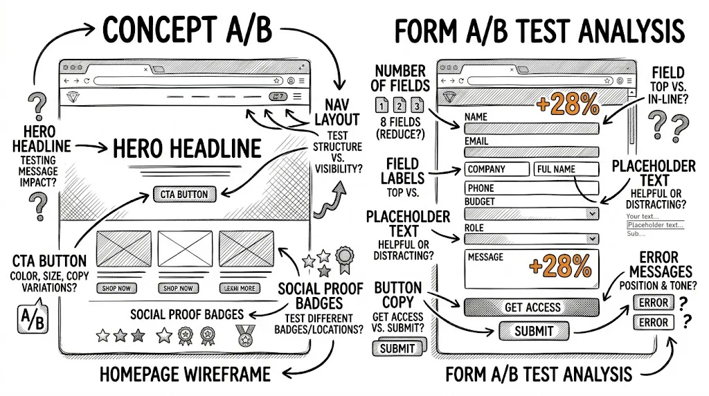
Your homepage is the most-visited page on your store — and for most D2C brands, the one that's tested least frequently. A single winning homepage test can lift site-wide conversion rate because it affects every visitor. These 30 A/B testing ideas cover every major element of an ecommerce homepage: hero section, navigation, social proof, personalisation, and more.
The homepage is your store's first impression. Visitors form a judgement within 3–5 seconds — and that judgement determines whether they browse further or bounce. For Indian D2C stores seeing 60–70% mobile traffic, homepage performance is even more critical because mobile attention spans are shorter and scrolling behaviour is different from desktop.
Every test on this page is a site-wide experiment. A hero headline that increases click-through rate by 10% lifts all downstream metrics proportionally. Split testing on the homepage has the highest leverage of any test location.
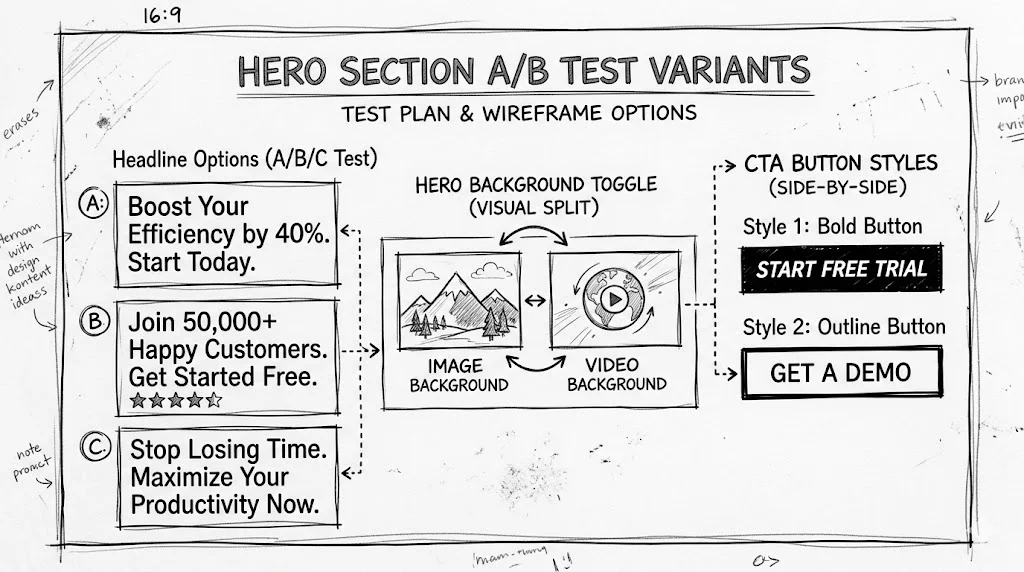
Variant A: "Discover India's Best-Selling Skincare Products" Variant B: "Clearer Skin in 28 Days — Trusted by 2,40,000 Indians"
Benefit-led headlines (what the customer gets) typically outperform product-led headlines (what you sell) by 8–15% on click-through rate.
Variant A: "Shop Now" Variant B: "Find My Perfect Product" Variant C: "Start With Our Best Seller"
"Shop Now" is the lowest-converting generic CTA. Specific, action-oriented CTAs that promise an outcome convert 10–20% better.
Lifestyle and UGC-style images typically outperform packshots for beauty, food, and apparel categories.
A looping 10–15 second background video vs. a high-quality static hero image. Video wins in fashion and food categories; static wins in minimalist and luxury contexts.
Variant A: No trust strip above the fold Variant B: "★★★★★ 4.8 from 14,000+ reviews | Free shipping above ₹499 | Easy returns"
A trust strip above the fold reduces bounce rate by 5–10% for new visitors who are evaluating brand credibility.
Variant A: Centred headline with image behind Variant B: Split layout — image left, headline and CTA right
Split layouts often perform better on desktop; centred works better on mobile. Always segment by device.
Test your current CTA button colour against a high-contrast alternative (e.g., if your brand is blue, test an orange or white CTA). Colour contrast with the background affects click-through rate more than button colour alone.
Variant A: No offer in hero Variant B: "First Order: 15% Off | Use Code NEW15" in the hero section
For acquisition-focused periods, an explicit first-order offer in the hero increases new visitor conversion by 10–20%.
Variant A: "Shop All Products" CTA Variant B: "Find Your Perfect Match — Take the 60-Second Quiz" CTA
For stores with complex product ranges, a quiz CTA can outperform a direct shop CTA by 15–25% for new visitor engagement.
During festive sales (Diwali, Republic Day sale), test a countdown timer to the end of the offer vs. no countdown. In appropriate contexts, countdown timers lift click-through by 8–15%.
Variant A: Category navigation: "Skincare | Haircare | Bodycare | Makeup" Variant B: Use case navigation: "For Dry Skin | For Oily Skin | Anti-Ageing | Sun Protection"
Use-case navigation outperforms category navigation for new visitors who know their problem but not your product range.
A navigation bar that scrolls with the visitor vs. one that disappears on scroll. Sticky navigation typically increases page depth and reduces bounce rate by 3–6%.
Variant A: Search icon (click to expand) Variant B: Full search bar visible in navigation
A visible search bar increases search usage by 20–30% and lifts CVR for search users by 15–25% (searchers convert at higher rates).
Adding a "Best Sellers" link as the first navigation item routes new visitors to your highest-converting products before they get lost in the catalogue.
On mobile, test a hamburger menu against a tabbed bottom navigation bar with the 4 most important categories always visible. Bottom tabs typically increase category click-through on mobile.
Variant A: "★ 4.8 (14,200 reviews)" Variant B: "Loved by 14,200+ Indian customers"
Plain language social proof often outperforms star rating formatting for trust communication.
A carousel of 3 featured written reviews (with customer name, photo, location) vs. a single aggregate star rating display. Featured reviews convert better for higher-consideration categories.
Variant A: No press logos on homepage Variant B: "As featured in: Economic Times | Femina | Cosmopolitan India" logo strip
Press logo strips lift brand trust scores by 8–12% for first-time visitors, especially for newer brands.
Variant A: Static social proof Variant B: "847 people are shopping right now" or "243 orders placed today" live ticker
Real-time signals create genuine FOMO without manufactured urgency. They work best for high-traffic stores.
A gallery of customer before/after results or "before & after" transformations vs. product photography only. Transformation galleries outperform product images for health, beauty, and fitness categories.
For visitors who have purchased before, show a personalised section: "Welcome back, Priya — your last purchase was [Product]. You might love these next."
For visitors who browsed skincare last visit, personalise the featured collection to show skincare products. Relevant product surfacing lifts engagement by 10–20%.
Show city-specific offers to visitors in Tier 2 and Tier 3 cities: "Delivering to Lucknow — Free shipping, no minimum order."
New visitors: "Discover Our Story — 15% Off Your First Order" Returning visitors: "New Arrivals Just for You"
Two different hero CTAs for two different audiences is one of the highest-impact personalisation tests.
During Indian summers (April–June), surface cooling/sun protection products. During monsoon (July–September), surface relevant products (anti-humidity haircare, waterproof beauty). Seasonal relevance lifts click-through by 8–14%.
For visitors in non-English language states, test showing a "हिंदी में देखें / தமிழில் பார்க்கவும்" option in the header. Language preference banners increase session depth by 15–25% for vernacular language visitors.
Variant A: Popup at 5 seconds Variant B: Popup at exit intent Variant C: No popup
Exit-intent popups typically have 3–5x higher conversion rates than time-based popups while generating fewer complaints and lower bounce rates.
Variant A: Bottom-right corner (standard) Variant B: Inline CTA within the hero section: "Questions? Chat with us on WhatsApp"
An inline WhatsApp CTA in the hero section drives 3–5x more conversations than a floating widget.
Variant A: Free shipping mentioned in footer Variant B: "Free shipping on orders above ₹499" in a persistent top bar above navigation
A persistent top bar for free shipping messaging reduces cart abandonment by 5–10% by setting expectations before the customer reaches the cart.
For newer brands, test including a 2–3 sentence "Why we exist" brand story snippet on the homepage vs. not. Brand story on the homepage increases time on site for high-quality traffic and sets purchase context.
| Test Area | Tests | Expected Lift Range |
|---|---|---|
| Hero section | 1–10 | 8–25% click-through |
| Navigation | 11–15 | 3–15% engagement |
| Social proof | 16–20 | 5–12% trust conversion |
| Personalisation | 21–26 | 10–25% relevance lift |
| Offers & engagement | 27–30 | 5–15% capture rate |
Test mobile and desktop separately. Homepage behaviour differs dramatically by device. A hero layout that wins on desktop may lose on mobile. Always segment results by device in CustomFit.ai's test reporting.
Don't test during the first week of a major sale. Traffic quality and behaviour during Diwali sale opening day is completely different from normal. Test in stable periods; deploy winners before the sale starts.
Track downstream, not just homepage. The primary metric for homepage tests is product page click-through rate — not bounce rate alone. A test that reduces bounce but sends visitors to the wrong products is still a loss.
See also: product page A/B testing ideas and ecommerce A/B testing ideas by funnel stage for the complete testing roadmap.