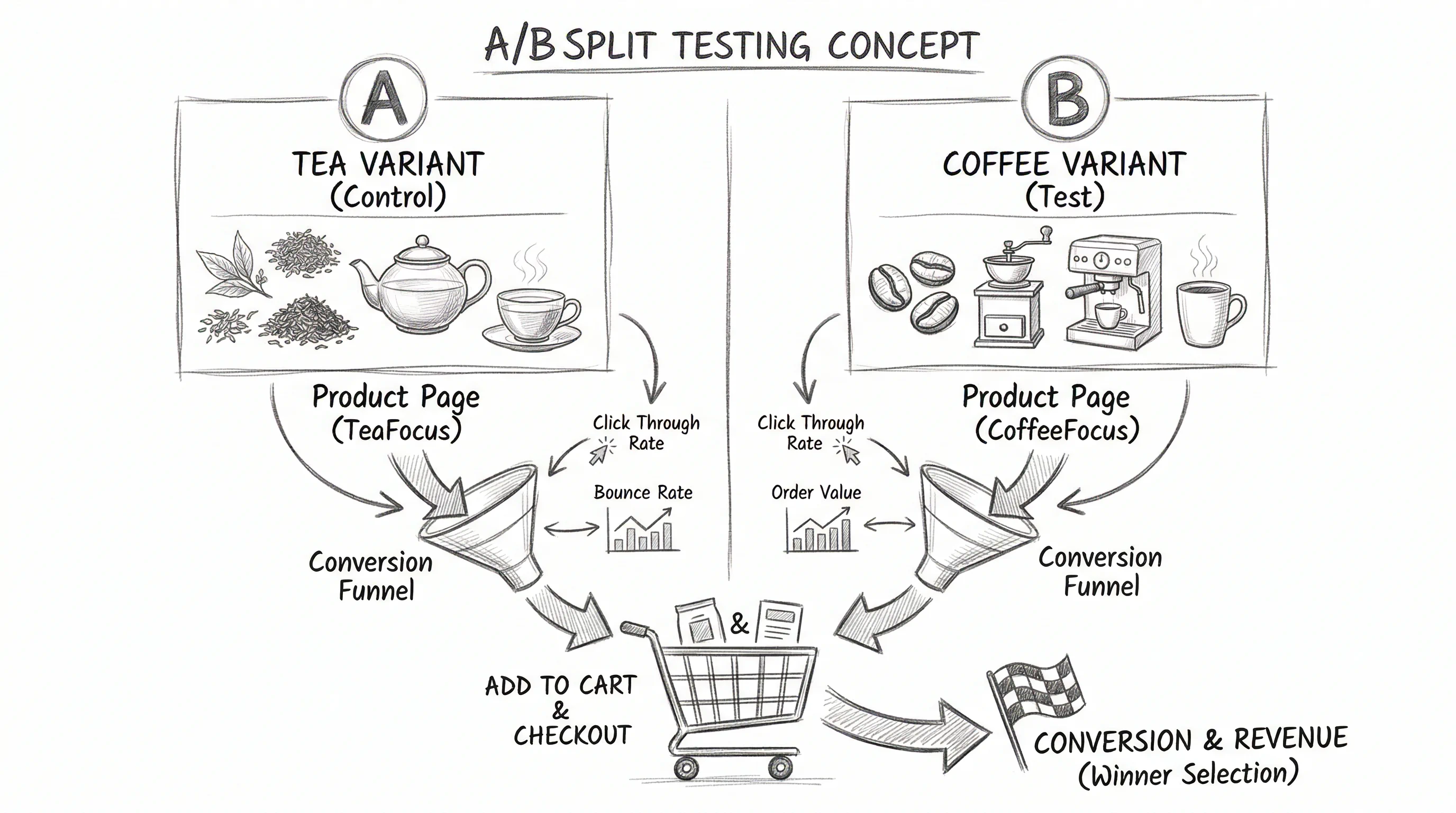
The most common mistake in ecommerce split testing is running tests in the wrong order. Testing checkout copy when your homepage has a 90% bounce rate is like polishing the windows of a shop with the door locked. Organising your A/B testing roadmap by funnel stage — fixing leaks where they're biggest first — is what separates high-velocity CRO programs from scattered experiment noise.
This article gives you 100+ A/B testing ideas organised by the four stages of the ecommerce funnel: Awareness (TOFU), Consideration (MOFU), Purchase (BOFU), and Retention. Use it as your master testing backlog.
The Ecommerce Funnel: A Testing Framework
Every visitor to your store passes through four stages:
- Awareness — First impression, homepage, landing pages
- Consideration — Product research, category browsing, product pages
- Purchase — Cart, checkout, payment
- Retention — Post-purchase, repeat purchase, subscription
Each stage has specific friction points and specific conversion rate metrics. Testing at the wrong stage is wasted effort. Testing at the right stage with the right hypothesis is compounding growth.
Stage 1: Awareness — TOFU Tests (Homepage & Landing Pages)
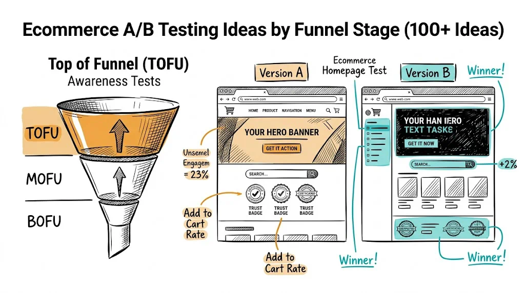
These tests focus on the first 3–5 seconds of a visitor's experience. The question is: does this visitor immediately understand what you sell, why they should trust you, and what they should do next?
Homepage Tests
- Hero headline: benefit-led vs. product-led
- Hero CTA: "Shop Now" vs. "Find Your [Product]" vs. "Start with Our Best Seller"
- Social proof placement: review count above fold vs. below fold
- Navigation: mega menu vs. simple category links vs. "Shop by Goal" navigation
- Homepage layout: grid vs. editorial vs. product-focused
- Trust badges: "Free shipping | Easy returns | 14,000+ reviews" strip above fold vs. footer only
- Featured collection: curated "Best Sellers" vs. "New Arrivals" vs. "Staff Picks"
- Brand story video: homepage hero video vs. static image
- Quiz CTA: "Find Your Perfect Product" quiz vs. direct category navigation
- Personalised returning visitor homepage vs. generic homepage
- Festive season homepage theme vs. evergreen homepage
- Social proof ticker: "243 people bought this today" vs. no ticker
- Mobile homepage hero: full-bleed image vs. product + copy split
- Homepage popup timing: 5-second delay vs. exit-intent only
- "Shop the Look" editorial section vs. product grid on homepage
- Countdown timer for offers vs. no countdown
- Free shipping threshold messaging: "Free shipping on all orders above ₹499" prominent vs. footer
- WhatsApp chat widget: prominent vs. minimised on homepage
- Instagram feed widget: visible on homepage vs. not shown
- Category organisation: by product type vs. by use case vs. by concern
Landing Page Tests
- Long-form landing page vs. short-form landing page for paid traffic
- Video hero vs. image hero on ad landing pages
- Above-fold CTA: single vs. dual option (buy vs. learn more)
- Testimonial placement: above fold vs. after product description
- Price display: full price prominent vs. per-unit or per-day pricing
- Urgency: "Limited time offer" vs. no urgency language
- Landing page vs. product page as ad destination
- Trust badges: number and placement on landing page
- FAQ section: present vs. not present on landing page
- Exit-intent popup: offer vs. email capture only
Stage 2: Consideration — MOFU Tests (Category & Product Pages)
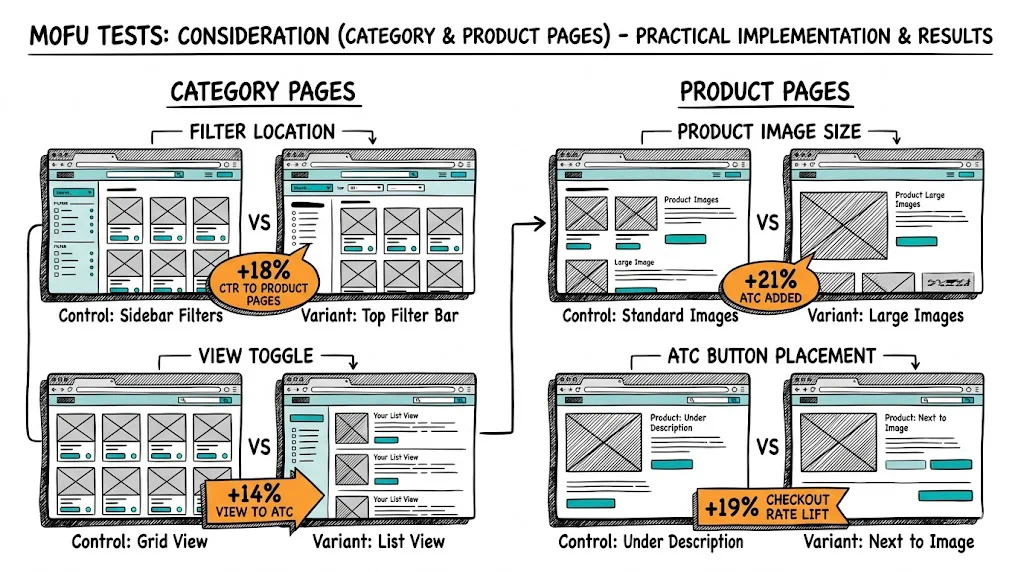
These tests focus on the research and evaluation phase. The question is: does this visitor find what they need, trust the product, and feel confident enough to add to cart?
Category Page Tests
- Filter placement: left sidebar vs. top horizontal bar
- Default sort order: bestsellers vs. newest vs. recommended
- Product card layout: image-only vs. image + title + price vs. image + social proof
- Pagination vs. infinite scroll on category pages
- "Quick Add" button on product cards vs. click-through to product page
- Category page banner: editorial hero vs. filter-first layout
- Sub-category navigation: tabs vs. dropdown vs. filter chips
- "Shop by Concern/Goal/Occasion" vs. standard category navigation
- Product card hover state: secondary image vs. quick view
- "X People Bought This Today" on product cards vs. star rating only
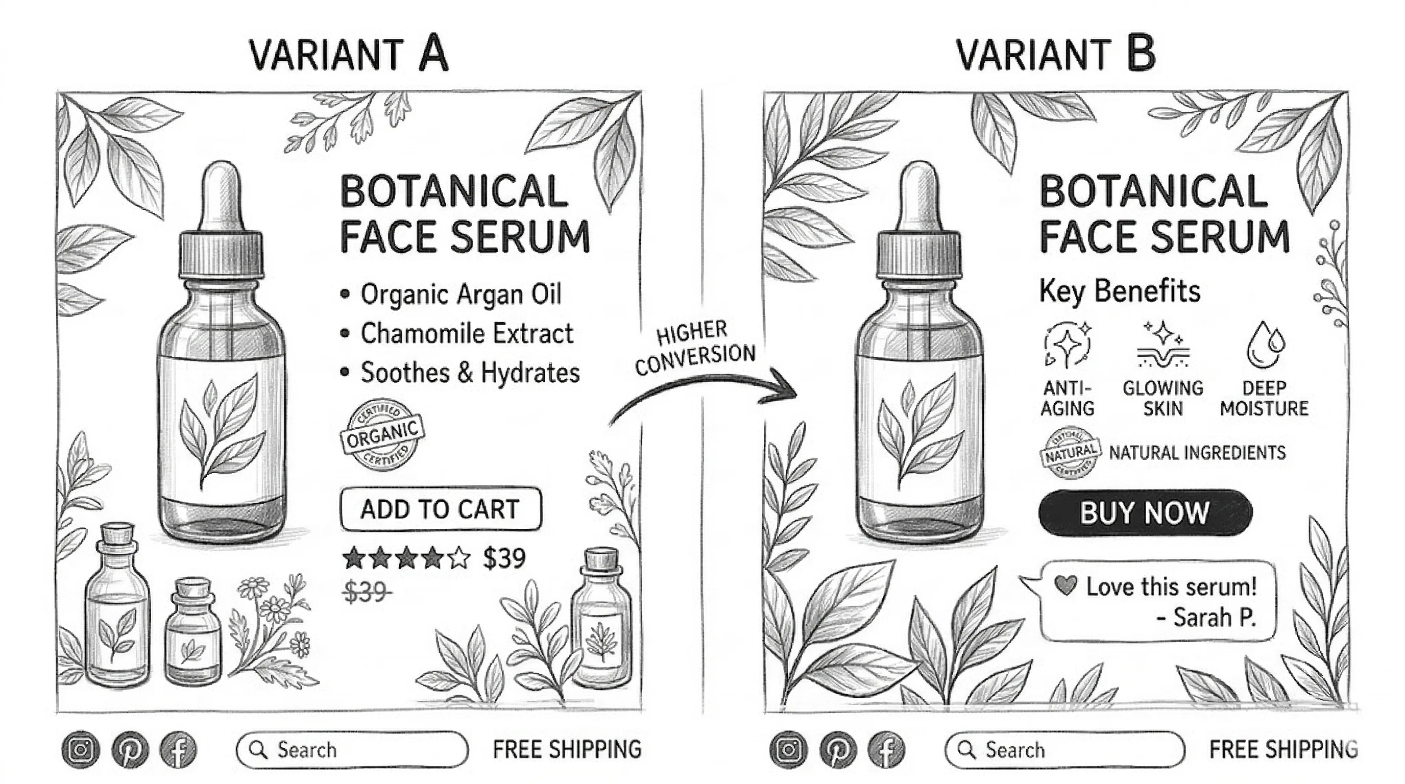
Product Page Tests
- Image gallery layout: horizontal thumbnails vs. vertical scroll
- Hero image: lifestyle vs. packshot
- Product description: long-form vs. bullet points vs. accordion tabs
- CTA button: colour, copy, size
- Sticky "Add to Cart" bar on mobile scroll
- Review placement: above fold vs. below product description
- Review display: star rating + count vs. featured review snippet
- Photo review carousel vs. text reviews
- Ingredient/material highlight cards vs. text list
- FAQ section: expandable accordion vs. link to separate FAQ page
- Trust badges: placement near CTA vs. in description
- "Why Buy From Us" section: present vs. not present
- Social proof statement near CTA: "8,400 people love this"
- Subscription vs. one-time purchase toggle: default selection
- Bundle offer on product page: below CTA vs. separate section
- "Frequently Bought Together" section: present vs. not present
- Cross-sell placement: above vs. below the fold
- Countdown timer for in-stock warning vs. no timer
- Video in image gallery: first vs. last position
- Size/variant selector: dropdown vs. button grid vs. swatch
- EMI breakdown: visible above price vs. expandable link
- "Compare with" tool: present vs. not present
- Shipping estimate: exact date vs. "5–7 business days"
- Return policy: visible on product page vs. footer link only
- Chat option: "Ask us anything about this product"
- "How to Use" section: on product page vs. separate page
- Model measurements with fit notes vs. standard size chart
Stage 3: Purchase — BOFU Tests (Cart & Checkout)
These tests focus on the moment of transaction. The question is: does every element of the cart and checkout experience support completion rather than create doubt or friction?
Cart Page Tests
- Cart design: full page vs. slide-out drawer vs. mini cart
- Order summary: collapsed vs. expanded by default
- "Continue Shopping" vs. "Back to Product" link style
- Upsell placement in cart: above order summary vs. below
- "You're ₹X away from free shipping" progress bar
- COD option: displayed in cart vs. only at checkout
- Estimated delivery date: in cart vs. only at checkout
- Cart abandonment save: "Save Cart" email option
- Coupon field: visible vs. hidden behind "Apply Coupon" link
- Trust badge strip in cart: present vs. not present
- "Customers Also Bought" in cart: present vs. not present
- Remove item: with undo vs. permanent remove
- Gift note option: in cart vs. at checkout
- WhatsApp cart share button: present vs. not present
Checkout Tests
- Single-page vs. multi-step checkout
- Guest checkout prominence vs. account required
- Payment method display order: UPI first vs. cards first vs. COD first
- UPI QR code display vs. UPI ID entry
- Phone number vs. email as primary contact field
- Address autocomplete: Google vs. Shiprocket vs. manual entry
- Delivery date selection: calendar picker vs. text estimate
- Order bump at checkout: relevant add-on product
- Coupon auto-apply vs. manual entry
- Trust signals at checkout: payment security badges
- Progress indicator: step number vs. visual progress bar vs. none
- "Why Buy From Us" reassurance at checkout vs. not shown
- Exit-intent at checkout: offer vs. just a delay/warning
- COD fee transparency: shown upfront vs. shown at payment stage
- EMI option: inline at payment vs. after payment method selection
- Post-purchase upsell: immediate offer vs. email-based
- WhatsApp order confirmation opt-in vs. email only
- "Place Order" button: copy variants and colour
- One-click checkout for returning customers vs. standard flow
Stage 4: Retention — Post-Purchase Tests
- Post-purchase page: upsell offer vs. social share prompt vs. loyalty enrolment
- Welcome email: personalised product guide vs. generic thank you
- Replenishment reminder: email vs. WhatsApp vs. both
- Loyalty program: points-based vs. tier-based vs. cashback
- Review request: timed at 7 days vs. 14 days vs. 21 days post-delivery
- Subscription upgrade offer: post-first-purchase email vs. product page
- Referral program: prominent "Give ₹200, Get ₹200" vs. buried in account
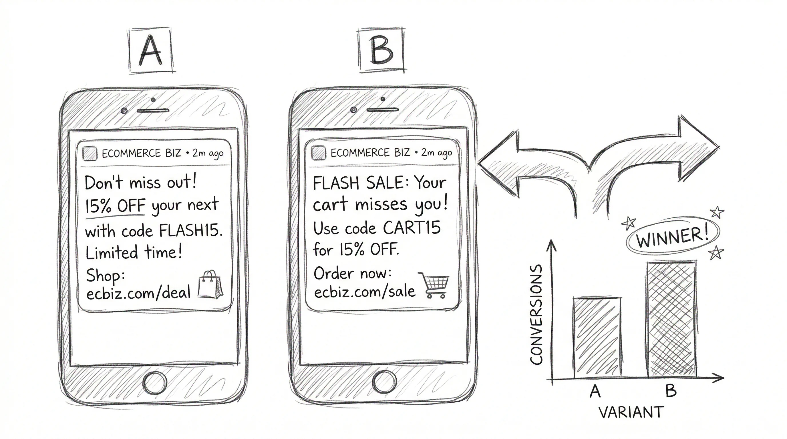
- Win-back campaign: discount offer vs. new product vs. personalised recommendation
- Birthday/anniversary surprise: email + special offer vs. no communication
- "You're about to run out" SMS/WhatsApp: 30 days vs. 45 days cycle
How to Prioritise Your Test Backlog
With 100+ ideas, the challenge is where to start. Use the ICE framework:
- Impact: How much CVR or revenue lift do you expect? (1–10 scale)
- Confidence: How strong is your evidence that this test will win? (1–10 scale)
- Ease: How quickly can you implement this? (1–10 scale)
Multiply the three scores. Run the highest-scoring tests first.
For most D2C stores, the highest-ICE tests are:
- Product page CTA button test (high traffic, easy to implement, clear impact)
- Checkout payment method order (high conversion impact, low implementation effort)
- Free shipping threshold messaging on cart (direct AOV and CVR impact)
- Homepage hero copy (high traffic, easy test, brand-defining result)
See also: homepage A/B testing ideas, product page A/B testing ideas, and checkout A/B testing ideas for deep dives into each funnel stage.
Tips and Best Practices
One test per page at a time. Running two tests on the same page simultaneously makes attribution impossible. Use statistical significance to conclude tests before starting new ones on the same page.
Start with sample size calculation. Before launching any test, calculate how many visitors you need per variant to detect your expected lift with 95% confidence. CustomFit.ai's built-in calculator handles this automatically.
Build a test log. Record every test: hypothesis, variants, start date, end date, result, next action. After 20 tests, this log becomes your most valuable CRO asset — a record of what your specific audience responds to.
Don't test during abnormal traffic periods. Festive sale events, PR spikes, and ad campaign launches all distort results. Run tests during stable traffic periods; deploy winners during peaks.
Key Takeaways
- Organising tests by funnel stage prevents wasted effort — fix the biggest leak first.
- TOFU tests (homepage, landing pages) affect all downstream metrics; one win here multiplies across the entire funnel.
- MOFU tests (product pages) have the highest volume-to-impact ratio for most D2C stores.
- BOFU tests (cart, checkout) target the highest-intent visitors — even small improvements have significant revenue impact.
- Retention tests (post-purchase, re-engagement) are the most underinvested test category and often have the highest LTV impact.