From the conversion glossary
Concepts referenced in this article, defined.
Cognitive accessibility ecommerce goes beyond screen readers and ADA checklists. Practical UX that helps every shopper think and decide more easily.
 Yuvraj Singh7 min read
Concepts referenced in this article, defined.
Run rigorous A/B tests and personalize every visit on Shopify or any storefront — no engineers required.
Most ecommerce accessibility work stops at the technical checklist — alt text, screen reader compatibility, color contrast ratios, and keyboard navigation. That work matters and should not be skipped. But it primarily addresses visual and motor accessibility while overlooking a much larger, less visible group: shoppers who process information, language, and decisions differently because of a diagnosed condition, situational stress, fatigue, or simply how their brain works.
Cognitive accessibility ecommerce is about designing for that group too. The genuinely useful part is that almost everything that helps them also makes the experience easier for every other shopper on your site.
ADA and WCAG compliance checklists are concrete and testable — either your images have alt text or they do not, and either your contrast ratio passes or it fails. Cognitive load, confusing navigation, and overly complex language are real barriers, but they're harder to audit with a simple pass/fail tool. That is part of why these issues get deprioritized even by teams genuinely trying to build an accessible site.
The group affected is also larger than most teams assume. It includes people with ADHD, dyslexia, autism, and other learning differences, but it also includes anyone shopping while distracted, stressed, sleep-deprived, or unfamiliar with your product category — which, at some point, is nearly every visitor to your site.
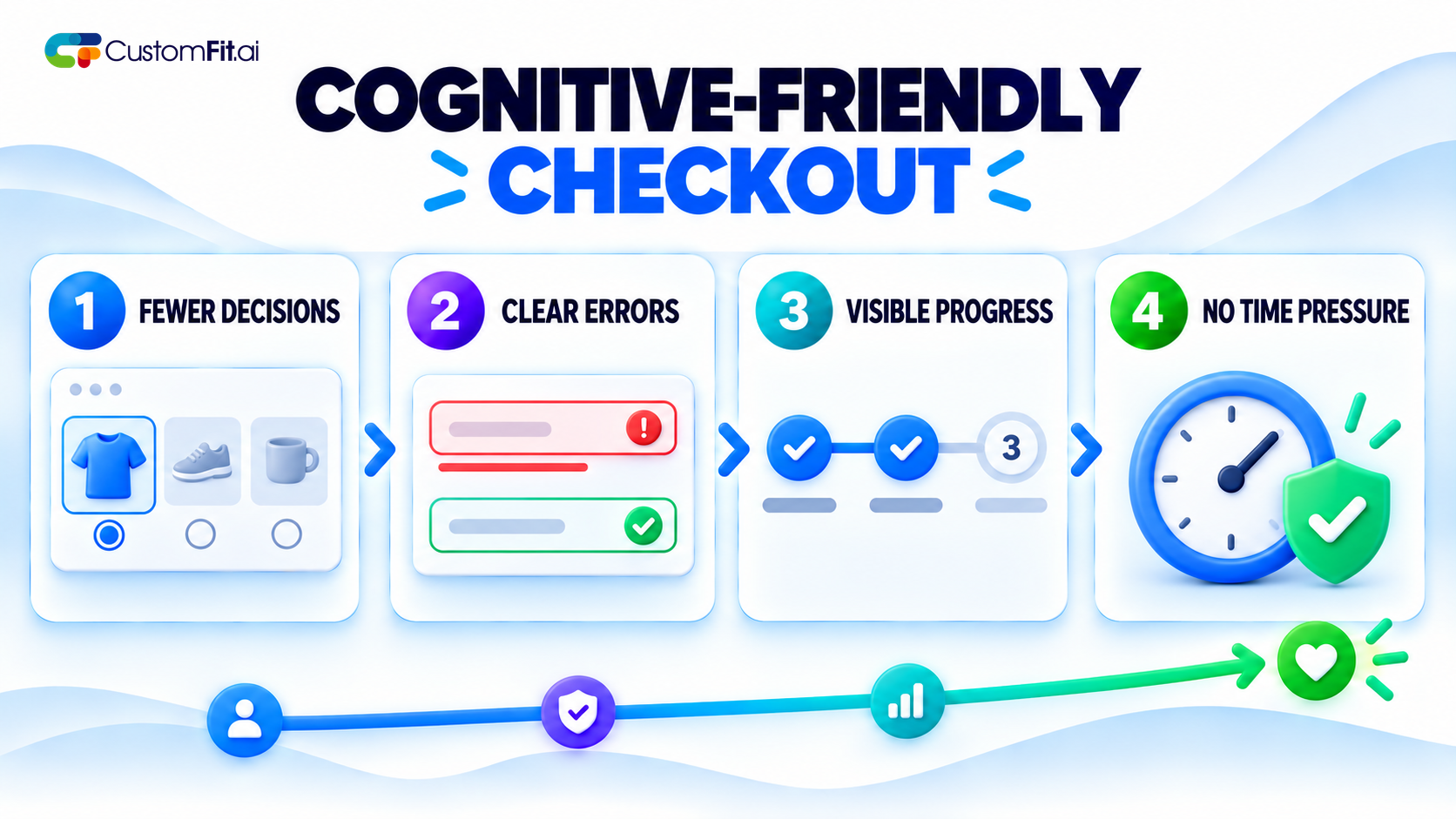
Reduce the number of decisions required at any one step. A checkout page presenting shipping options, payment methods, and multiple add-on offers simultaneously creates real cognitive load. Breaking the flow into clear, sequential steps — each asking for one category of decision at a time — reduces the mental effort required to complete a purchase.
Make error messages specific and actionable, not just red text. "Invalid input" tells a shopper nothing useful. "Your card number should be 16 digits" — please check for typos — tells them exactly what to fix. That specificity matters enormously for anyone who struggles with ambiguous or vague instructions.
Show progress clearly through multi-step processes. Knowing how many steps remain reduces the anxiety and mental tracking burden of an open-ended process. It especially benefits shoppers with attention or working-memory differences, but genuinely helps everyone.
Avoid time pressure on cognitively demanding tasks. A countdown timer pressuring a shopper through a checkout form they are still reading carefully can be genuinely distressing for some users, not just mildly annoying. Reserve urgency messaging for browsing and decision stages, not the mechanical process of entering payment details.
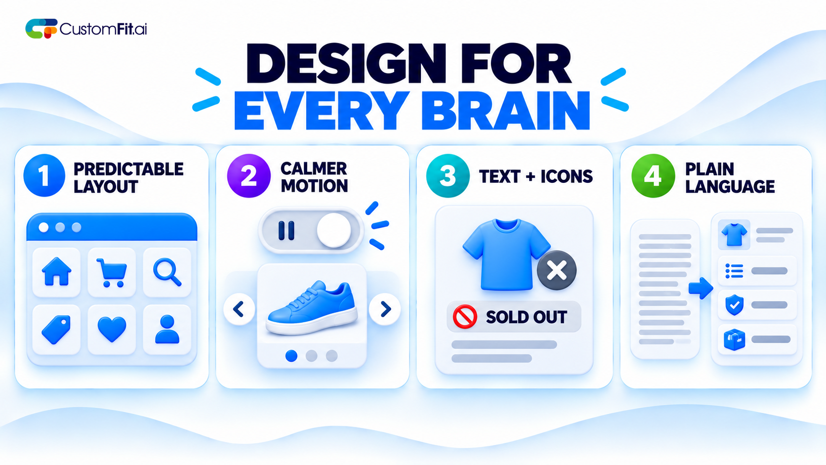
Use consistent layout and navigation patterns throughout the site. Predictability reduces cognitive load significantly. A navigation menu, button style, or page structure that shifts unpredictably between pages forces a shopper to relearn the interface repeatedly, which is a bigger barrier for some users than it may seem to a design team familiar with the site.
Minimize unnecessary animation and motion. Auto-playing carousels, parallax scrolling effects, and constant micro-animations can be genuinely difficult to process for some neurodivergent users and are often distracting for everyone else. Testing a calmer version of key pages is worthwhile even outside an explicit accessibility initiative.
Avoid relying on color alone to convey meaning. Using color as the only signal for a sold-out item, an error, or a selected option excludes colorblind users and can be unclear for anyone quickly scanning a page. Pair color consistently with text or icons.
Give users control over sensory intensity where relevant. For sites with significant video, audio, or animation content, simple controls that reduce or disable motion and autoplay respect the real range of sensory-processing differences among visitors.
Write product descriptions and policies in plain, direct language. Legal or marketing jargon that requires real effort to parse creates a barrier for shoppers with reading or processing differences. It also slows every other shopper trying to understand quickly what they are buying.
Break complex information into short, scannable sections. Dense paragraphs of policy text or product specifications are harder to process than the same information divided into short sections with clear headings. This is one of the lowest-effort, highest-impact changes most sites can make.
Define unfamiliar terms instead of assuming prior knowledge. A technical specification or industry term that makes perfect sense to your team may be unclear to a first-time shopper. A brief inline explanation removes ambiguity for everyone.
Test your most important pages with a readability tool. Simple readability checkers can flag content that is more complex than necessary, giving you a concrete starting point instead of relying entirely on subjective judgment.
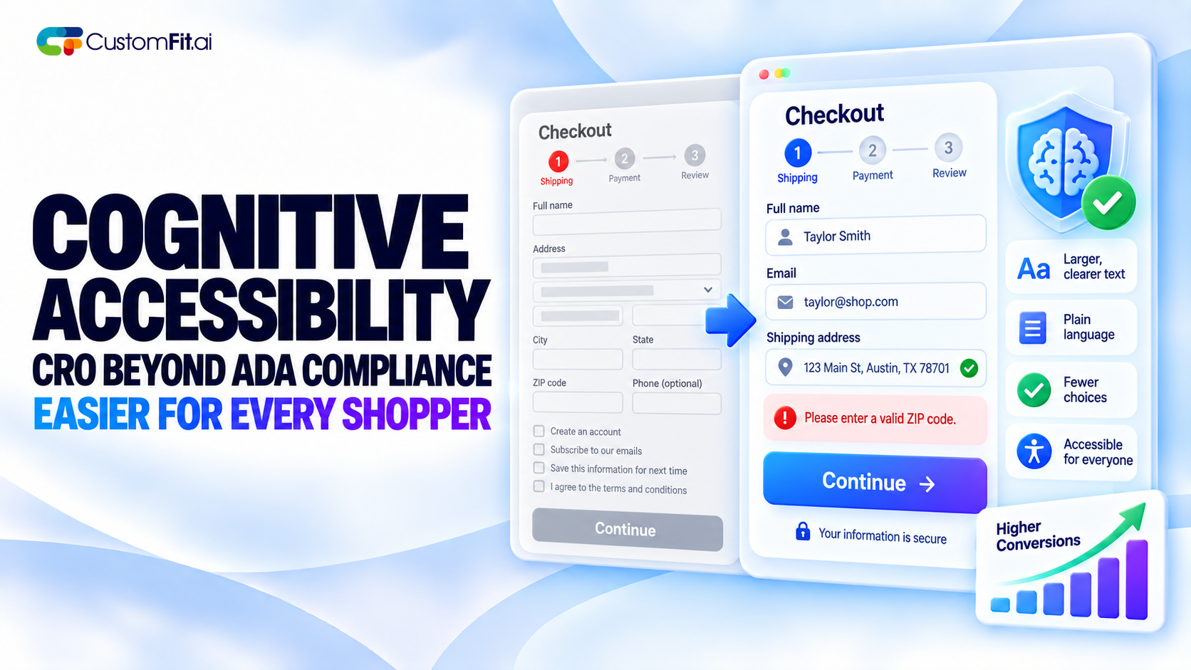
This is the point worth emphasizing to any team skeptical of investing here: cognitive accessibility improvements consistently appear as general conversion improvements, not just accessibility wins for a specific group. Clearer error messages, simpler checkout flows, and plainer language reduce abandonment for every shopper, not only those the changes were specifically designed to help.
This is sometimes called the "curb-cut effect" — a design change created for accessibility that benefits a much broader population than originally intended.
The most common mistake is treating accessibility purely as a legal compliance checkbox, stopping at technical WCAG requirements and never considering cognitive load, language complexity, or interface predictability.
The second is assuming cognitive accessibility is a niche investment for a small user segment, when in practice it measurably reduces friction for the entire visitor base, including many shoppers who would never describe themselves as needing accessible design.
Cognitive accessibility ecommerce goes well beyond what a standard ADA compliance audit covers, and it consistently pays off in ways that extend far beyond the group it is designed to help.
Plain language, predictable navigation, reduced cognitive load at checkout, and calmer sensory design are not niche accommodations. They are good CRO practices that also happen to be the right things to build.