From the conversion glossary
Concepts referenced in this article, defined.
Does dark mode change ecommerce conversion? Learn how site appearance and visual preference affect shoppers, and how to A/B test theme toggles without hurting UX.
Concepts referenced in this article, defined.
 cro
croLearn membership paywall CRO: how to design tiers, show value before the paywall, cut signup friction, and test what turns visitors into paying members.
 cro
croLearn how to set up live selling on your own website, keep shoppers from leaving, and test what turns live viewers into buyers. A practical live selling website CRO guide.
 cro
croDoes eco-friendly copy actually help sales? Learn how sustainability messaging CRO works, which green claims earn trust, and what to A/B test on your product pages.
Run rigorous A/B tests and personalize every visit on Shopify or any storefront — no engineers required.
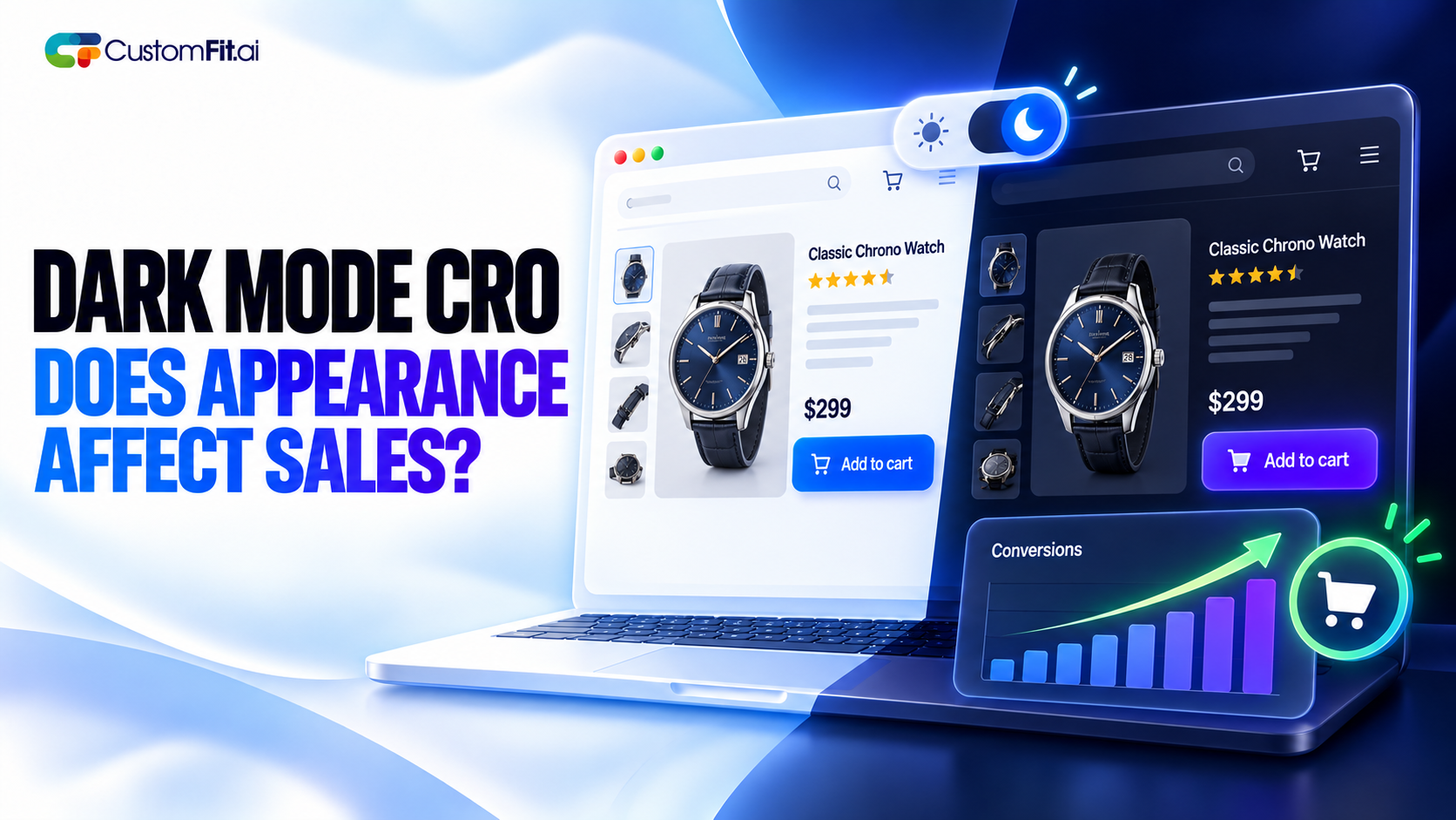
Most phones and laptops now let people switch to dark mode, and a lot of them do. So a shopper might open your store at night with their whole device set to dark, and land on a bright white page. Does that matter for sales?
The honest answer is that nobody can tell you in general. Dark mode CRO for ecommerce depends on your products, your audience and how well your site is built. What we can do is look at where appearance really affects shopping, and how to test it properly.
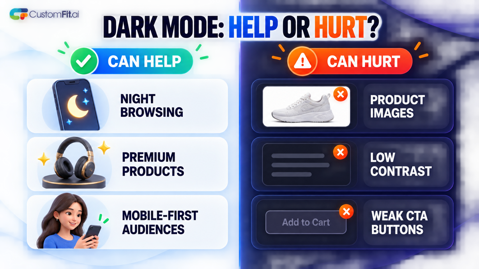
A website's look is part of how it feels to use. Contrast affects how easy text is to read. Brightness affects comfort, especially at night. Color affects how products look.
For most stores, the effect on conversion is small compared to things like price, shipping and trust. But in a few situations, appearance can make a real difference, and those are worth testing.
Dark mode isn't automatically better. A poor dark theme can lose sales.
If your catalog was built for a white background, a dark theme may need a lot of work to be worth it.
Before building a toggle, check what your visitors already use. Browsers can tell your site whether the person has chosen light or dark mode. A good approach is to follow that setting by default and let people switch manually.
Forcing everyone into one theme ignores a preference they've already set. At minimum, make sure your site doesn't look broken when a visitor's device is in dark mode, even if you haven't designed a dark theme on purpose.
Testing appearance is trickier than testing a headline, because the groups aren't random in the same way. Someone who uses dark mode may behave differently from someone who doesn't, regardless of your site.
Here's a sensible approach:
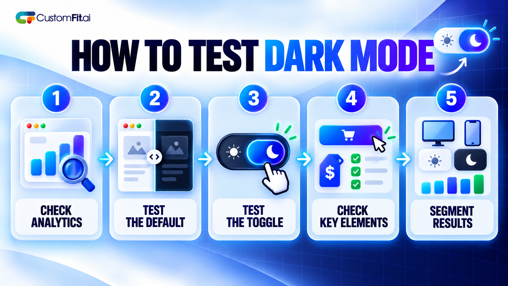
Don't just look at overall conversion. Watch bounce rate, time on page and add to cart rate, and compare returns if you can. If dark mode makes colors look off, you may see more returns even when sales look fine.
Some people use dark mode because it's easier on their eyes, and others find it harder to read. Contrast matters either way. Aim for good contrast ratios in both themes, and let people choose. That's good for shoppers and it protects you from accessibility problems.
Dark mode isn't a conversion trick. It's a comfort and preference feature that helps some stores and does little for others. Look at your own visitor data first, make sure the site works well in both modes, and test before you invest in a full redesign.