From the conversion glossary
Concepts referenced in this article, defined.
Learn membership paywall CRO: how to design tiers, show value before the paywall, cut signup friction, and test what turns visitors into paying members.
Concepts referenced in this article, defined.
 cro
croLearn how to set up live selling on your own website, keep shoppers from leaving, and test what turns live viewers into buyers. A practical live selling website CRO guide.
 cro
croDoes eco-friendly copy actually help sales? Learn how sustainability messaging CRO works, which green claims earn trust, and what to A/B test on your product pages.
 cro
croGen Z shopping behavior CRO — the real differences in how Gen Z and Millennial shoppers browse, decide, and check out, and what to actually test.
Run rigorous A/B tests and personalize every visit on Shopify or any storefront — no engineers required.
Asking someone to pay before they've gotten anything is a hard sell. That's the core problem with membership and paywall pages. The visitor has to believe the value is worth it based on very little.
Good membership paywall CRO is mostly about closing that gap. You show enough to build trust, make the offer easy to understand, and remove anything that gets in the way of signing up.
Visitors who hit a paywall cold usually leave. Visitors who've already had a taste of what's inside are far more likely to stay.
There are a few common ways to do this:
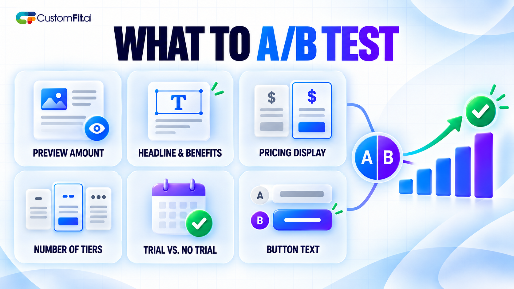
Test how much to give away. Too little and people don't see the point. Too much and they have no reason to pay.
Most paywalls fail because they confuse people. The shopper should understand three things in a few seconds: what they get, what it costs, and what happens next.
A good paywall usually has a plain headline, a short list of benefits, the price, and one clear button. Skip the long essays and the five competing calls to action.
Also check the wording on the button. "Join now" and "Start free trial" and "Get access" can perform very differently, and the right one depends on your audience.
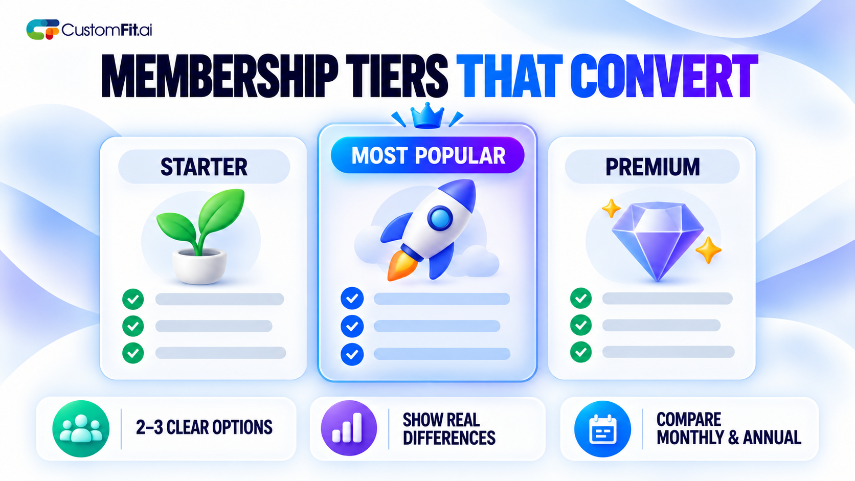
If you offer more than one plan, keep the choice easy. Too many tiers push people into doing nothing.
Try showing the annual saving as a percentage against showing it as a rupee or dollar amount. The two can land differently.
Even people who want to join drop off if the process is annoying. Look closely at your signup flow.
On mobile, check that the form is easy to fill with a thumb. A form that looks fine on a laptop can be painful on a phone.
Trials work because they lower the risk. But they come with a fear: "Will I forget to cancel and get charged?"
Address that directly. Say when the trial ends, what the first charge will be, and how to cancel. Some brands find that a reminder promise, such as "We'll email you 3 days before your trial ends," increases signups because it removes the worry. Test it.
Be honest here. Hiding the cancel button or making it hard to find might protect short-term revenue, but it creates refunds, chargebacks and angry reviews.
Don't stop at signup rate. Check how many members are still active after 30 and 90 days. A paywall that wins on signups but loses members quickly isn't a winner.
People join memberships when they can see what they'll get, understand the price quickly and sign up without hassle. Start by showing real value early, keep the paywall simple, and measure what happens after signup, not just the signup itself.