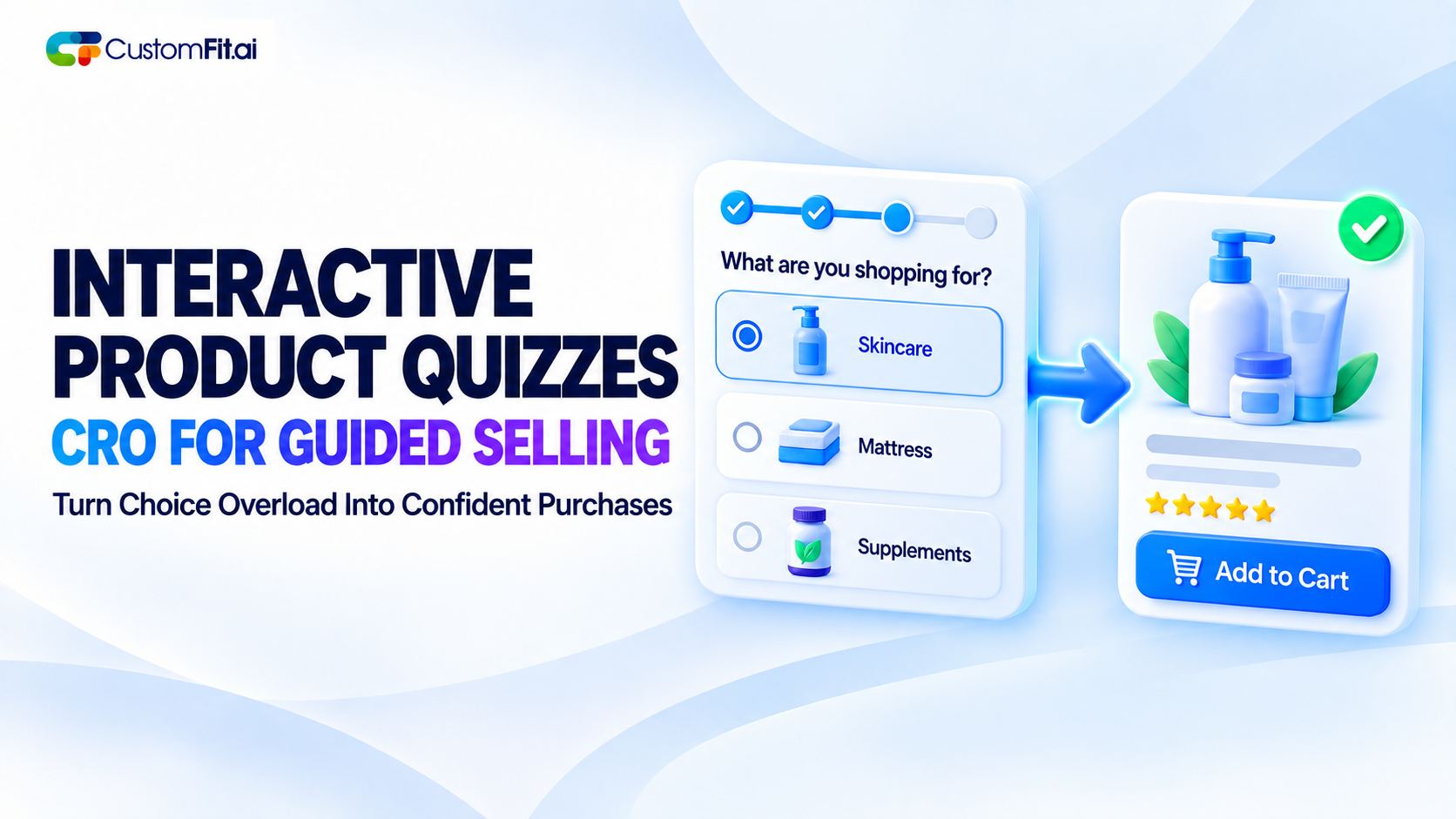
From the conversion glossary
Concepts referenced in this article, defined.
Product quiz CRO for ecommerce — how to design a guided selling quiz that actually increases conversion instead of just adding a fun distraction.
Concepts referenced in this article, defined.
 cro
croMulti language website CRO goes beyond translated text - currency, trust signals, and local buying habits. A practical guide to real ecommerce localization.
 cro
croPre-order waitlist CRO strategies that convert hype into real revenue - how to design waitlist and pre-order pages that don't lose momentum before launch.
 cro
croFirst purchase experience optimization - practical strategies to turn first-time visitors into buyers, from welcome offers to a smarter new customer funnel.
Run rigorous A/B tests and personalize every visit on Shopify or any storefront — no engineers required.
A shopper lands on a site with forty variations of the same product category — skincare formulas, mattress firmness levels, protein powder flavors — and no clear idea which one is actually right for them. Left alone, a meaningful share of those shoppers won't dig through comparison charts to figure it out. They'll leave and buy from whichever competitor made the decision easier.
Product quiz CRO exists to solve exactly that moment. A well-built quiz replaces the confusing work of comparing options with a short, guided conversation that ends in a specific recommendation — which is a fundamentally easier thing for a shopper to say yes to than an open-ended catalog.
Guided selling ecommerce isn't the right tool everywhere. It earns its place specifically in categories with real complexity or personalization — skincare (skin type, concerns, ingredients to avoid), supplements (goals, existing routine, dietary restrictions), mattresses (sleep position, firmness preference, body type), or anything with enough genuine variation that a generic "here's our bestseller" recommendation would often be wrong for a specific shopper.
For simple, low-variation products, a quiz adds friction without adding value — nobody needs five questions answered before buying a plain white t-shirt in their usual size. The test for whether guided selling fits your catalog: does knowing more about this specific shopper meaningfully change which product they should actually buy?
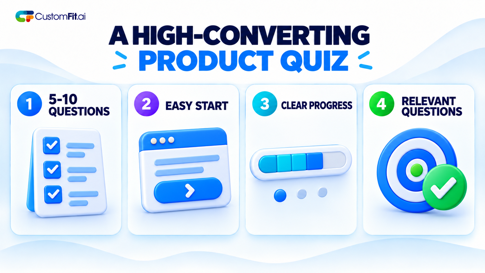
Keep it short enough to finish, thorough enough to feel accurate. A quiz funnel conversion problem shows up fast if the quiz feels either too short to be trustworthy ("three questions and you claim to know my perfect skincare routine?") or too long to bother finishing. Most well-performing quizzes land somewhere between five and ten questions — enough to feel personalized, not so many that people abandon halfway through.
Ask easy and appealing questions at the beginning. Initiating the conversation with a simple question, such as skin type, prepares the ground for more complex questions later in the sequence. People are more likely to leave when they feel they have been asked a difficult or complicated question too early in the process.
Make the progress clear. If only the progress bar displays the progress or "question 3 of 8" notifications, uncertainty can be avoided and people will be more willing to complete the quiz.
Ensure that every question feels relevant to the recommendation. The moment a question appears irrelevant to the final offer, the experience feels like a data collection exercise rather than real personalization. Shoppers will notice it even if they cannot articulate it.
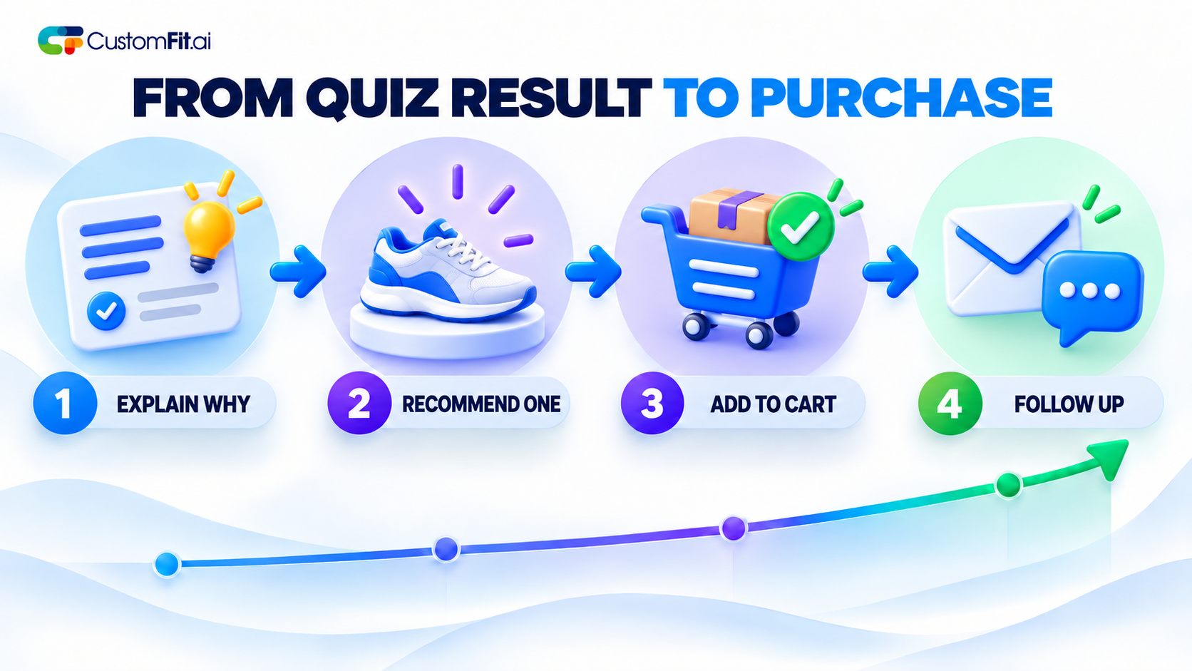
Explain the "why," not just the "what." A result that says "we recommend Product X" is weaker than one that says, "based on your combination of oily-and-dry skin and sensitivity to fragrance, we recommend Product X because it's fragrance-free and balances both zones." The explanation is what makes the recommendation feel earned rather than arbitrary.
Offer a primary recommendation, not an overwhelming list. The entire value of a quiz is reducing choice paralysis — ending with "here are your top eight matches" undoes that value. One clear primary recommendation, with at most one or two close alternatives, keeps the simplicity the quiz was supposed to provide.
Make adding to cart the very next step, with zero extra friction. After investing several minutes answering questions, a shopper who then has to search manually for the recommended product is more likely to abandon than one given an immediate, one-click add-to-cart from the results page itself.
Capture the result for follow-up, with permission. Email or SMS capture at the results screen, framed as "get your personalized results sent to you," is a natural, low-resistance moment to build a list. It is less intrusive than a generic popup because it is tied directly to something the shopper just actively engaged with.
Let the quiz results influence the wider site experience. If a user has taken the skin-type quiz, the information gathered can be used to propose relevant products across the website, increasing the usefulness of that information beyond a one-time purpose.
Make it simple to retake or change responses. Users whose requirements have changed, or who want to check their answers through slight variations, should not have to begin again from scratch. Letting them change questionnaire responses acknowledges the time they already spent.
Measure quiz completion and post-quiz conversion separately. A quiz with a high completion rate but low resulting purchase rate points to a problem with the recommendation or the handoff to checkout, not the quiz format itself. Segmenting these metrics tells you which part of the funnel actually needs fixing.
The most common mistake is building a quiz that's genuinely fun and well-designed but disconnected from an actual purchase decision — entertaining, but not converting, because the questions don't map cleanly to real product differences.
The second is making the result screen a dead end, requiring the shopper to manually search for the recommended product instead of offering an immediate, frictionless path to buy it.
Product quiz CRO works precisely because it turns an overwhelming catalog into a guided decision — but only when every question earns its place and the result ends in an immediate, easy next step. Done well, a quiz doesn't just feel like a nice feature; it directly and measurably increases conversion for the shoppers who would otherwise have left confused and empty-handed.