
From the conversion glossary
Concepts referenced in this article, defined.
Learn product configurator CRO: how to simplify build-your-own tools, reduce abandonment, show live previews and price, and test what gets shoppers to finish.
 Yuvraj Singh6 min read
Concepts referenced in this article, defined.
 cro
croDoes dark mode change ecommerce conversion? Learn how site appearance and visual preference affect shoppers, and how to A/B test theme toggles without hurting UX.
 cro
croLearn membership paywall CRO: how to design tiers, show value before the paywall, cut signup friction, and test what turns visitors into paying members.
 cro
croLearn how to set up live selling on your own website, keep shoppers from leaving, and test what turns live viewers into buyers. A practical live selling website CRO guide.
Run rigorous A/B tests and personalize every visit on Shopify or any storefront — no engineers required.
Letting customers build their own product sounds like a sure win. Custom sneakers, a made-to-order sofa, a personalized gift box. But in practice, a lot of people start a configurator and never finish it.
Product configurator CRO is about finding where people drop out and making the process feel easier instead of like homework. A configurator is an important part of the sales funnel, not just a design feature, because every choice affects whether a shopper continues toward the cart.
Customization adds choices, and choices add effort. Each decision is a chance for the shopper to feel unsure, get tired, or leave.
The usual reasons people quit:
None of these mean people do not want to customize. They mean the tool is making them work too hard.
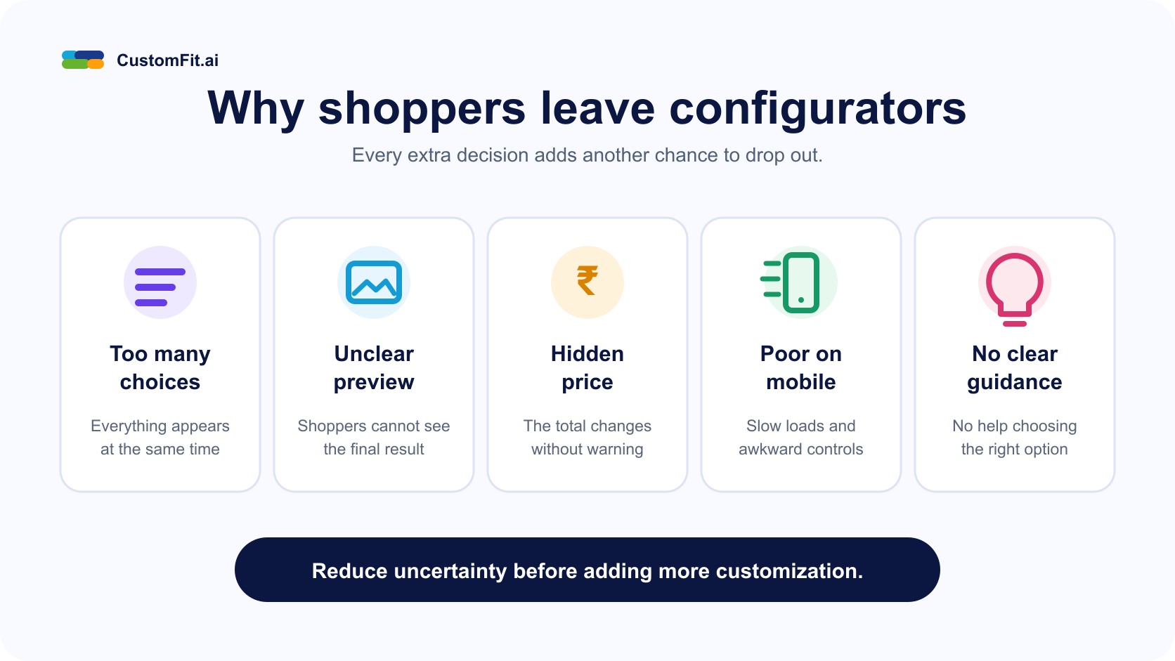
The most common fix is a live preview. When a shopper picks a color or material, the image should change right away. If they have to guess what "walnut finish" looks like, they might not finish.
Where possible, show the product from more than one angle or let people rotate it. For products where fit or size matters, add a short guide inside the tool instead of sending shoppers to a separate page.
Read Also: Product Page Optimization: A Complete Guide
Few things damage trust like a surprise at the end. Show a running price from the first step and update it as options change. If an upgrade costs extra, say so beside the option, such as "+ Rs. 500."
It also helps to show the total including shipping, or at least when shipping will be calculated, so the cart does not feel like a trick.
You do not have to offer everything on screen at once. A few ways to simplify:
A good test is to count how many decisions someone has to make before reaching the cart. If it feels like a lot to you, it is too many for them.
Customization is rarely completed in one sitting. People want to think, ask a partner, or compare. Give them a way to save the design, share a link, or email it to themselves. This turns abandonment into a return visit.
It is also a good moment to capture an email address, as long as you make it optional.
Many configurators were built for desktop and then squeezed onto a phone. Check yours on a real device. Buttons should be easy to tap, the preview should not scroll away as options change, and the tool should load quickly.
Heavy 3D previews are a common cause of mobile drop-off, so test a lighter version.
Read Also: Ecommerce Form UX: How to Reduce Friction
Custom orders raise questions that regular products do not. How long will it take? Can I return it? What if the color looks different in person?
Answer these inside the configurator, near the add-to-cart button. Be clear about production time, delivery date, and return policy for custom items. If returns are not allowed, say it plainly and early, not after the shopper has spent twenty minutes designing.
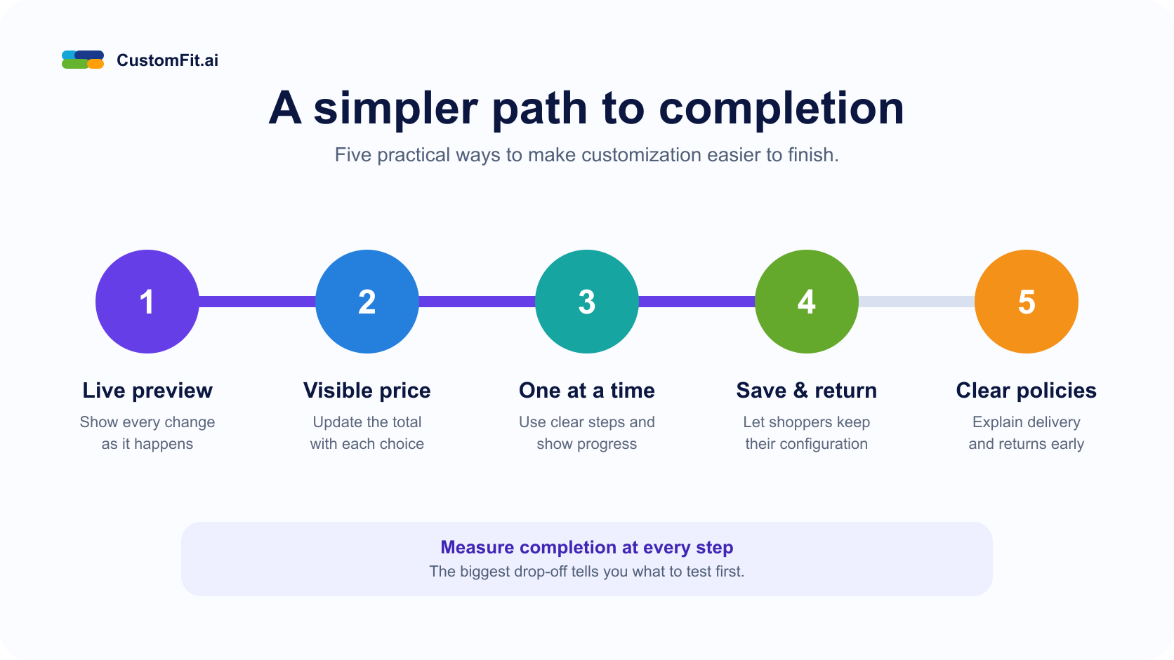
Measure where people drop out step by step, not only the overall completion rate. That shows you which step needs work.
From ABTesting.world: What Makes a Good A/B Test? Avoiding Common Mistakes
Customization can raise order value and loyalty, but only when the tool is easy to finish. Show the result as shoppers build, keep the price clear, cut the number of decisions, and make it simple to save and return. Then test each change against how people actually drop out.
Read Also:
Ready to identify and fix the biggest drop-off in your product configurator? See how CustomFit.ai can help you test the full experience without adding development bottlenecks.
Book a CRO strategy call